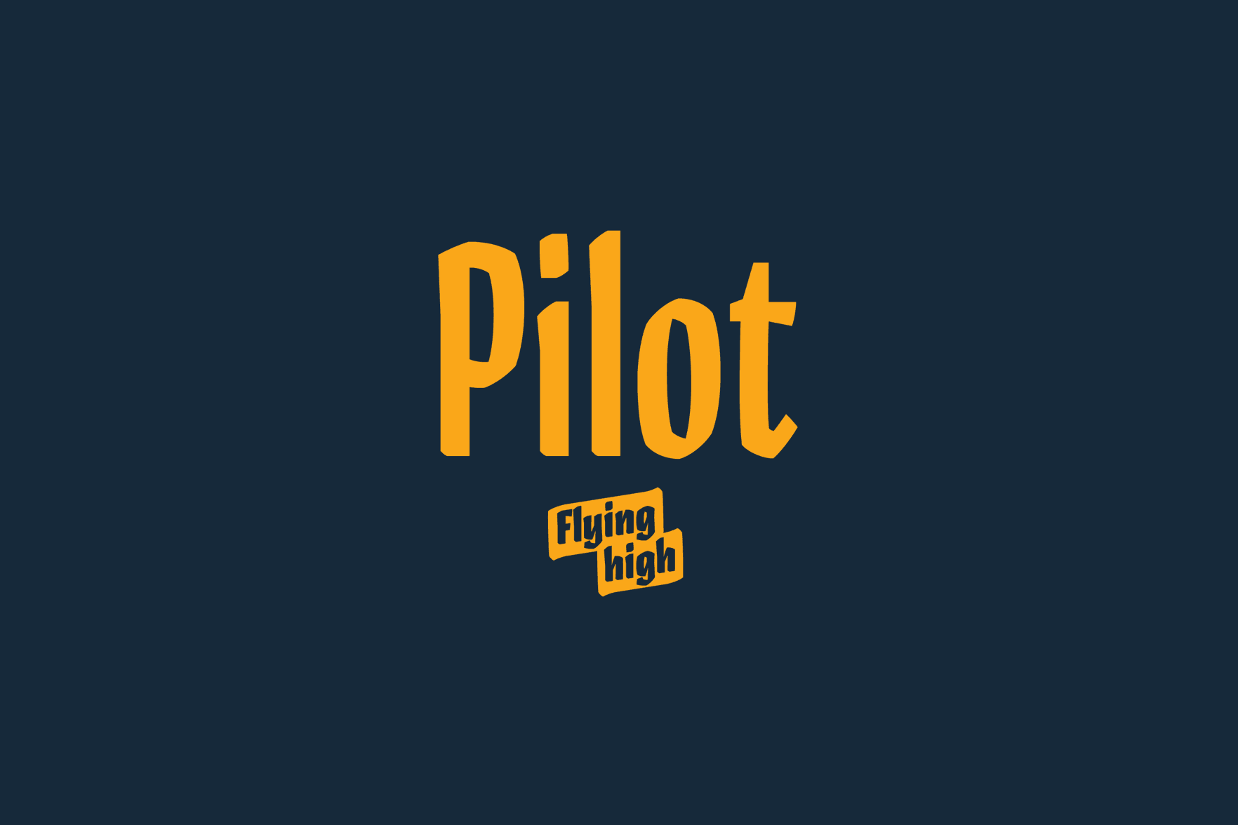
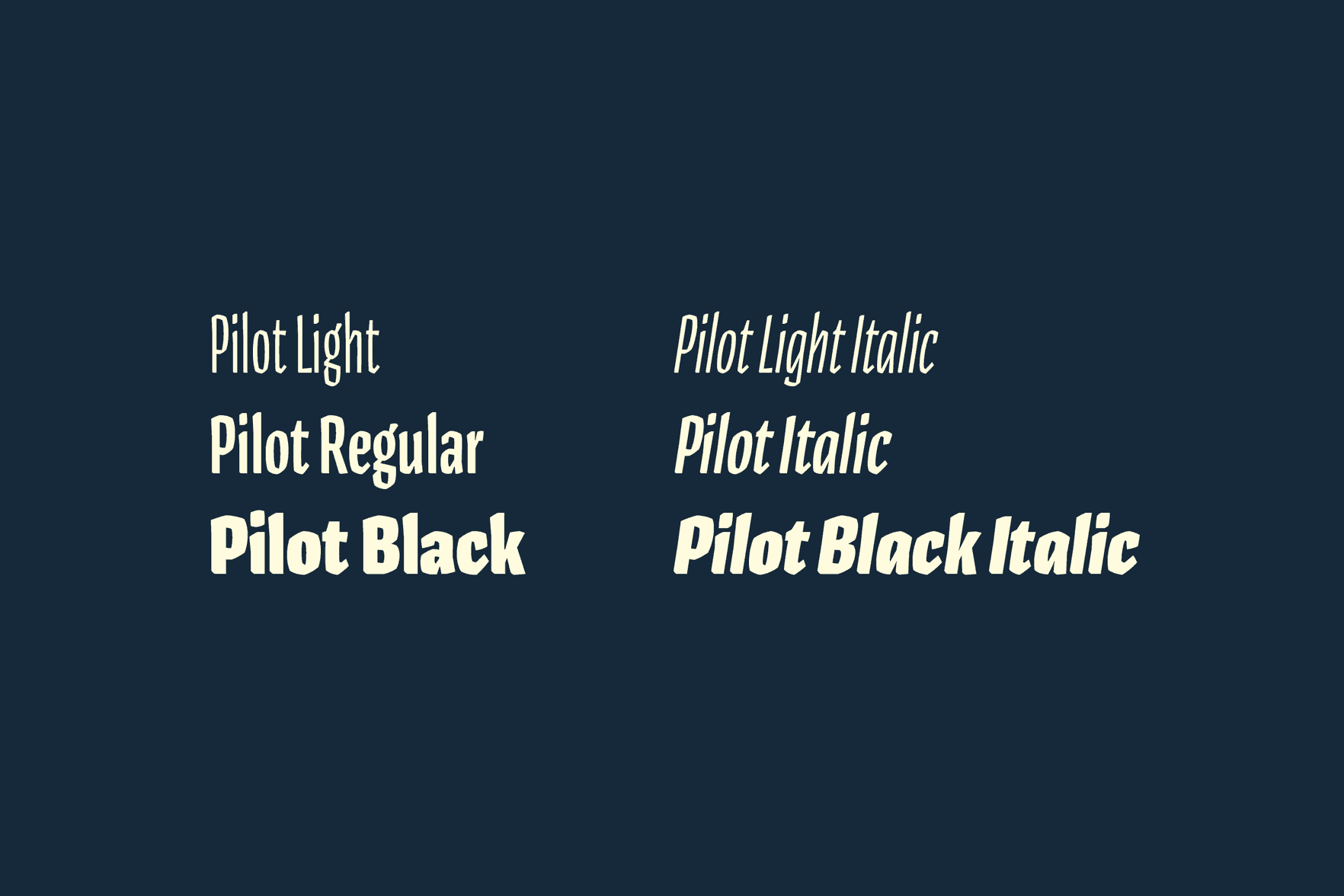
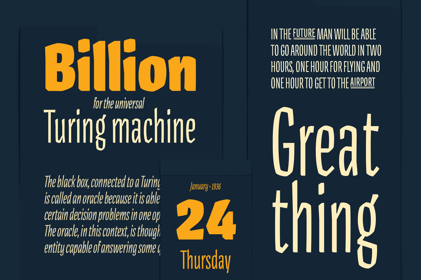
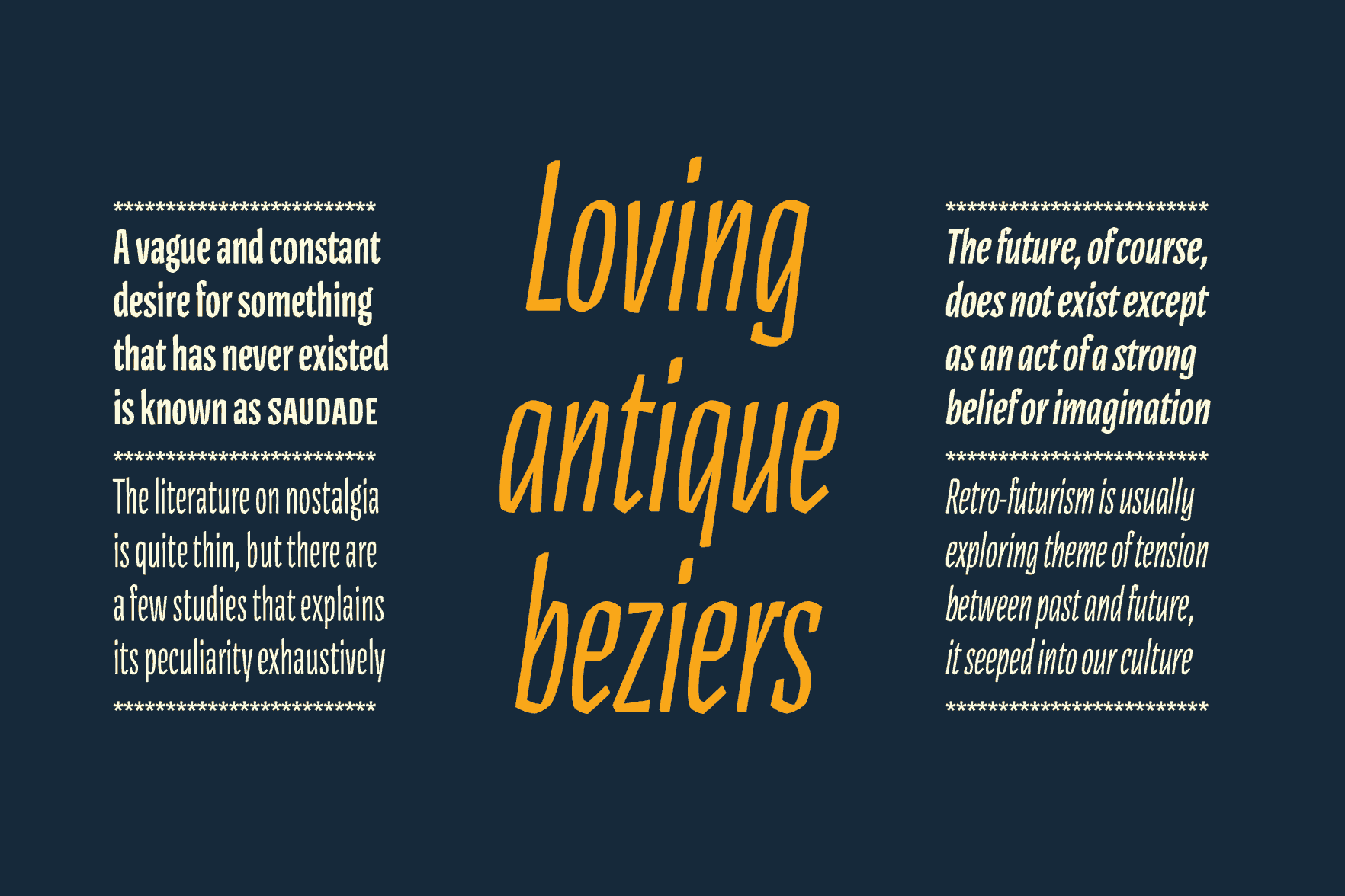
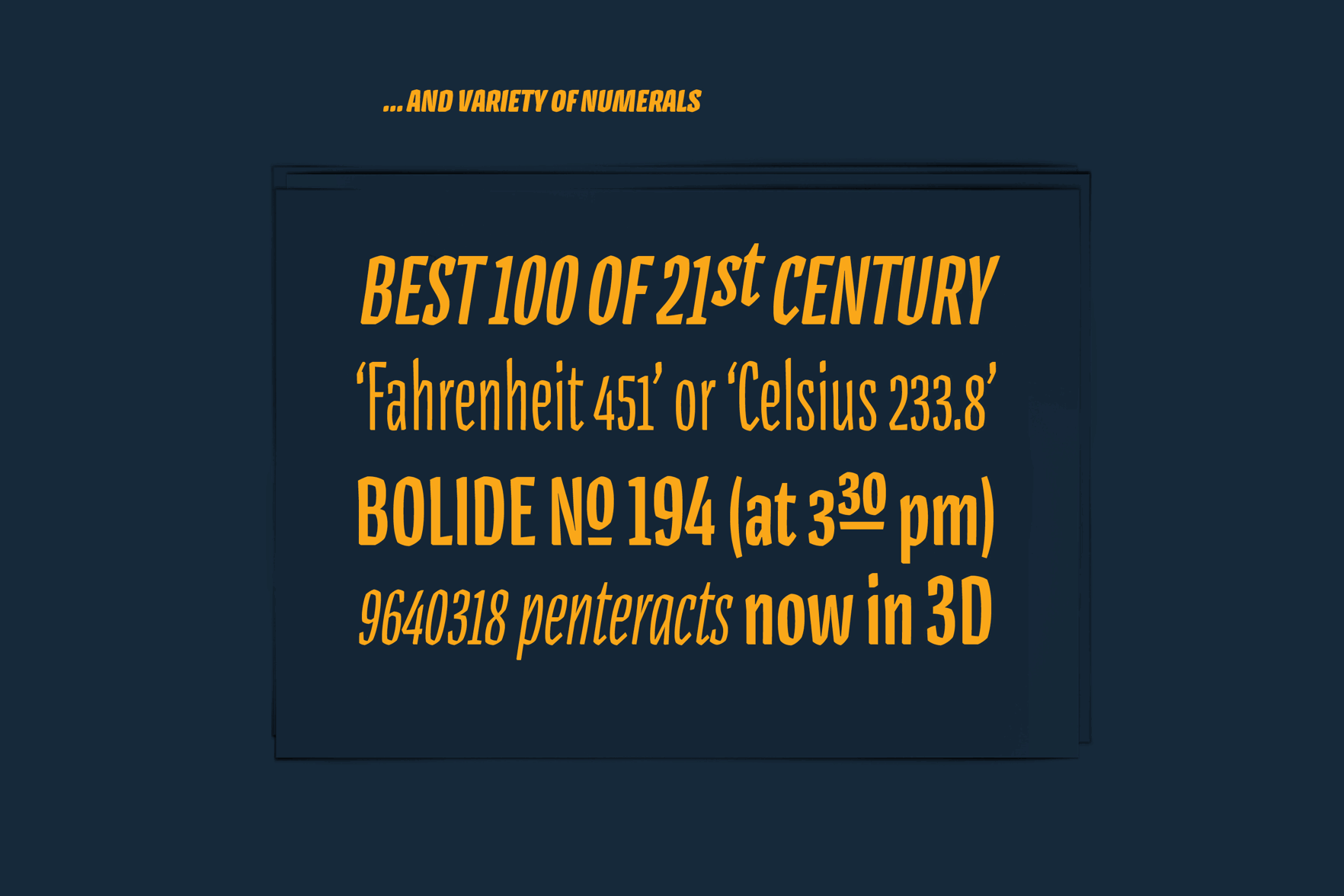
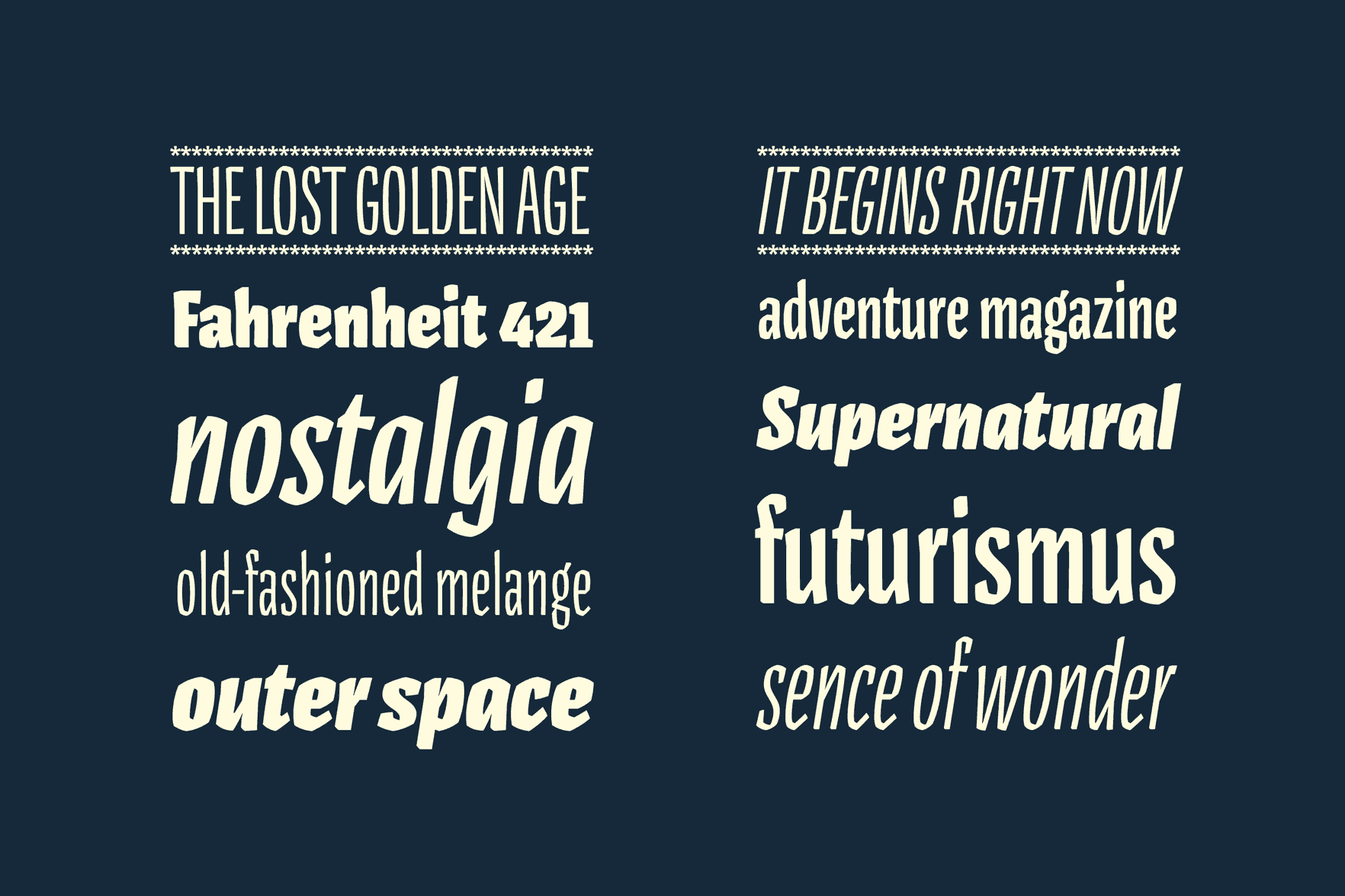
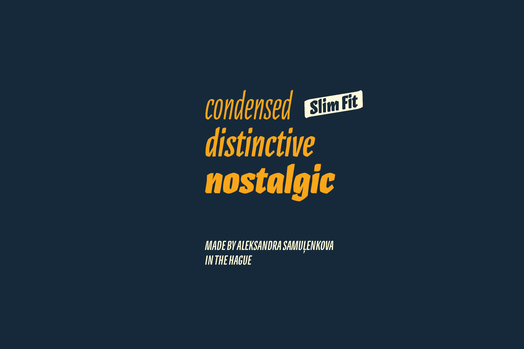
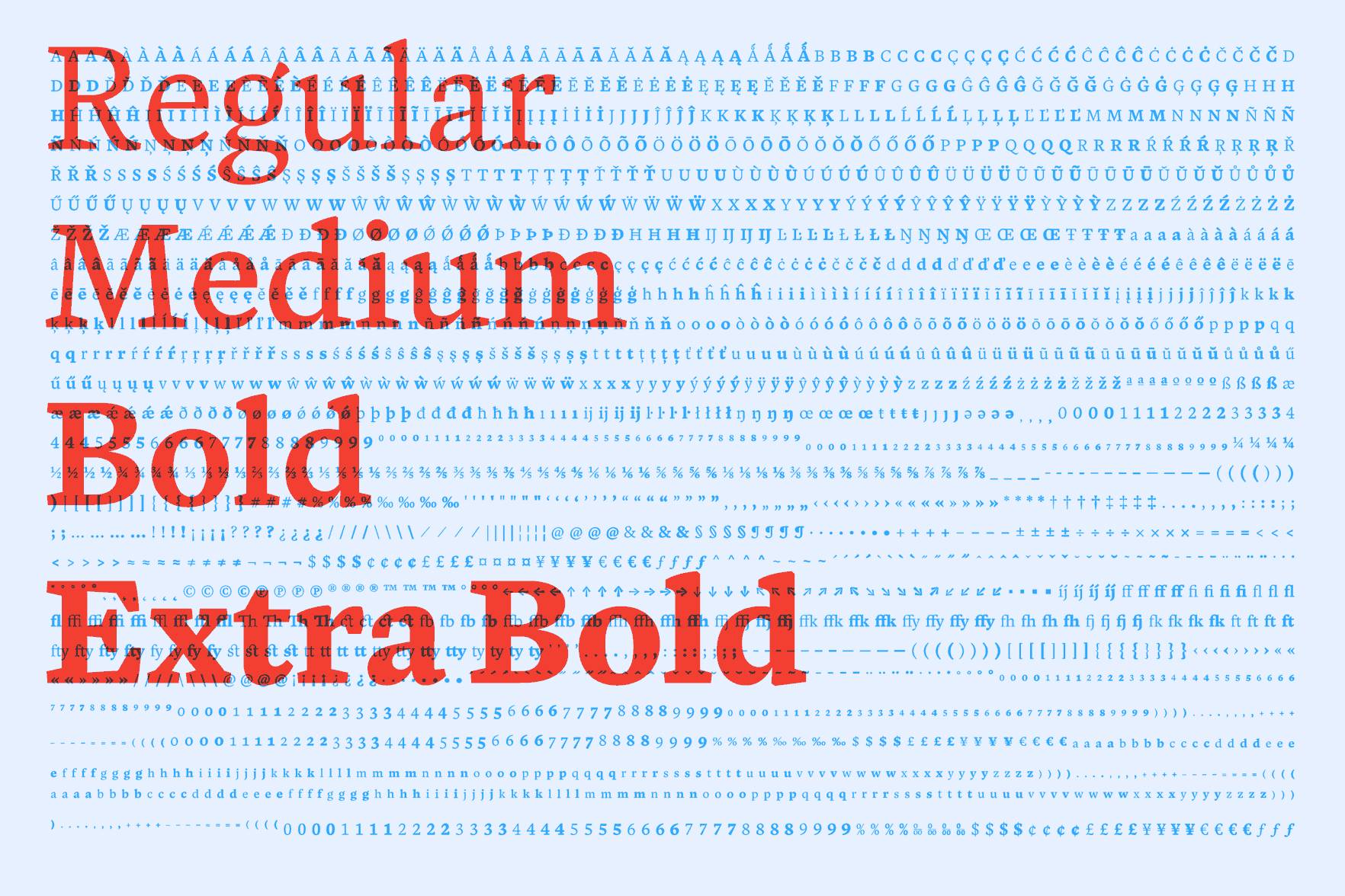
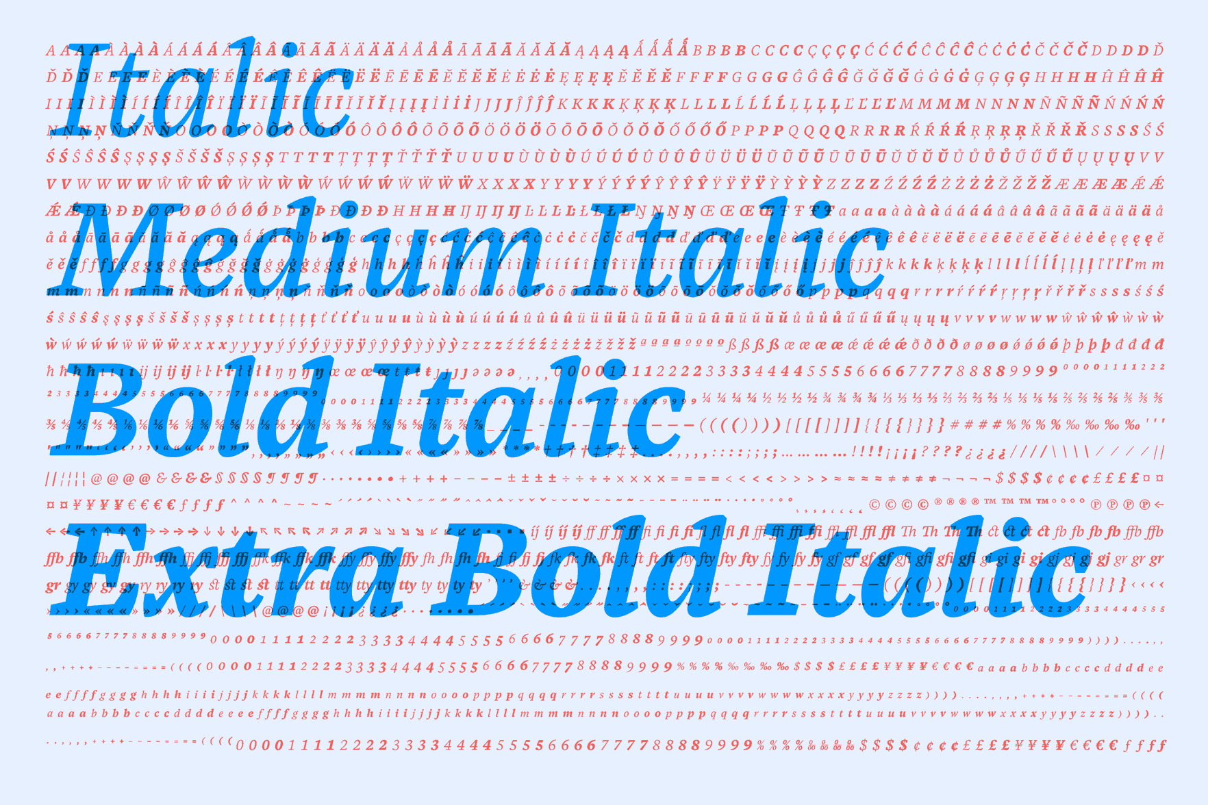
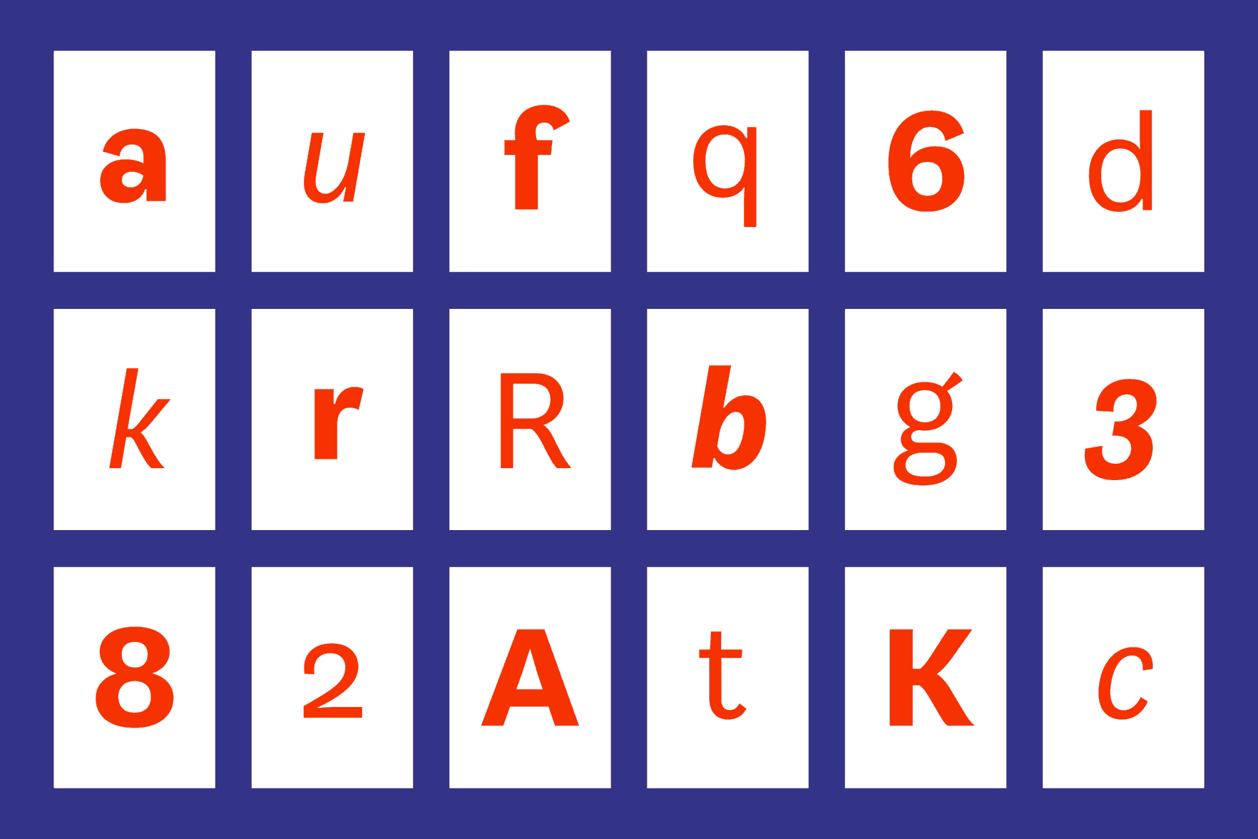
Pilot
Pilot is a condensed typeface family with a distinctive character and slightly nostalgic flavor. Pilot’s three weights and their corresponding italics provide rich typographical variety for any kind of display use. This family is initially planned as a natively condensed design, it is self-sufficient and does not derive from a regular width.
Aleksandra Samuļenkova
Latvia
Aleksandra studied art and design at the Latvian Art Academy, where she graduated with a BA, and at the Kunsthochschule Weissensee in Berlin. She is a multidisciplinary designer and active as an artist. Growing up in a linguistic and journalistic family engaged her interest in typography at an early age, which later developed into a passion for type design. After the Type and Media course she will return to Berlin to continue her work with Luc[as] de Groot.
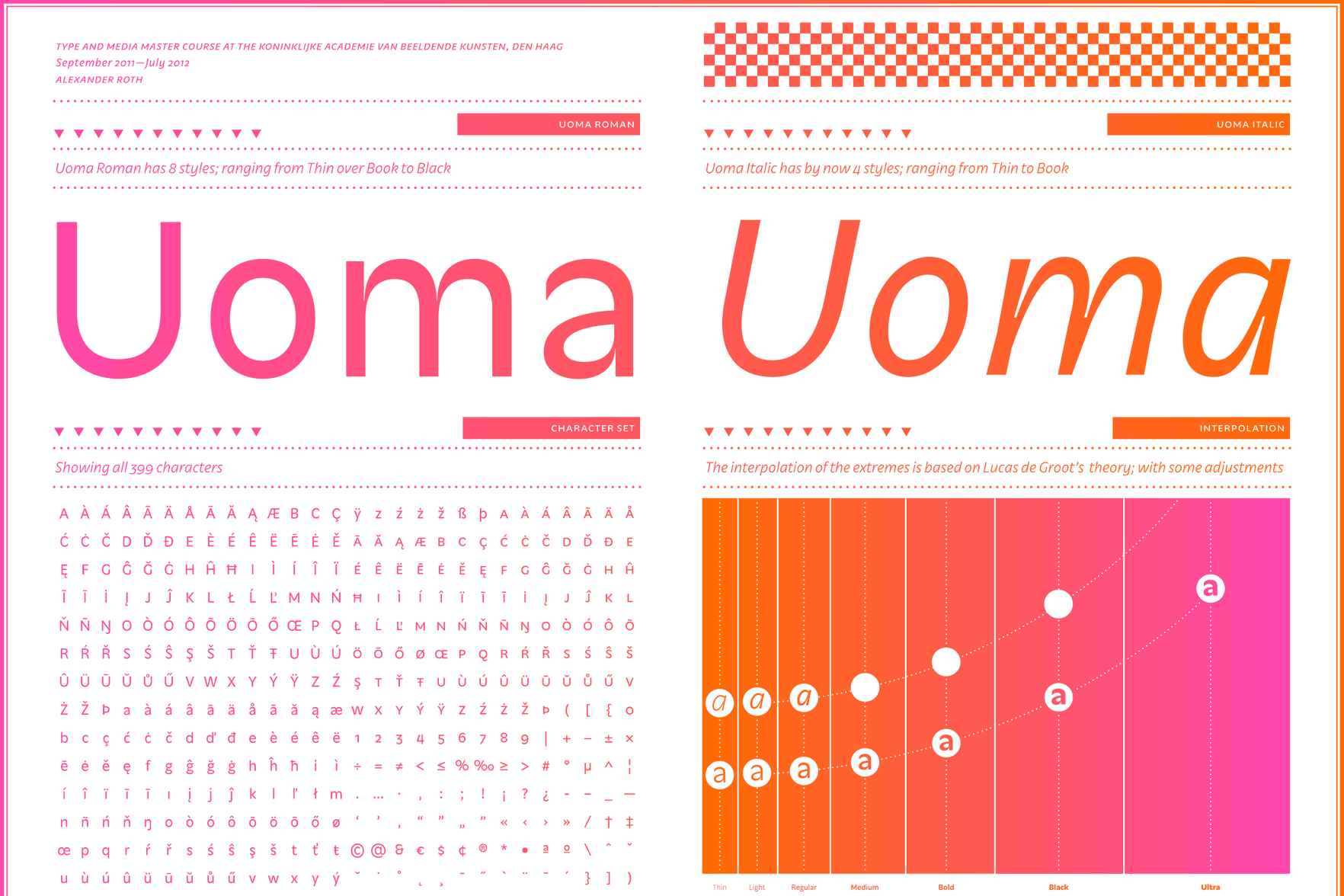
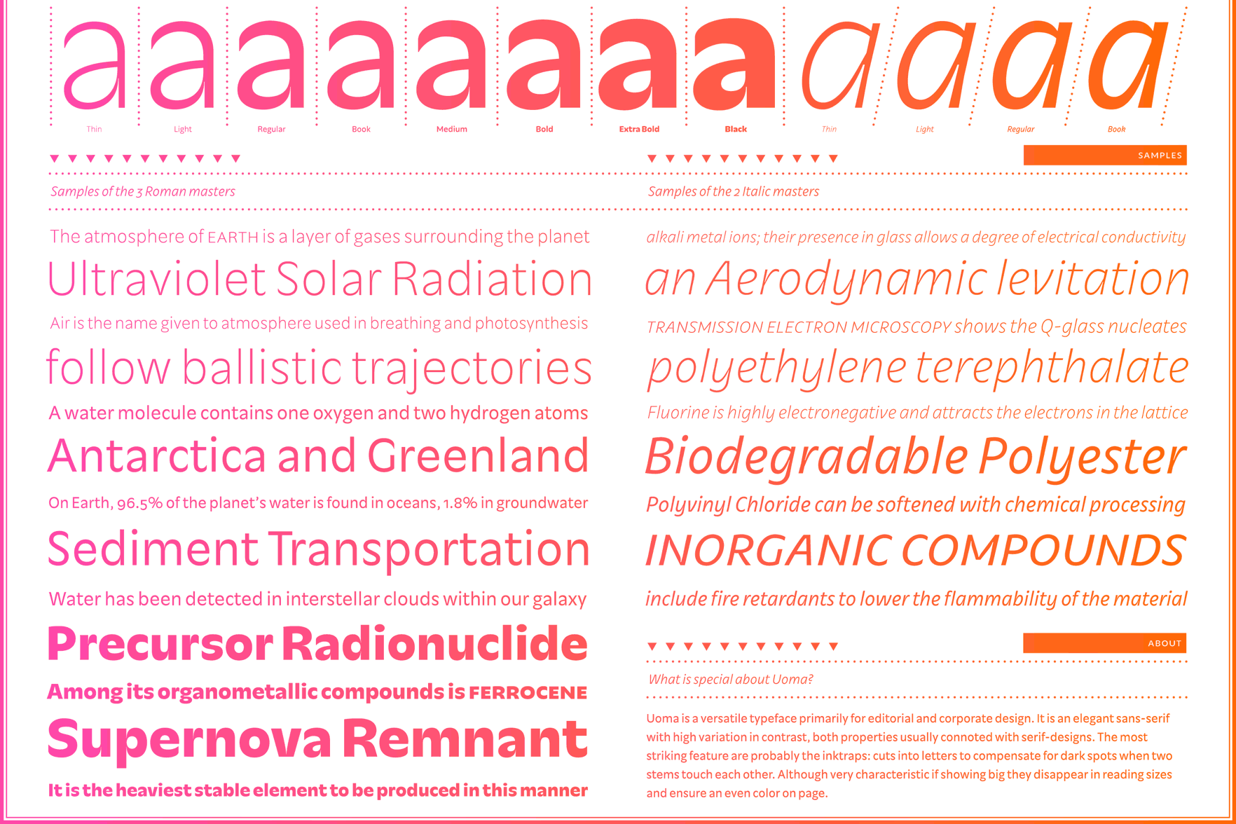
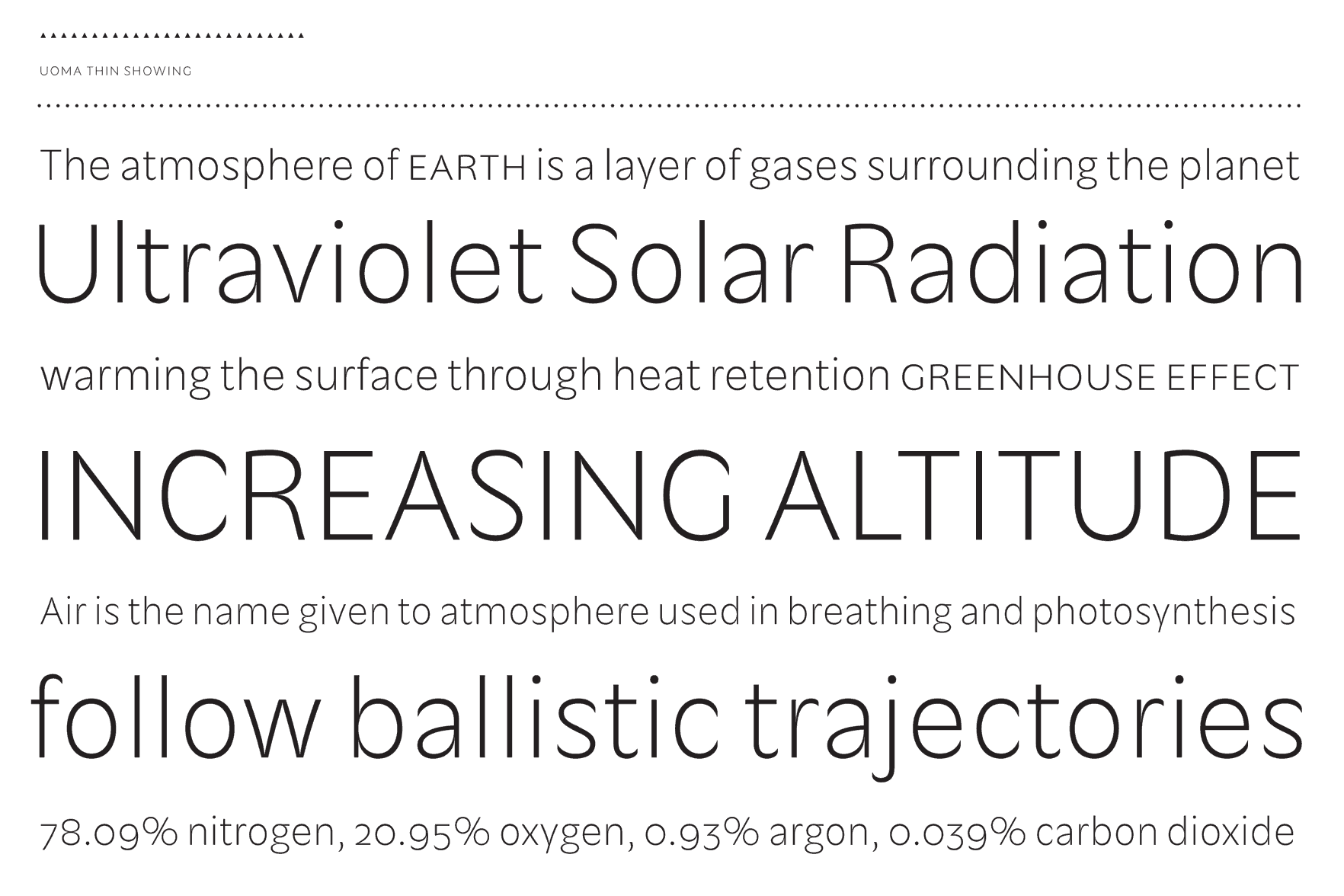
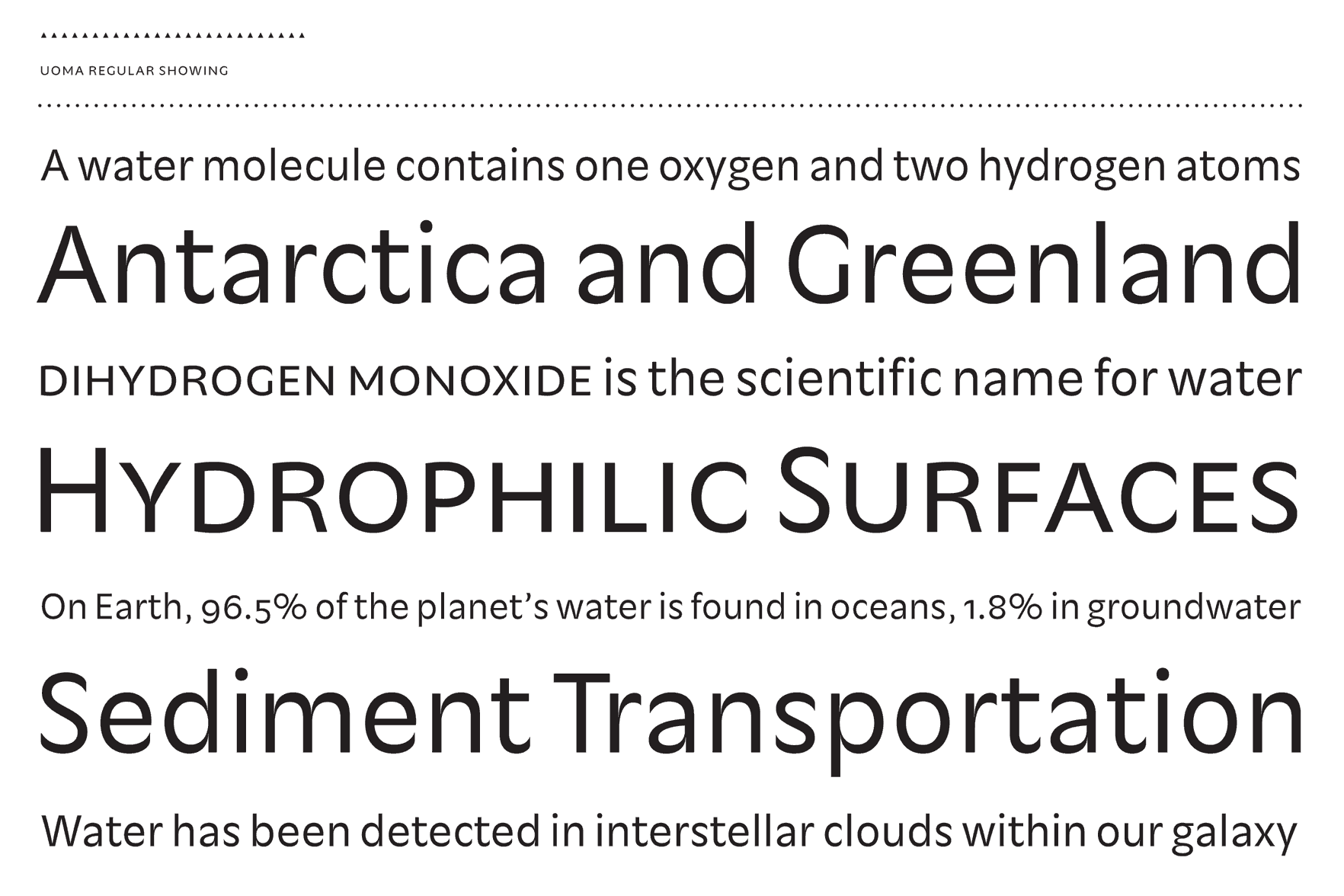
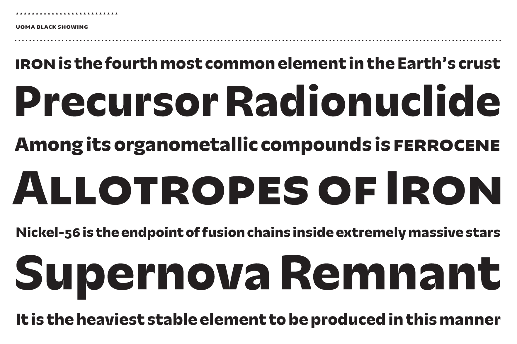
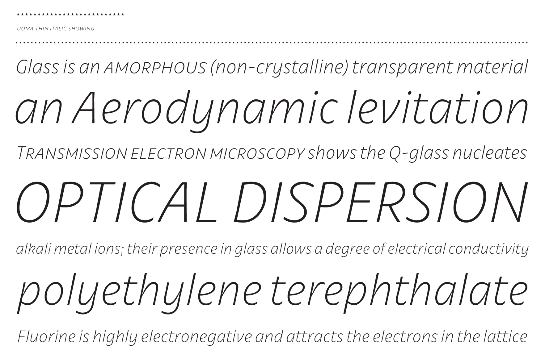
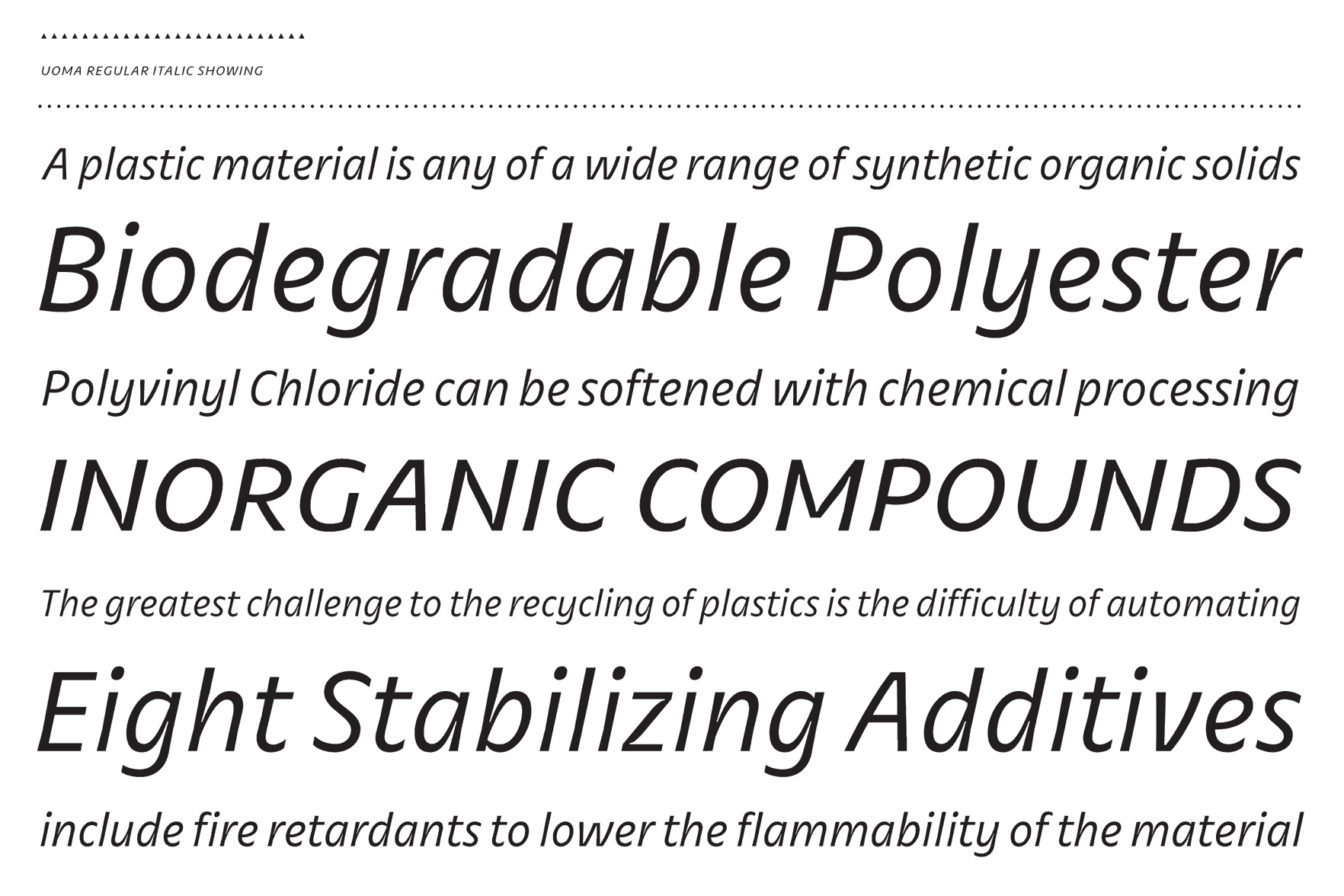
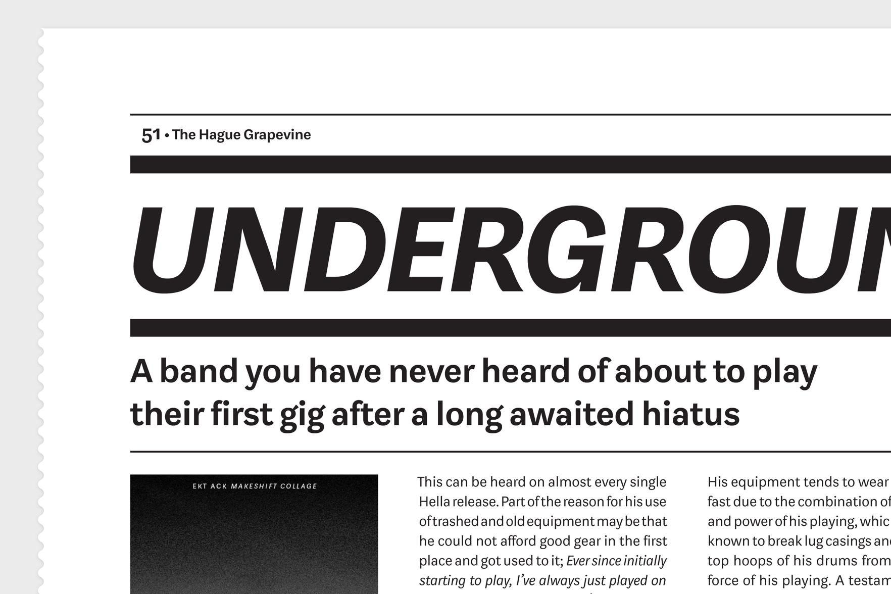
Uoma
Uoma is a versatile typeface primarily for editorial and corporate design. It is an elegant sans-serif with high variation in contrast, both properties usually connoted with serif designs. The most striking feature is probably the inktraps: cuts into letters to compensate for dark spots when two stems touch each other. Although very characteristic when displayed large, they disappear at reading sizes and ensure an even color on the page.
Alexander Roth
Tajikistan
Alexander Alexandrowitsch Roth was born in the Tajik Soviet Socialist Republic and immigrated to Germany in 1993. He is a Berlin-based graphic designer who holds a bachelor degree in Media Production from the Hochschule Ostwestfalen-Lippe University of Applied Scienes. Alexander is one of the founders of Ghostarmy – a conglomerate of several designer who are working among others for Erik Spiekermann, FSI FontShop International, FontShop Germany and the city of Wardenburg.
www.ghostarmy.de www.nasdorowje.tumblr.com roth@ghostarmy.de @nasdorowje
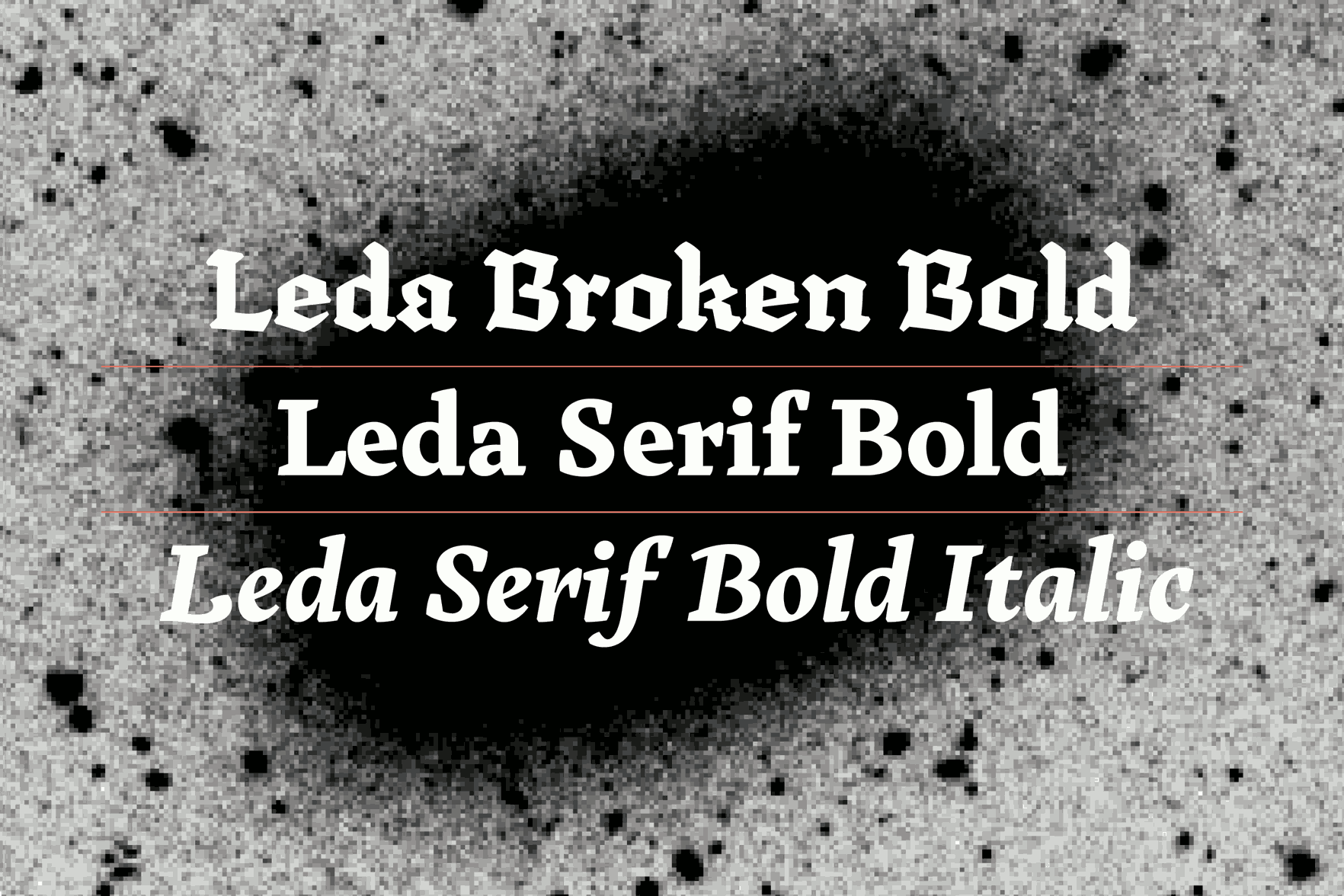
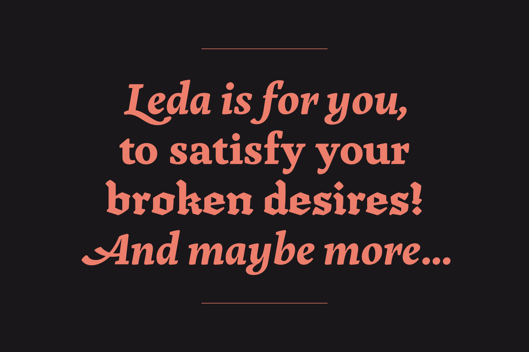
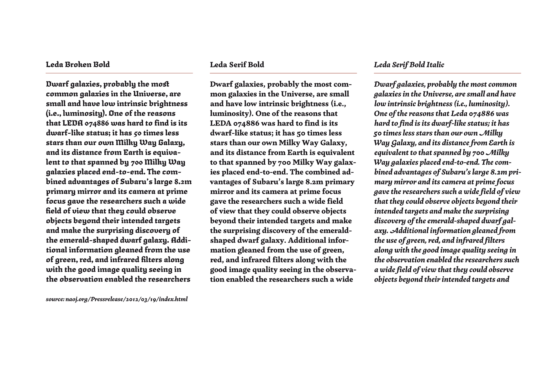
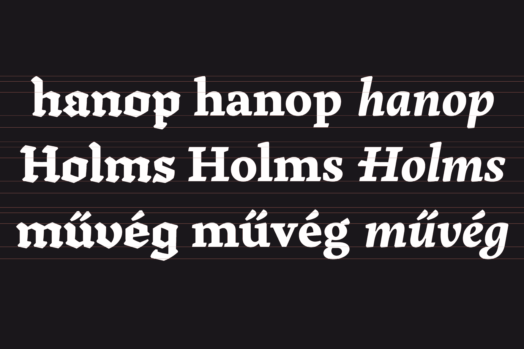
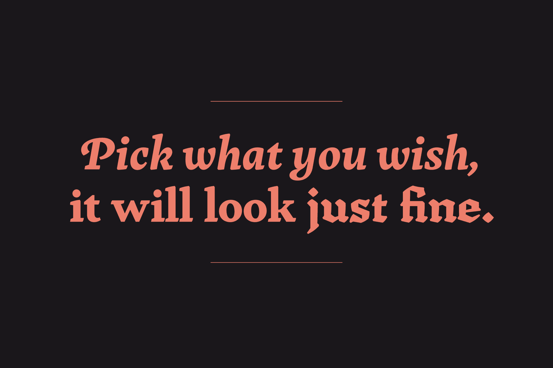
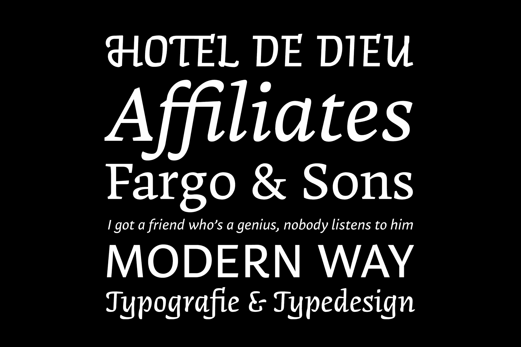
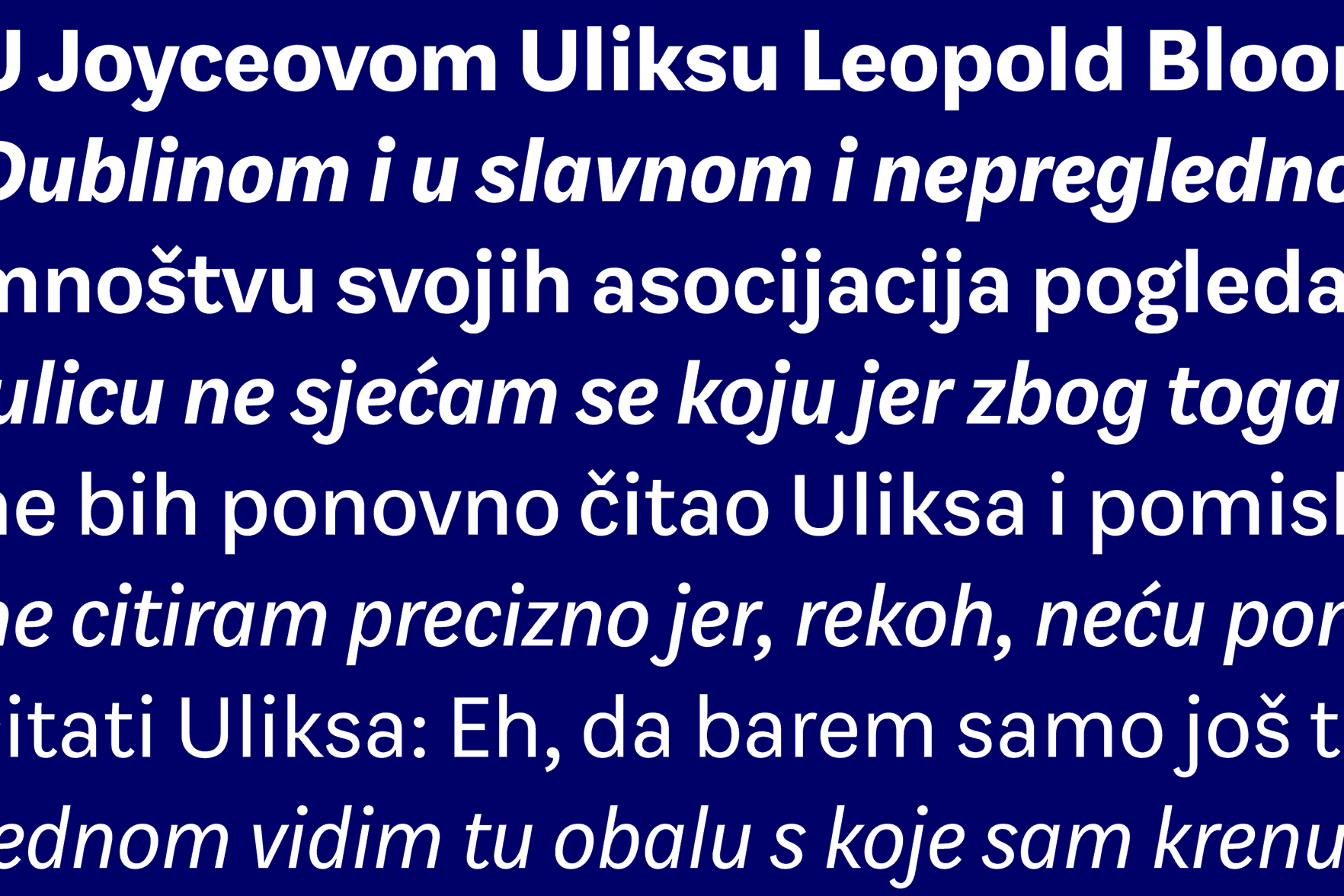
Leda
An international team of astronomers has discovered a rare, rectangular-shaped galaxy (LEDA 074886) that has a striking resemblance to an emerald-cut diamond. Leda was named after that galaxy. It is a text family which consists of Leda Broken Bold, Leda Serif Bold and Leda Serif Bold Italic. Broken is based on calligraphic lettering and has humanistic influence on its construction. Serif Bold shares the same color and proportions, and also certain details. Italic gives a distinctive company to Serif Bold. They work the best at reading sizes, only in bold weights at the moment.
Aliz Borsa
Hungary
Aliz Borsa is a packaging designer from Hungary. She graduated with an MA from the University of West Hungary, Institute of Applied Arts (AMI), Sopron, in 2010. She also studied painting in Helnæs (DK) and typography at MOME, Budapest (HU). Before studying at KABK, Aliz worked as junior designer on Subjective Atlas of Hungary with Annelys de Vet at new media lab Kitchen Budapest.
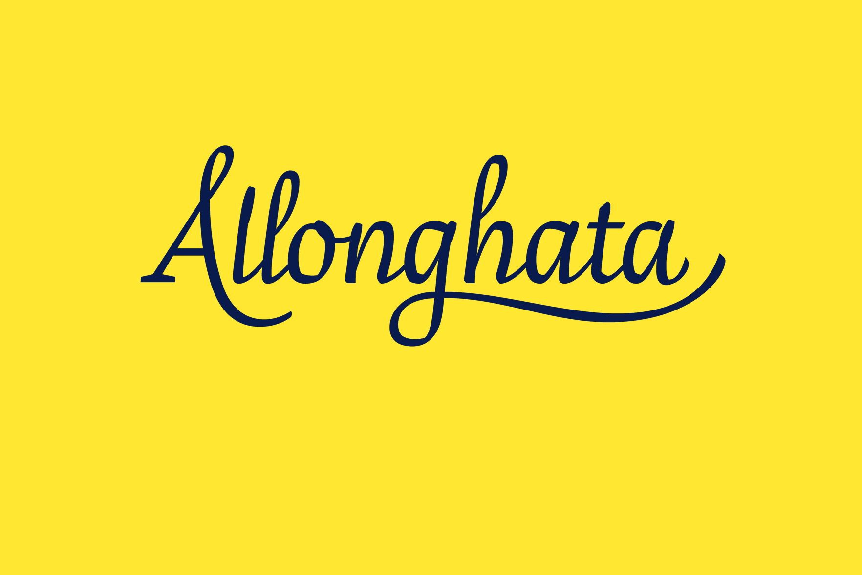
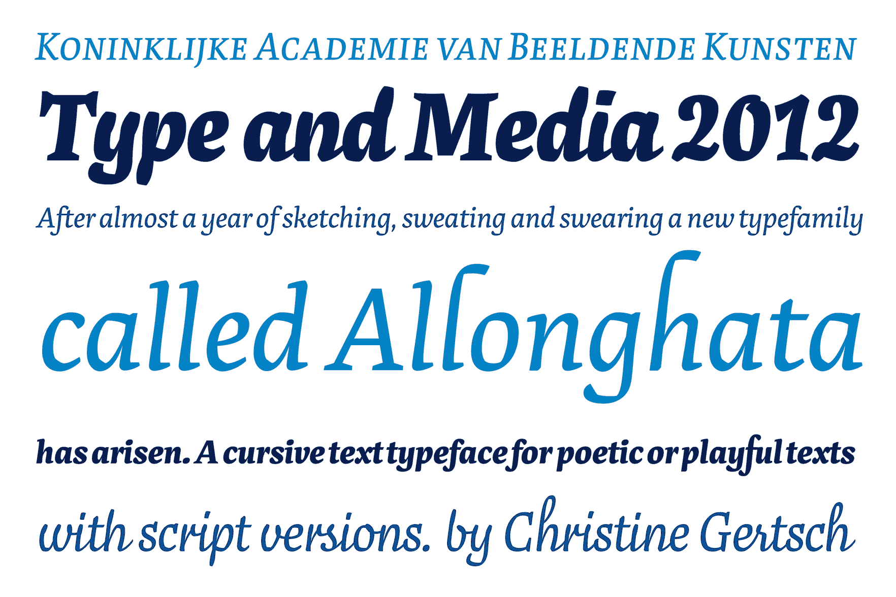
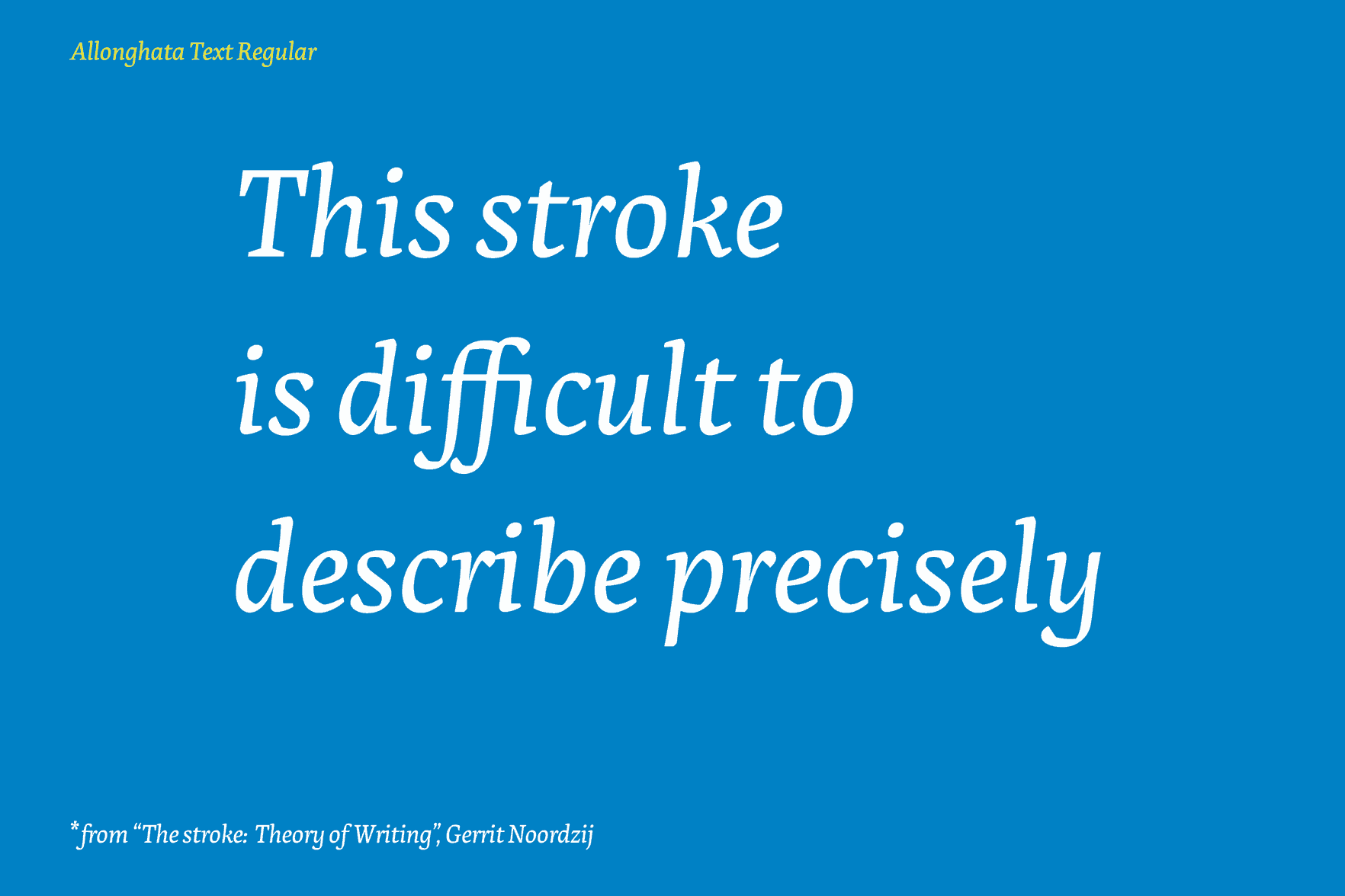
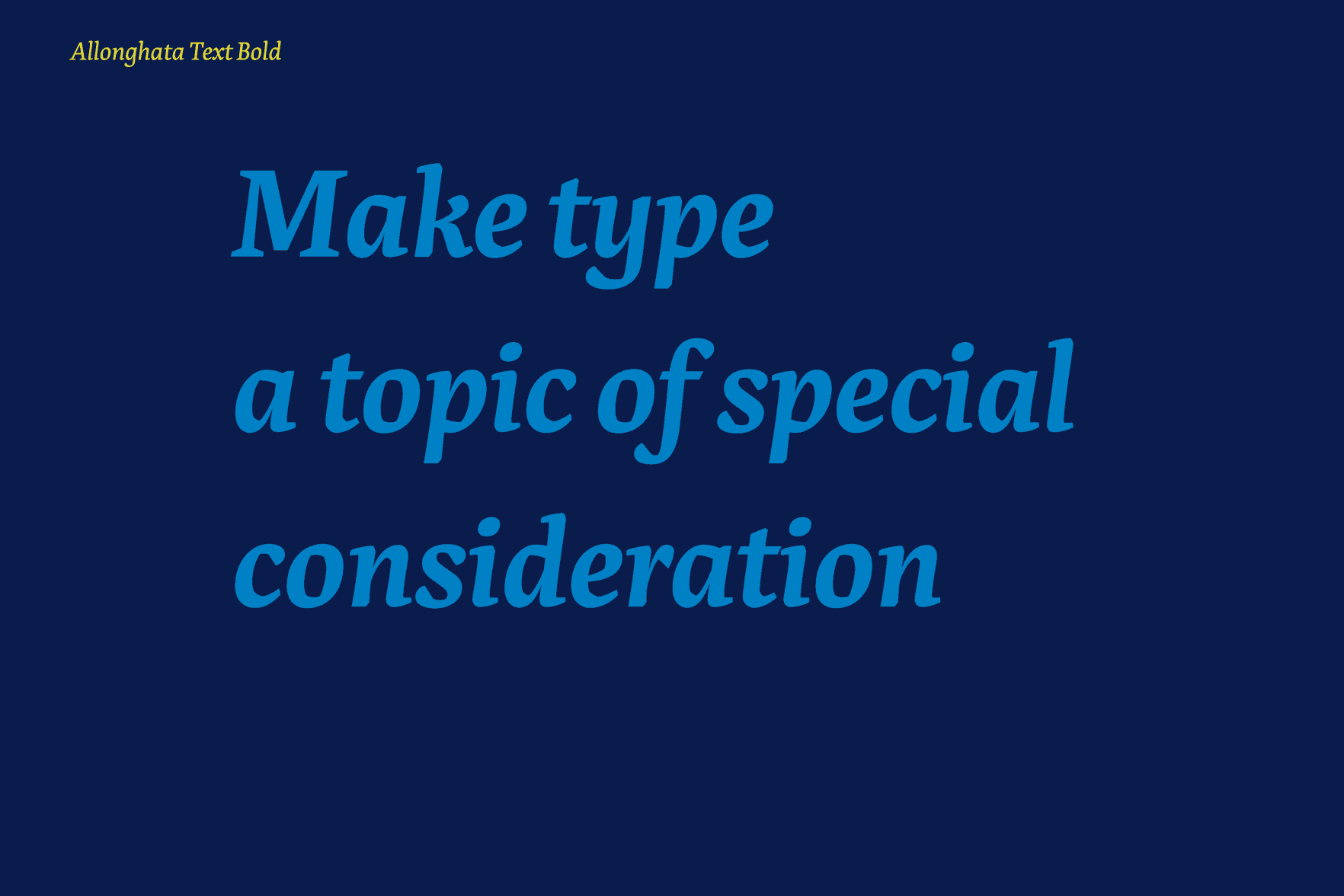
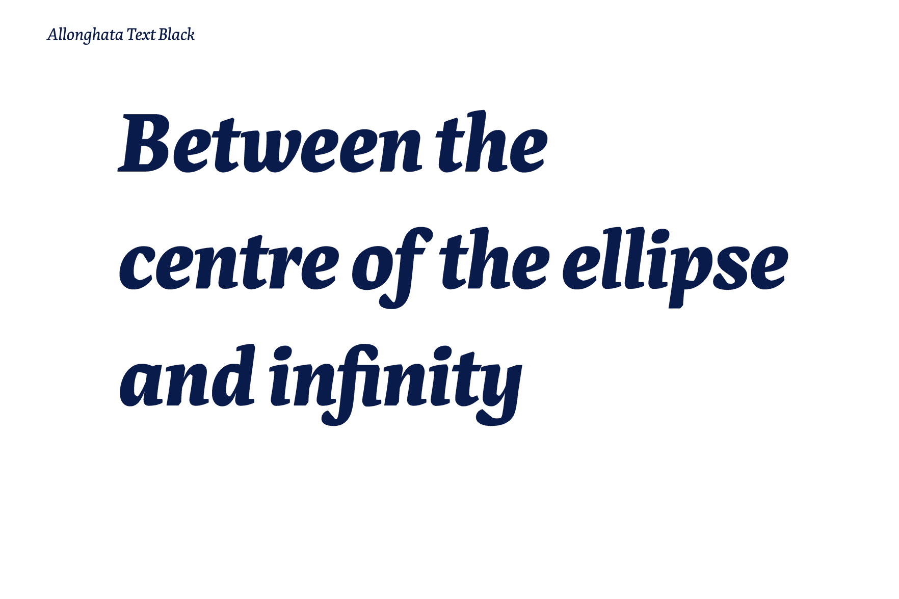
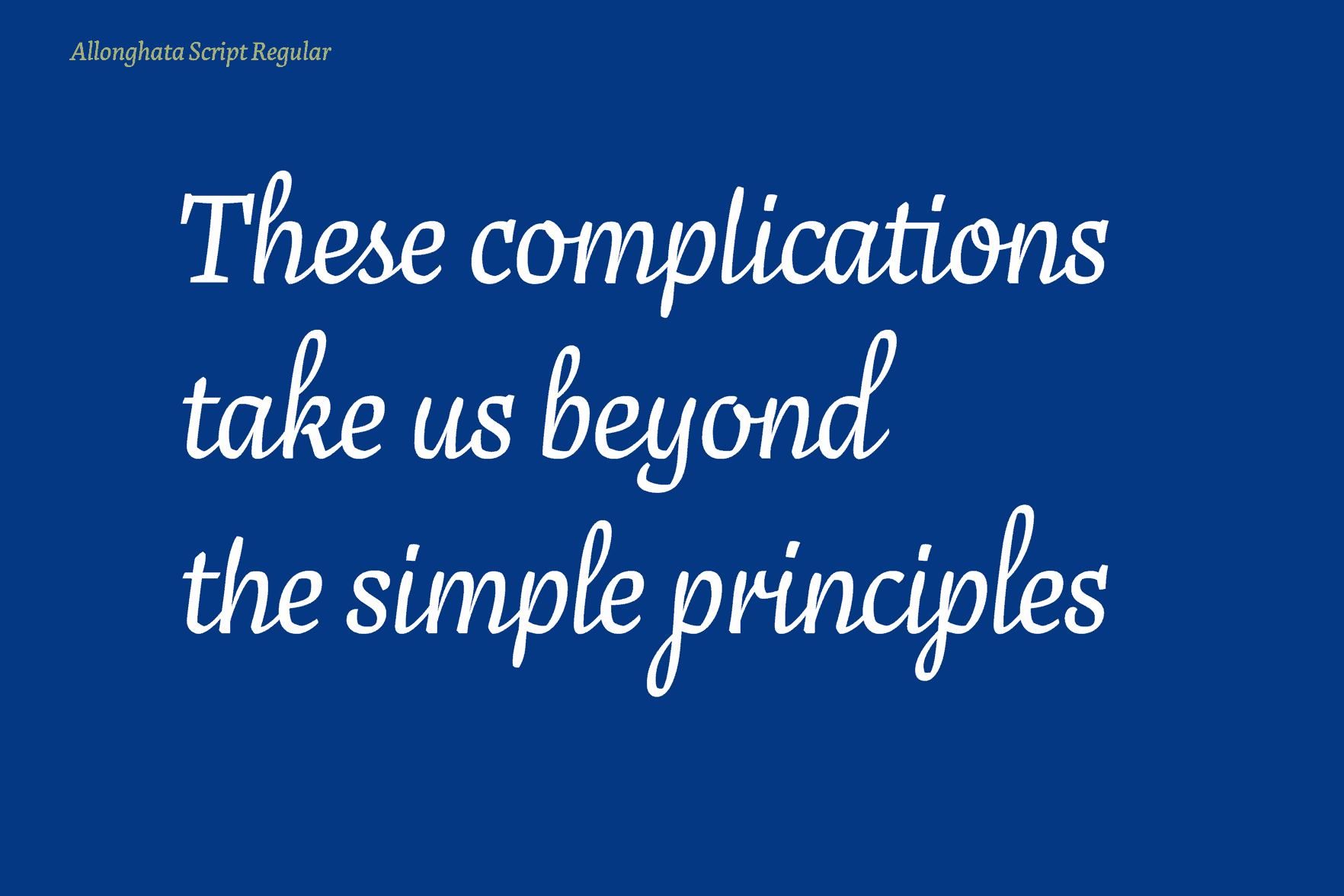
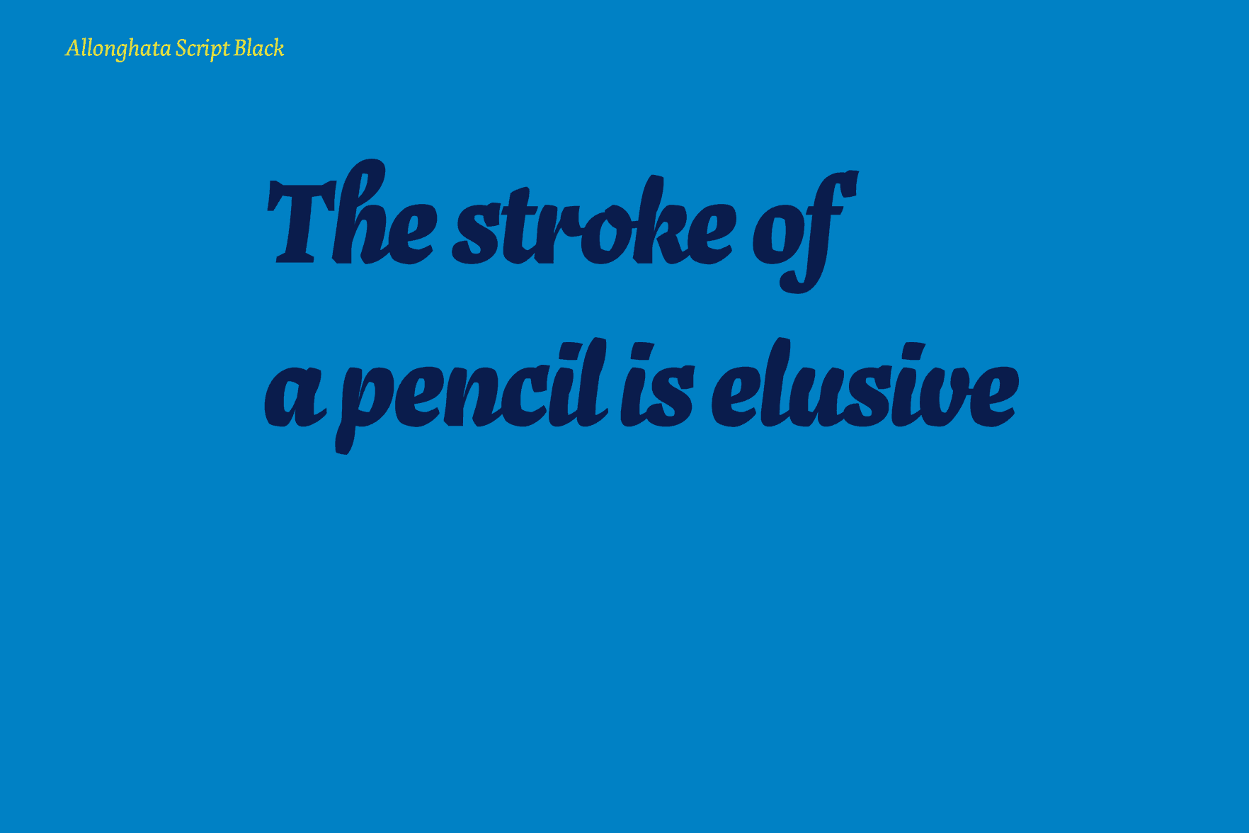

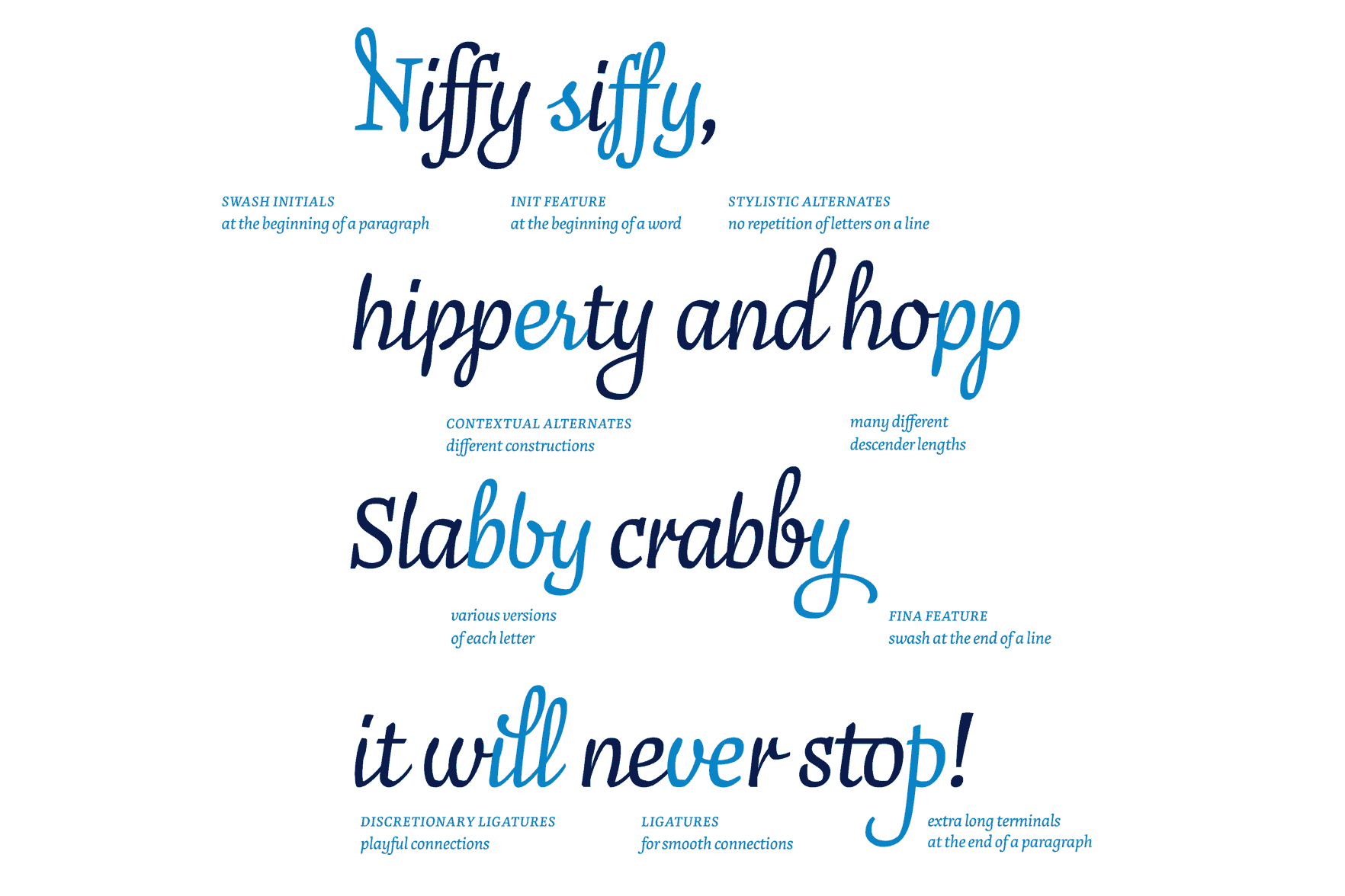
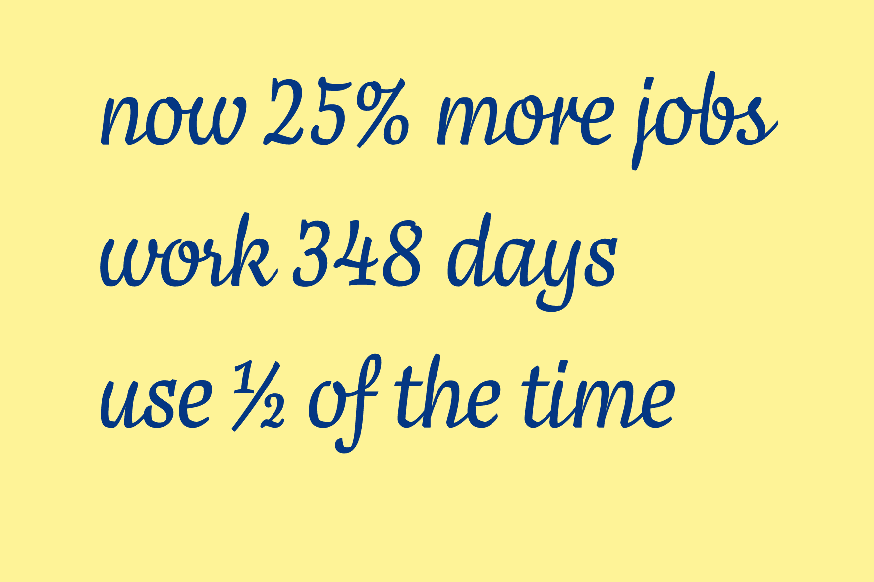
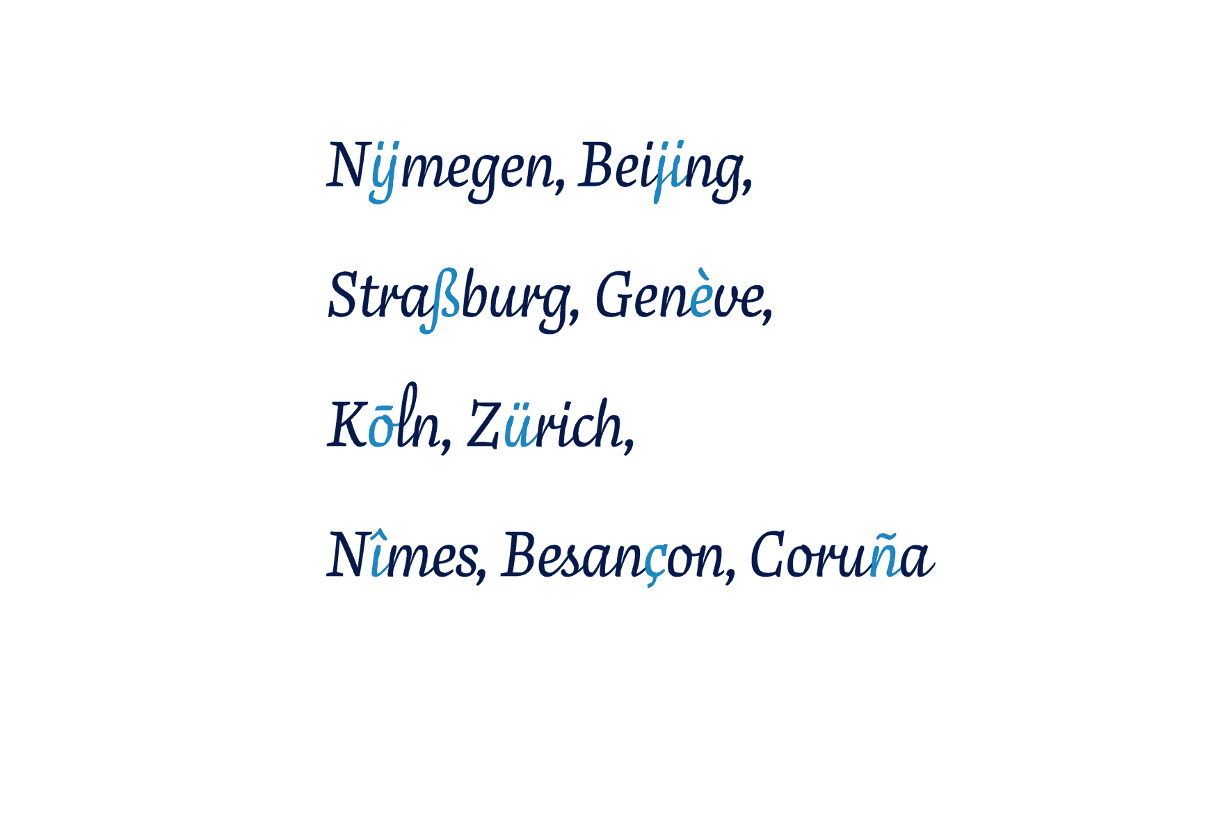
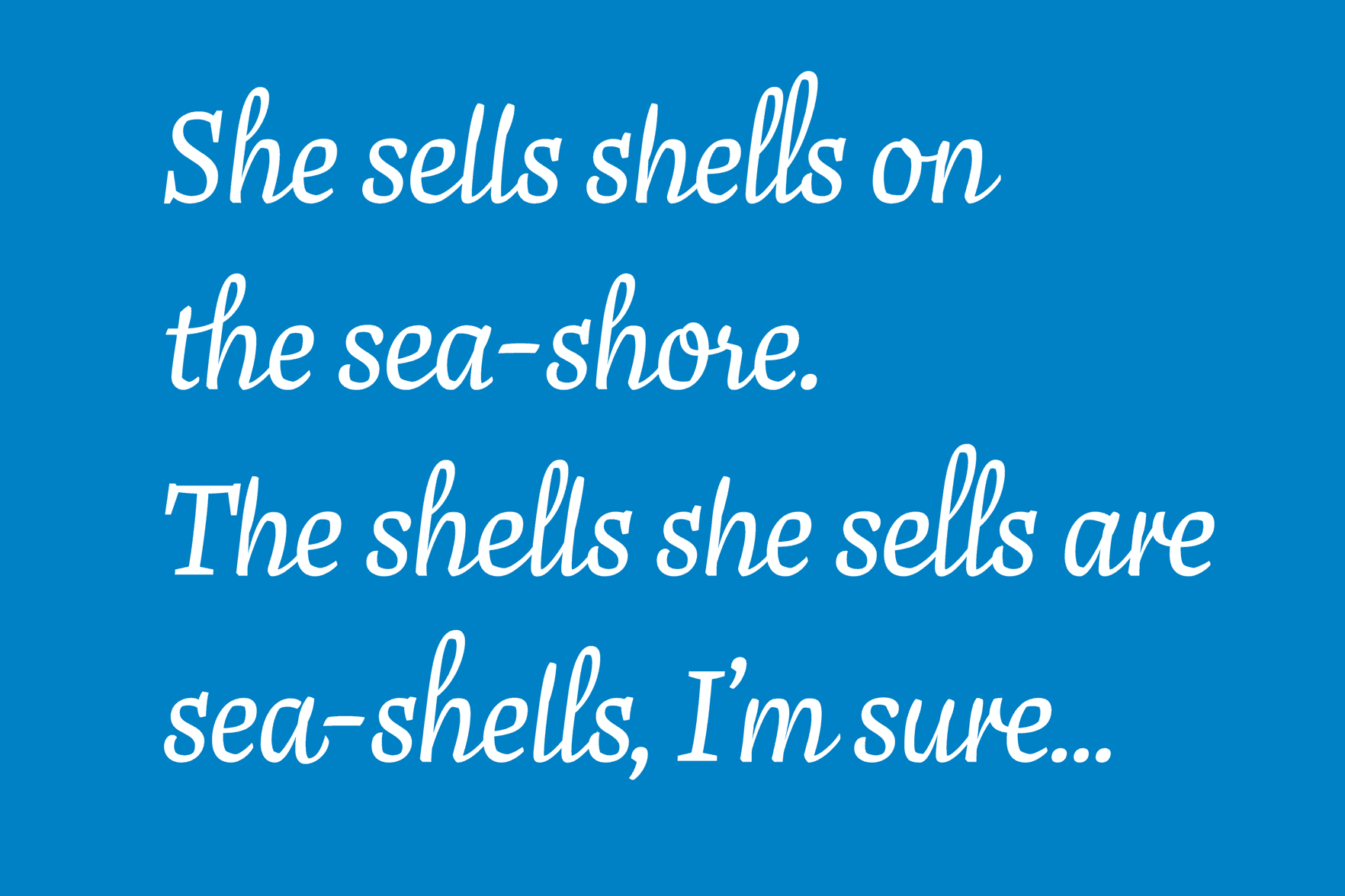
Allonghata
Allonghata is a lively type family especially designed for setting playful texts such as poems, songs, magazine covers, or greeting cards. Two styles with different personalities may be combined: a more formal, yet flourishing version for reading sizes and a playful happy script version for headings. Lots of ligatures and alternates embellish the display version. In continuous text, three different ascender and descender lengths create a visual melody.
Christine Gertsch
Switzerland
Christine is a graphic and type designer from Switzerland. Searching for revelations and wisdom, she studied visual communication in Basel, Québec, Berlin and Kolding (Dk). Finally, her restless mind took her to The Hague to dive into the type design universe.
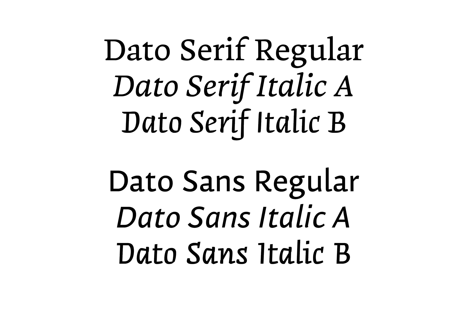
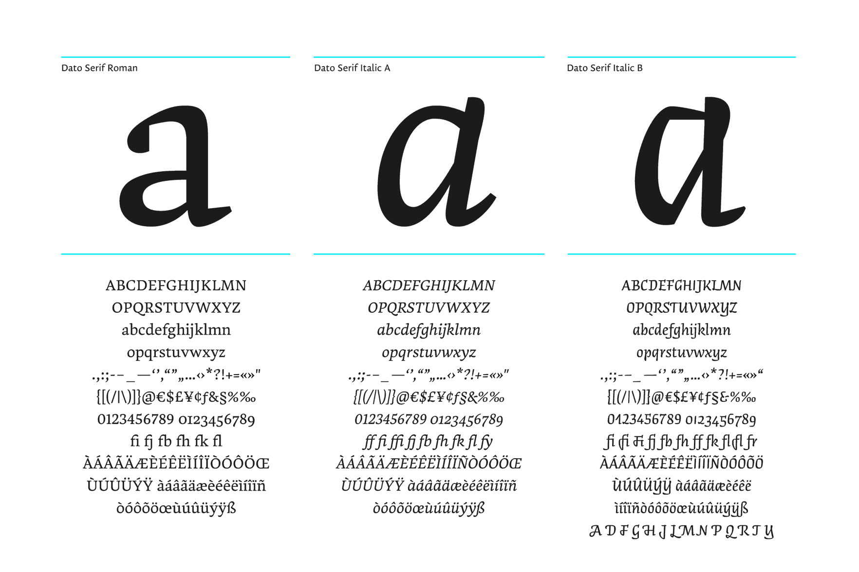
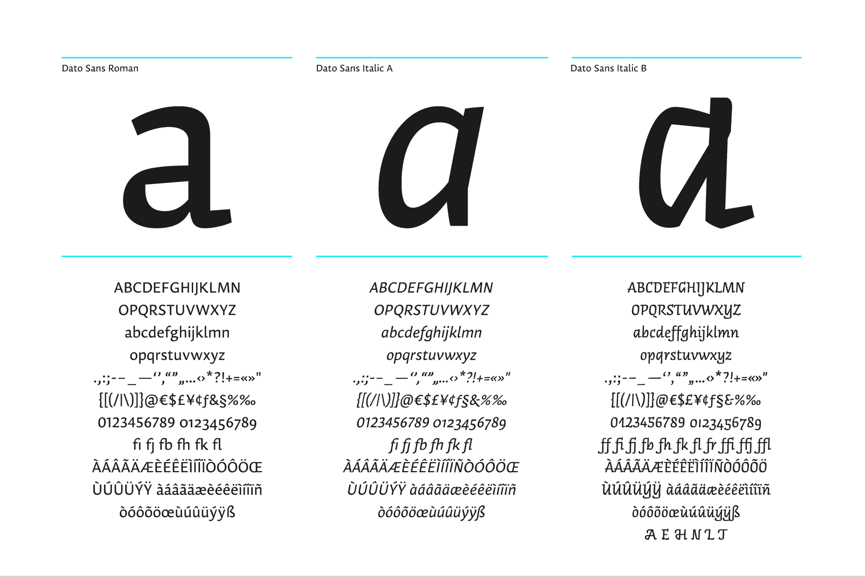
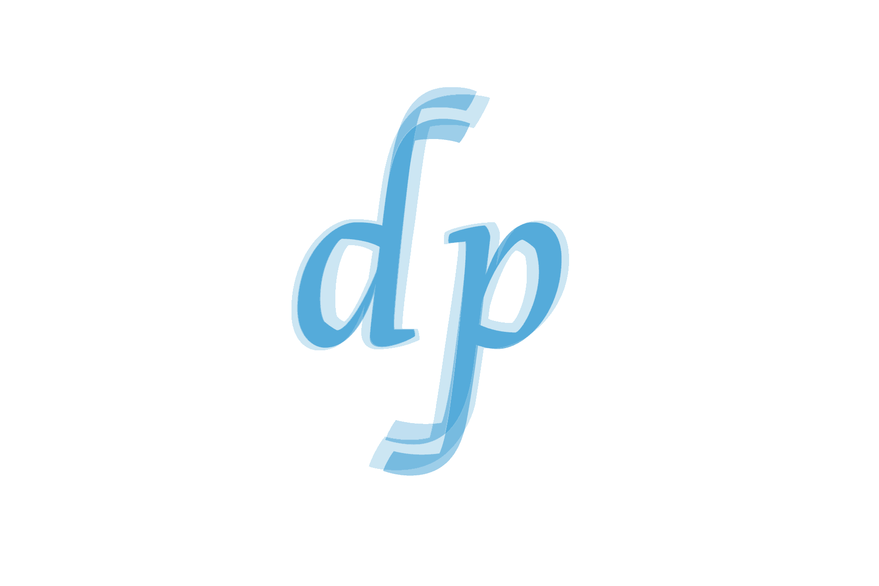
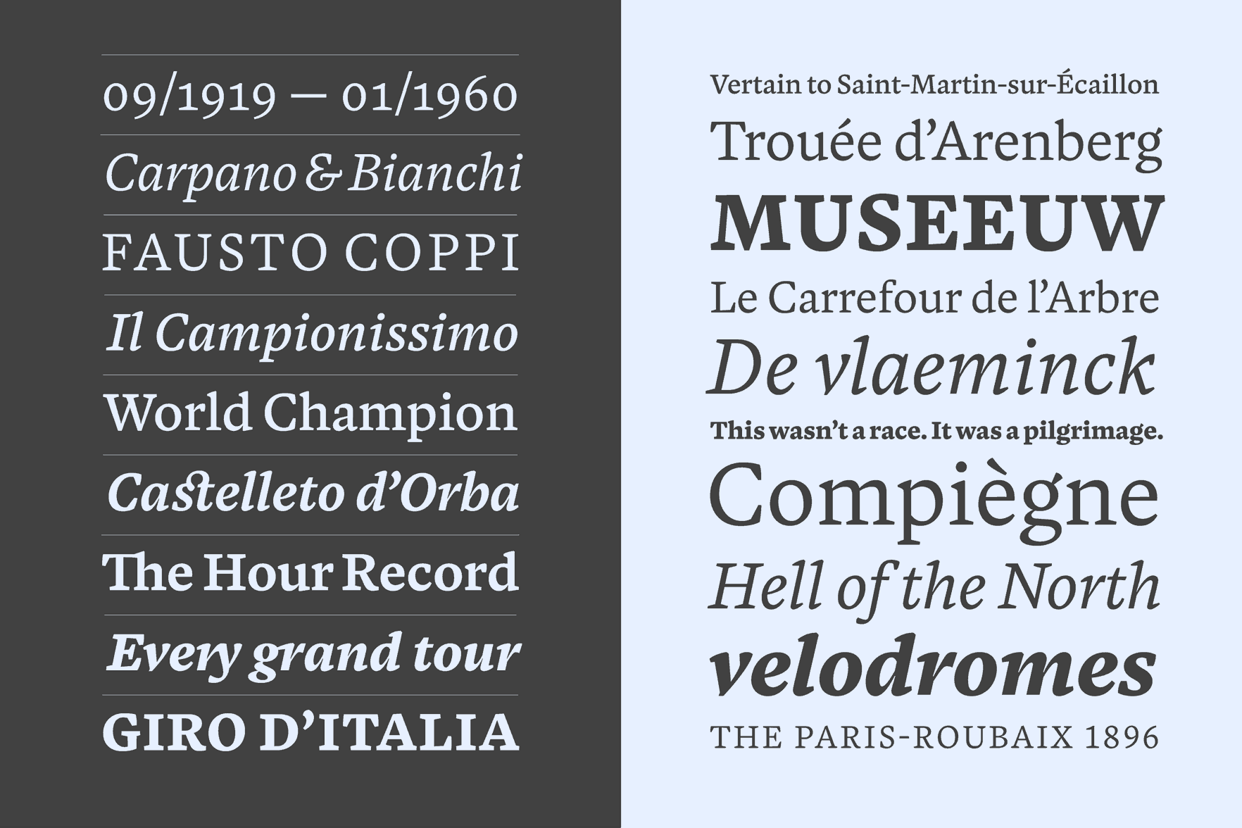
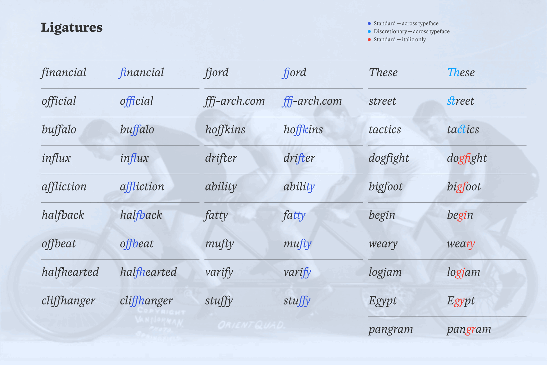
Dato
Dato is a type family consisting of a serif and a sans, each with two italics. It is designed to work best in corporate design, (printed) brand communication and editorial. The Roman as well as the ‘normal’ Italic A inherit a certain timelessness, neutrality and subtle elegance, whereas the upright Italic B can be used for a more expressive flavor. Still, both versions go well with the corresponding Roman. Every style amongst the six styles per weight clearly distinguishes itself but is still recognizable as part of the same family. All three styles of Dato Serif also share the same construction and vertical metrics with their sans counterpart. Dato comes in 6 styles per weight.
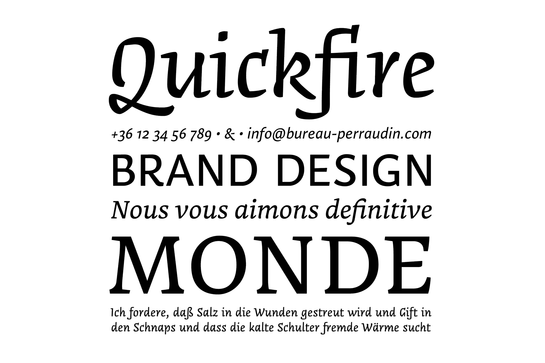
Daniel Perraudin
Germany
Daniel Perraudin studied Information Design in Stuttgart and at FH Joanneum Graz. In 2007 he graduated and worked at KMS Team in the areas of Corporate Design and Typography. His first typeface, Parka, was released by The Font Bureau in 2010. Currently he works as a freelance designer, specializing in type and graphic design as well as signage and orientation systems (with Gourdin & Müller). Daniel Perraudin is a member of Forum Typographie. Additionally, he lectures and teaches workshops on typography and type design.
www.bureau-perraudin.com perraudin@bureau-perraudin.com @danielperraudin
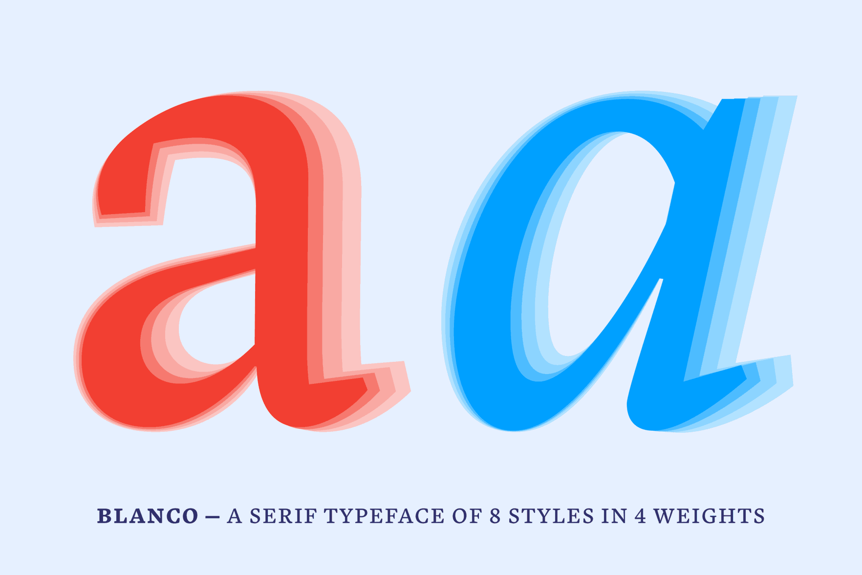
Blanco
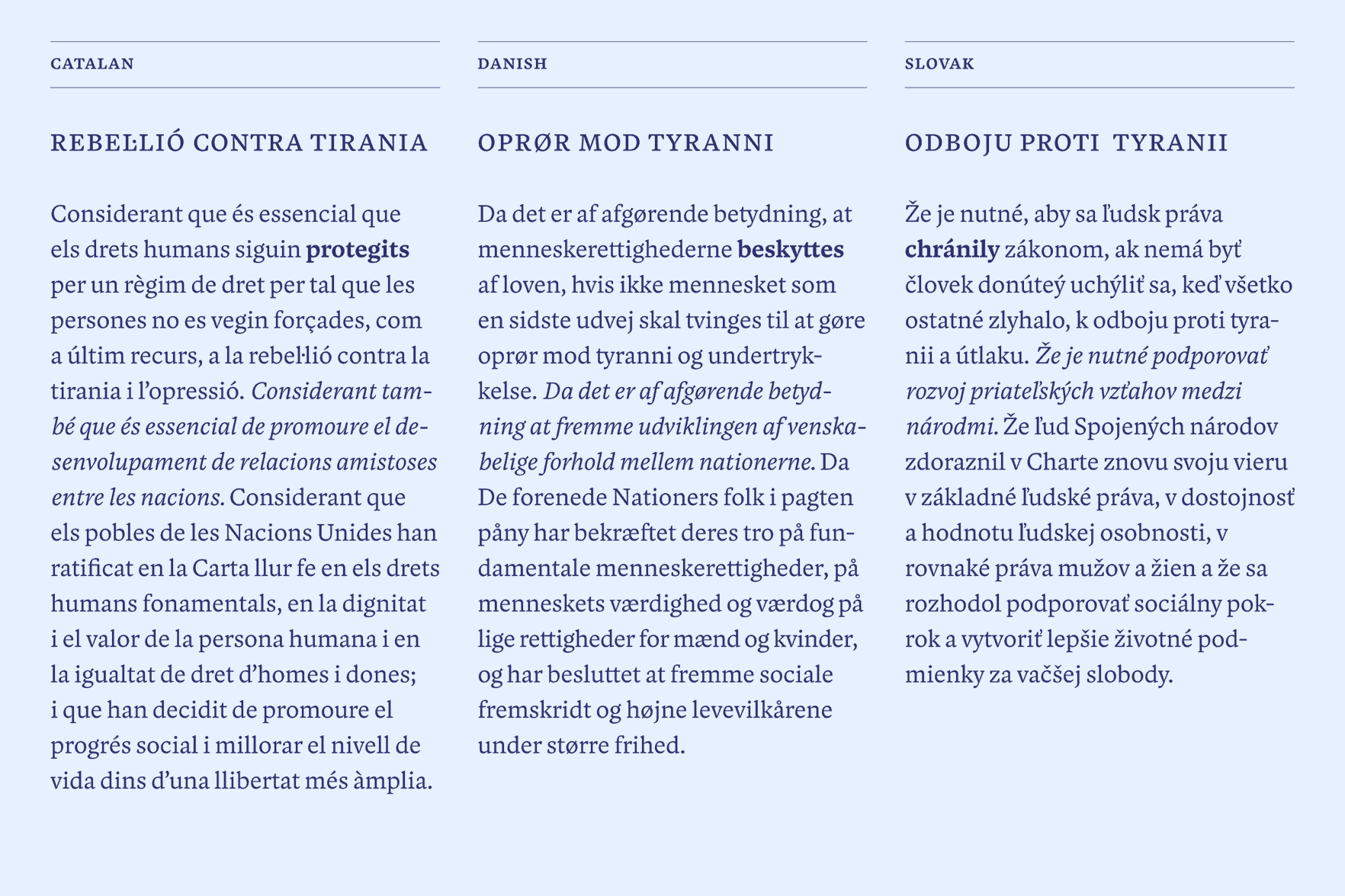
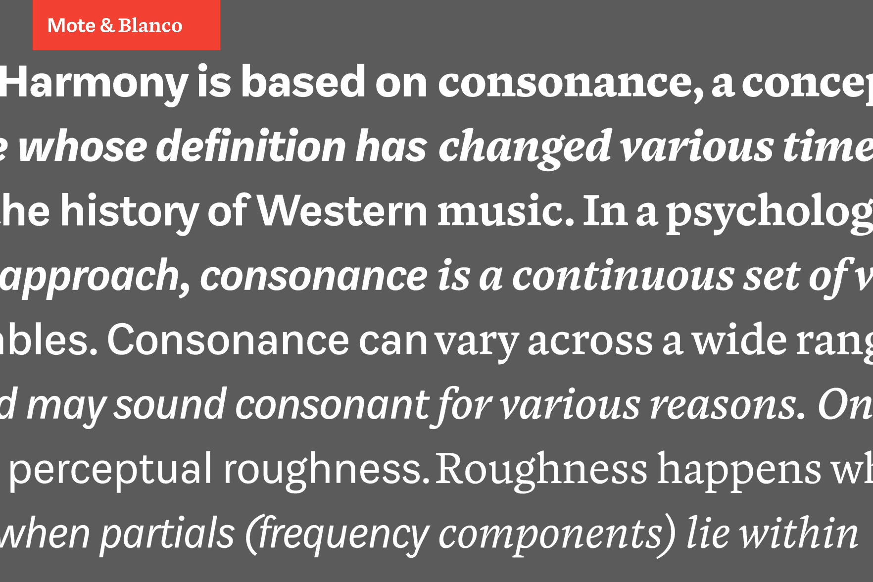
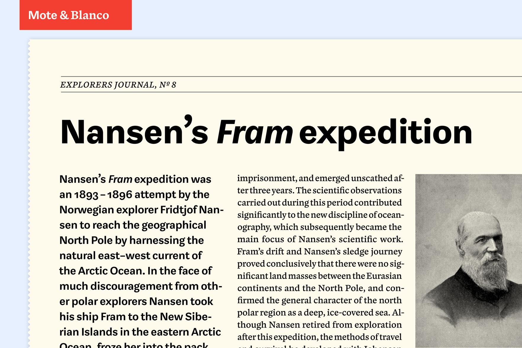
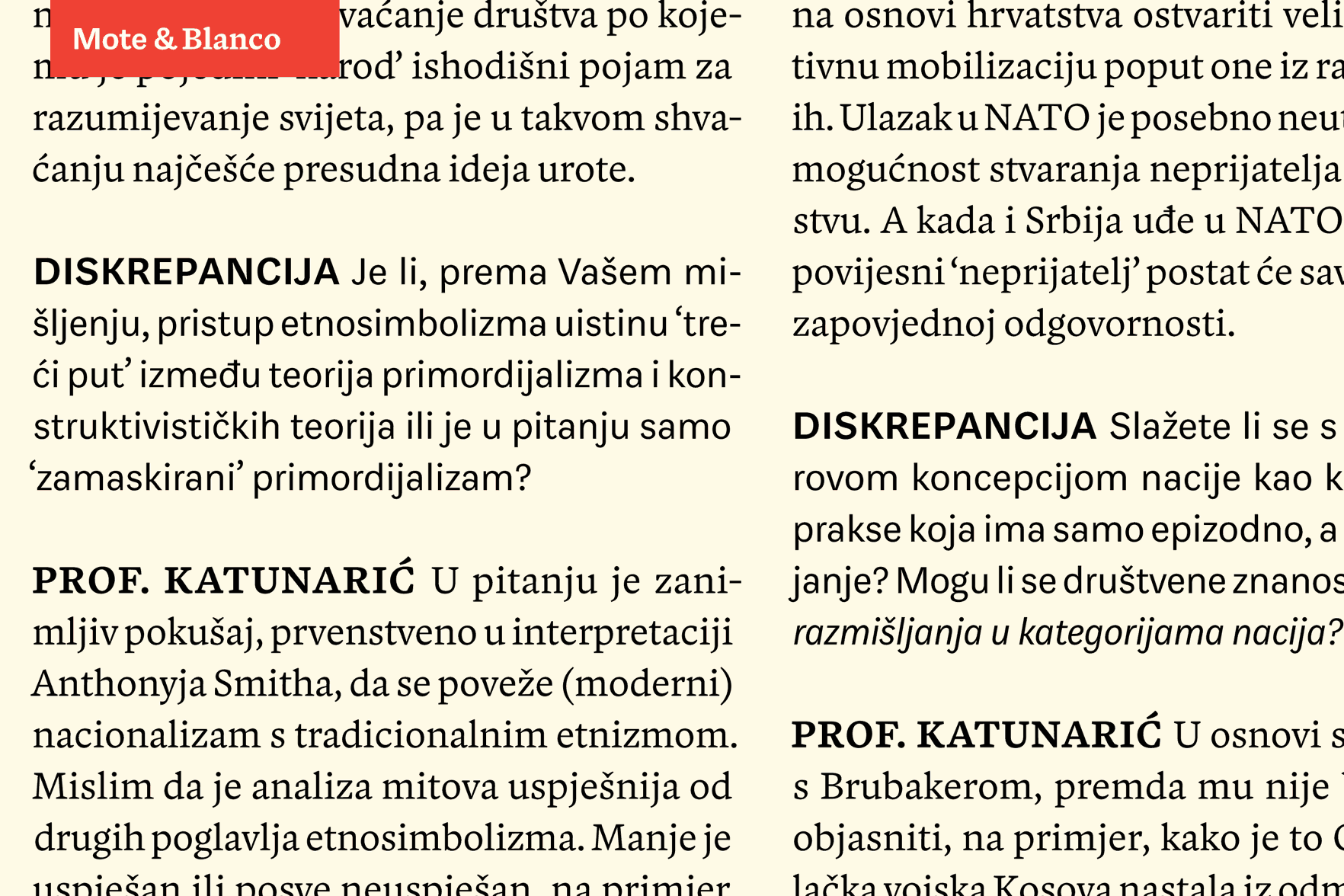
Blanco is a serif typeface for all sizes that works best in reading sizes for print. Its sturdiness is derived from the influence of typefaces like Plantin, Fleischmann and Caslon. It is designed to work as an independent type family but also as the companion to Mote, a sans-serif typeface by Hrvoje Živčić. The two are connected by their proportions, text-fit and shared tastes between both designers. Their optical size, range of weights and darkness are intended to match. The project was about finding a balance between harmonizing two separate designs into a useful combination while maintaining their unique characteristics. They have different influences, contrast and tone of voice to set them apart.
Dave Foster
Australia
At 19, Dave graduated with a Bachelor in Visual Communication from Swinburne University. For 5 years he worked as a freelancer with many studios in Sydney and recently began teaching typography part-time. In 2011, he won the Design NSW Travelling Scholarship which allowed him to turn his passion for letters, normally restricted to lunch breaks and evenings, into something more productive.
www.davethedesigner.net hello@davethedesigner.net @davethedesigner
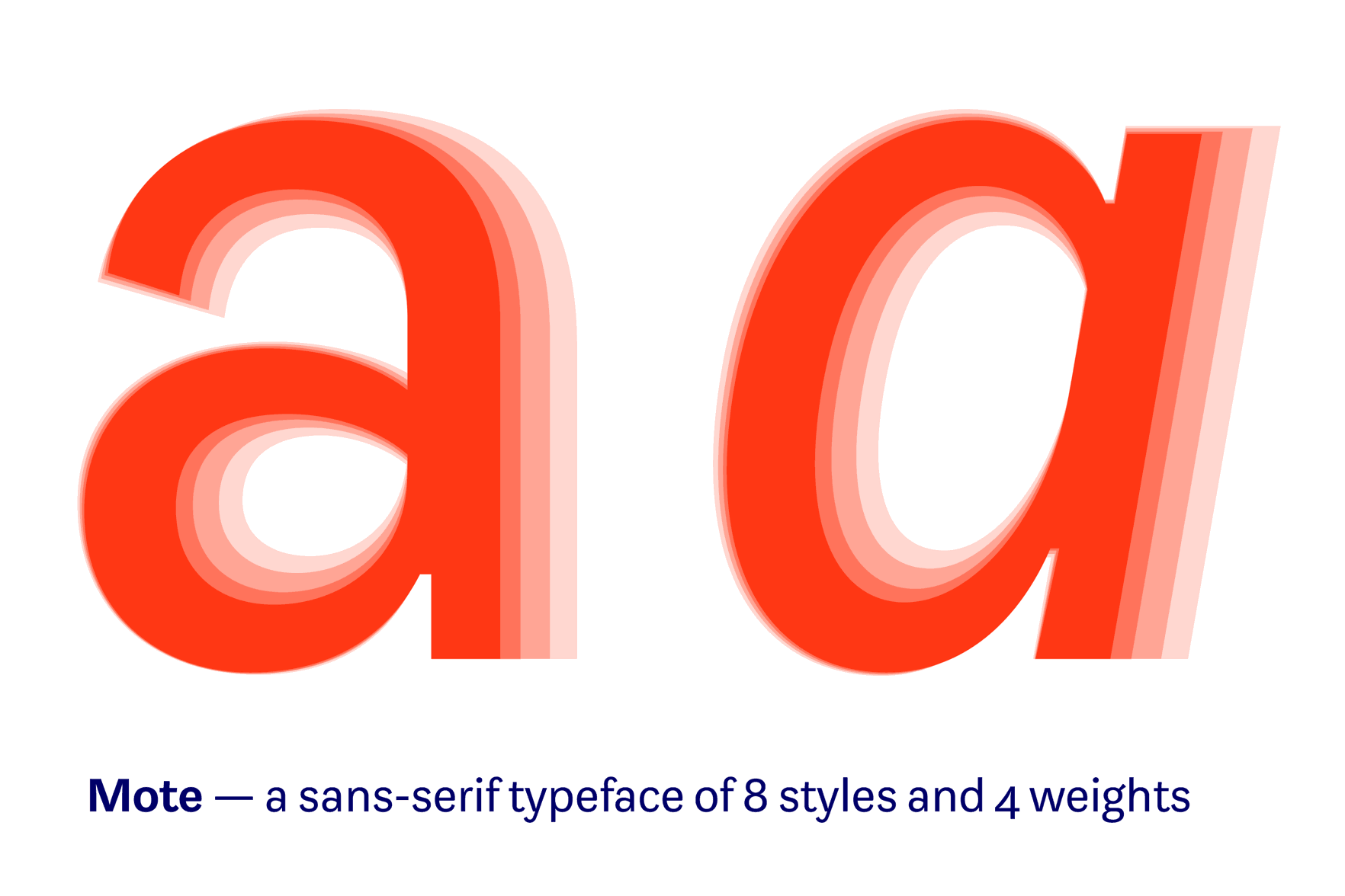
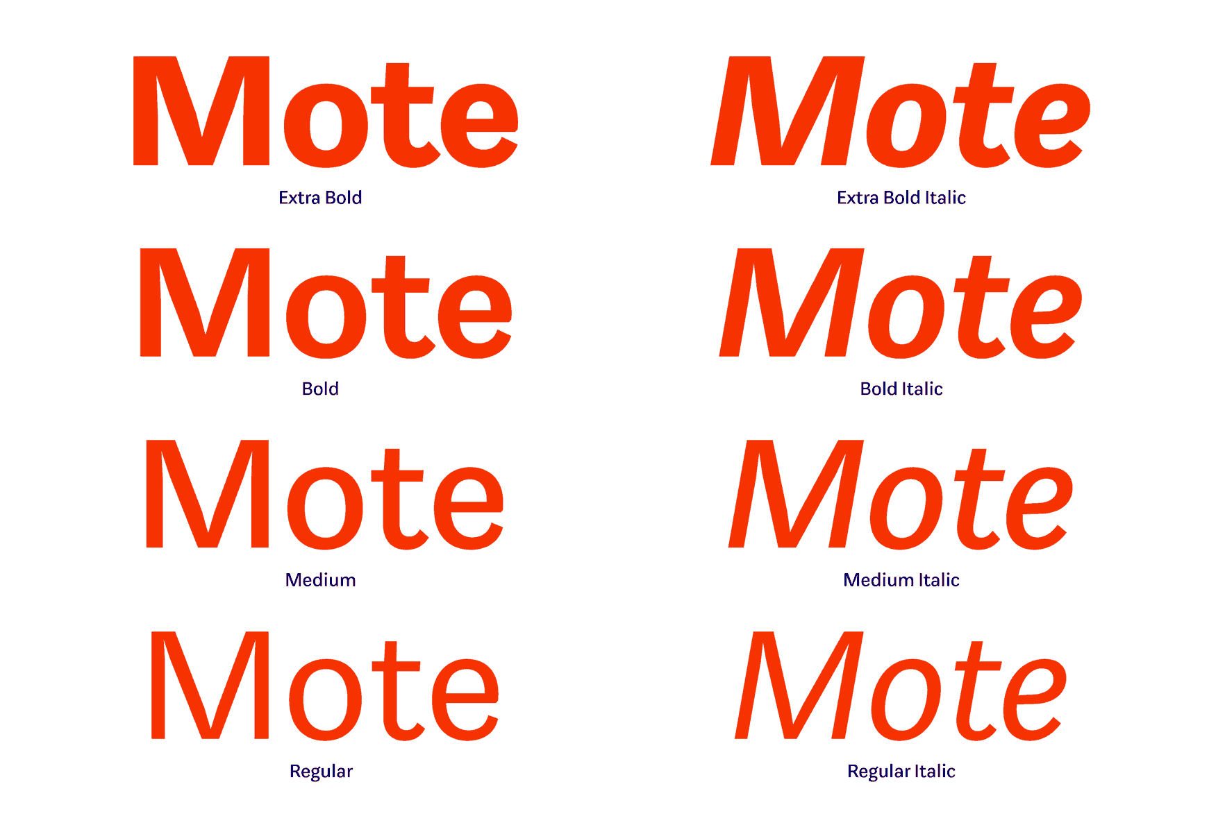
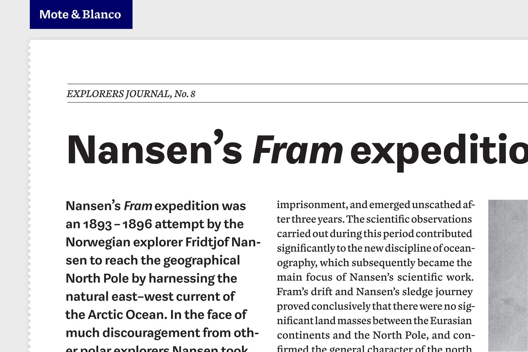
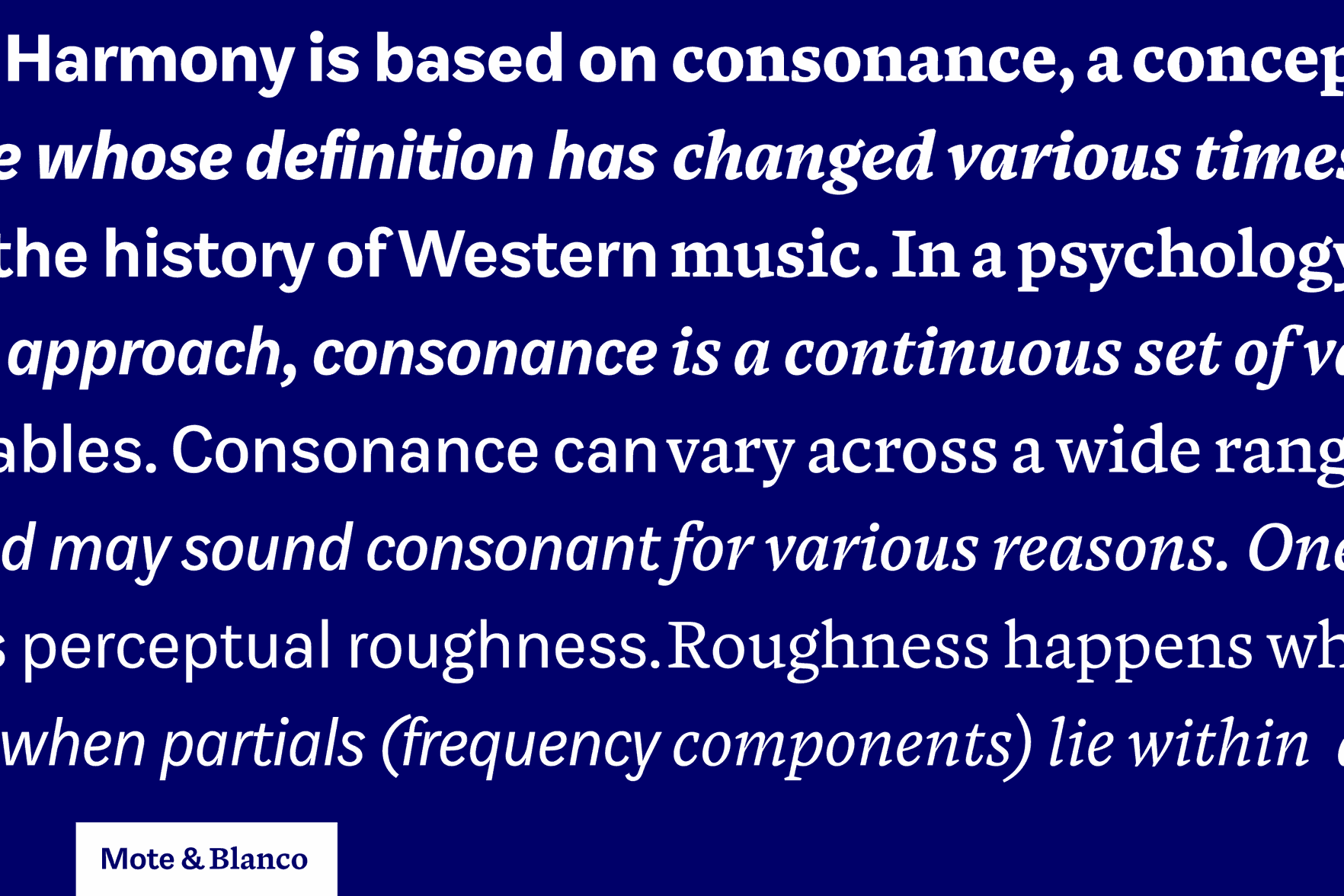
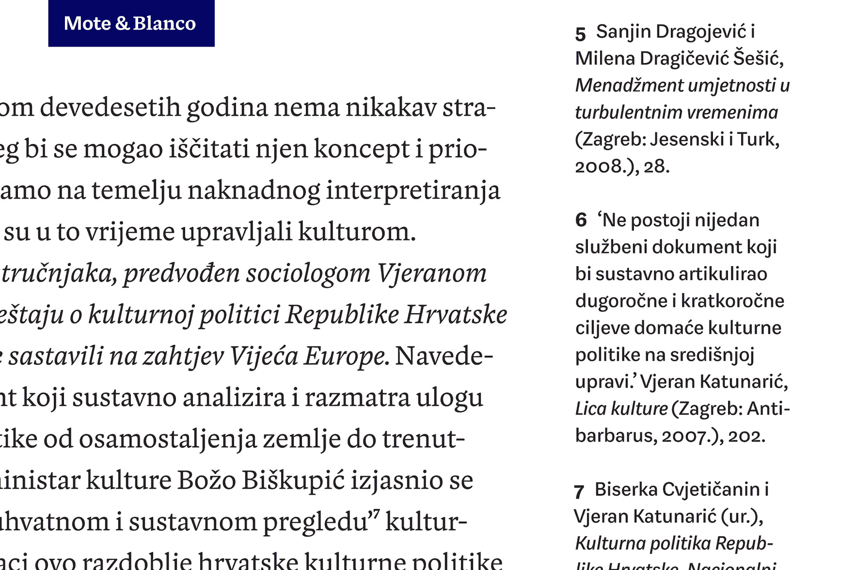
Mote
Mote is a utilitarian sans-serif typeface mainly for reading sizes in print, influenced by neutral gothic and grotesk designs. It is designed to work as an independent type family but also as the companion to Blanco, a serifed typeface by Dave Foster. The two are connected by their proportions, text-fit and shared tastes between both designers. Their optical size, range of weights and darkness are intended to match. The project was about finding a balance between harmonising two separate designs into a useful combination while maintaining their unique characteristics. They have different influences, contrast and tone of voice to set them apart.
Hrvoje Živčić
Croatia
Hrvoje Živčić is a graphic designer from Zagreb, Croatia where he graduated with an MA from the School of Design. Before Type and Media he worked together with Dario Dević as a freelance duo mainly in print design for various cultural clients from Croatia.
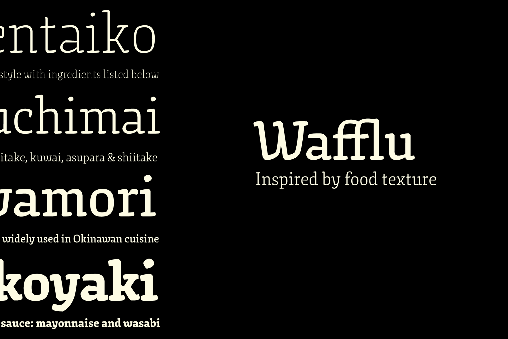
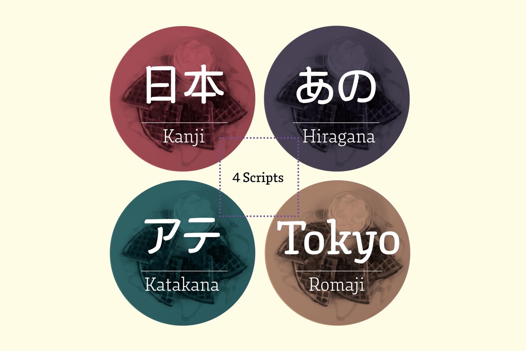
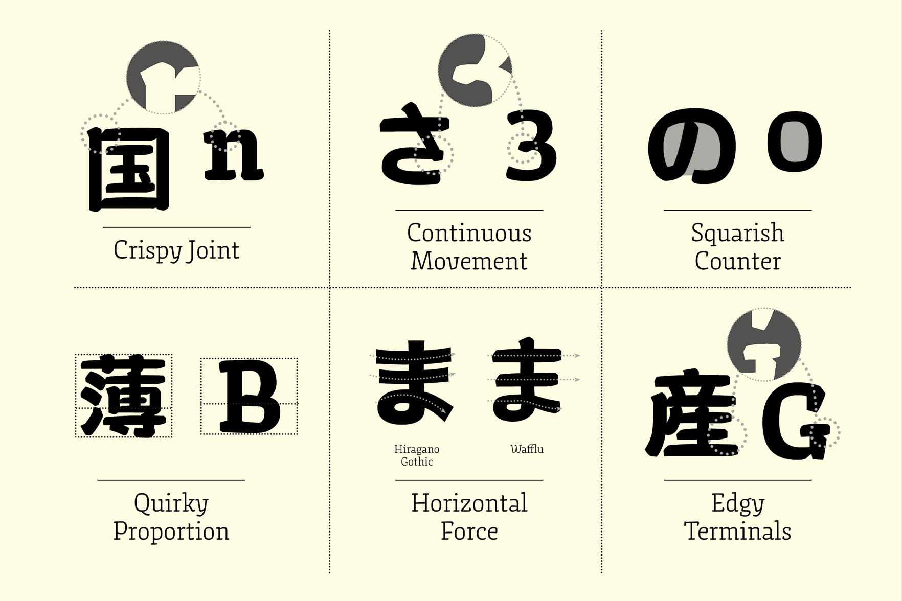
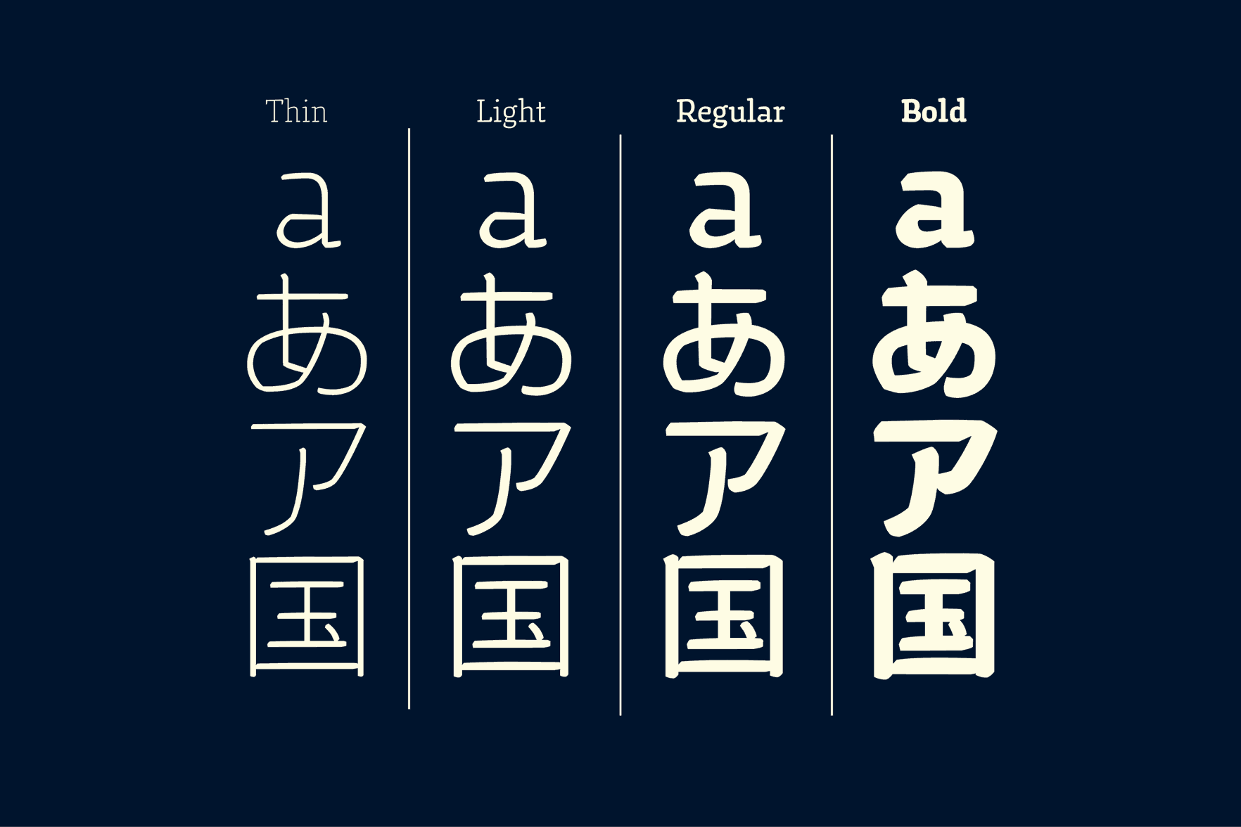
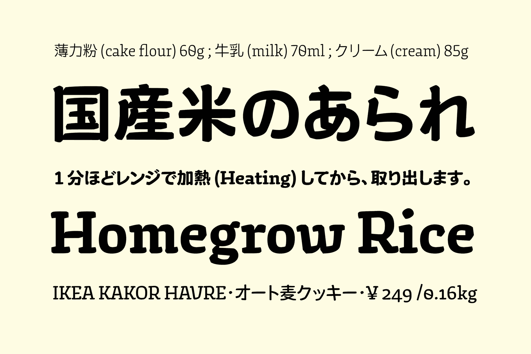
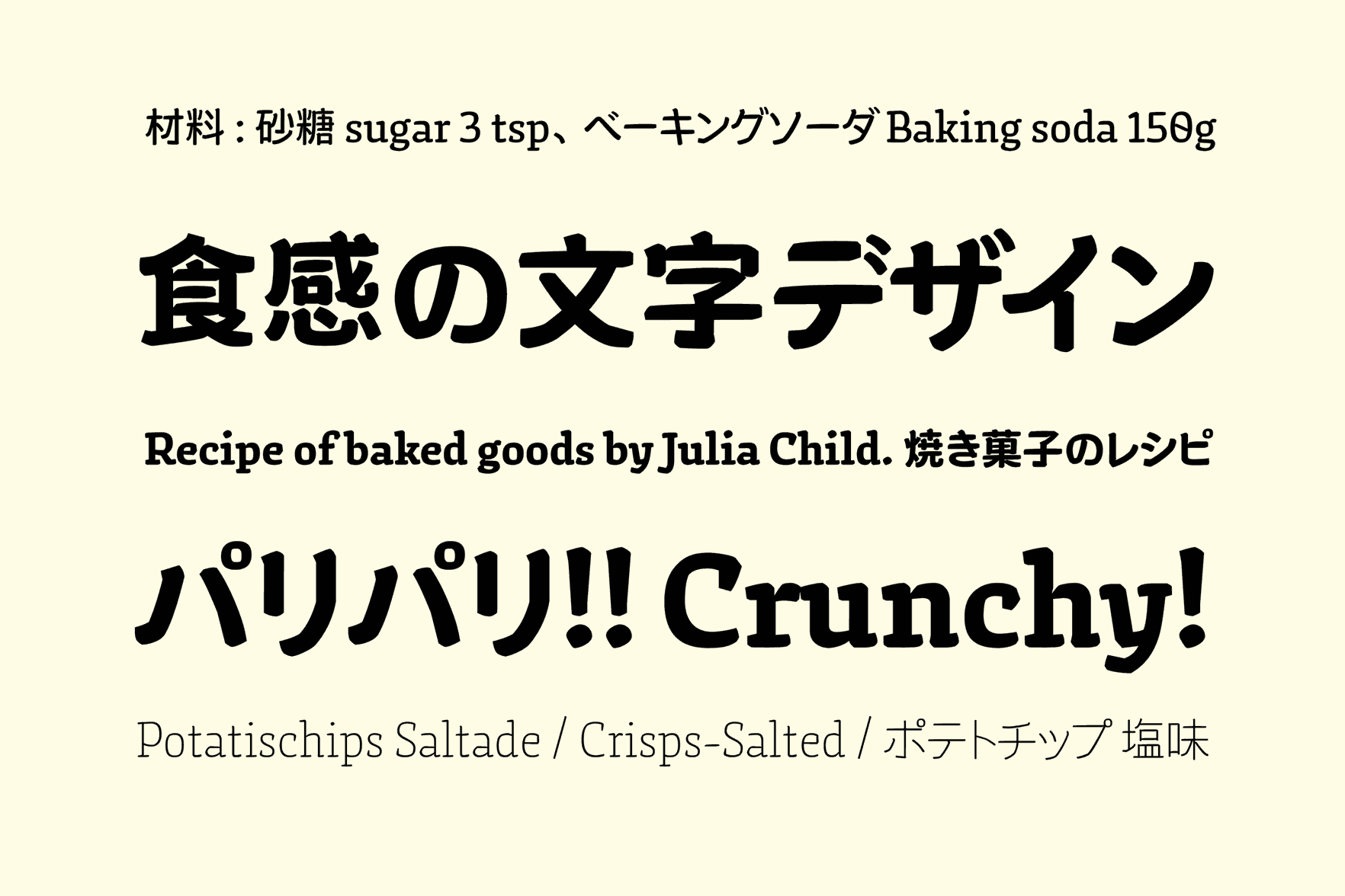
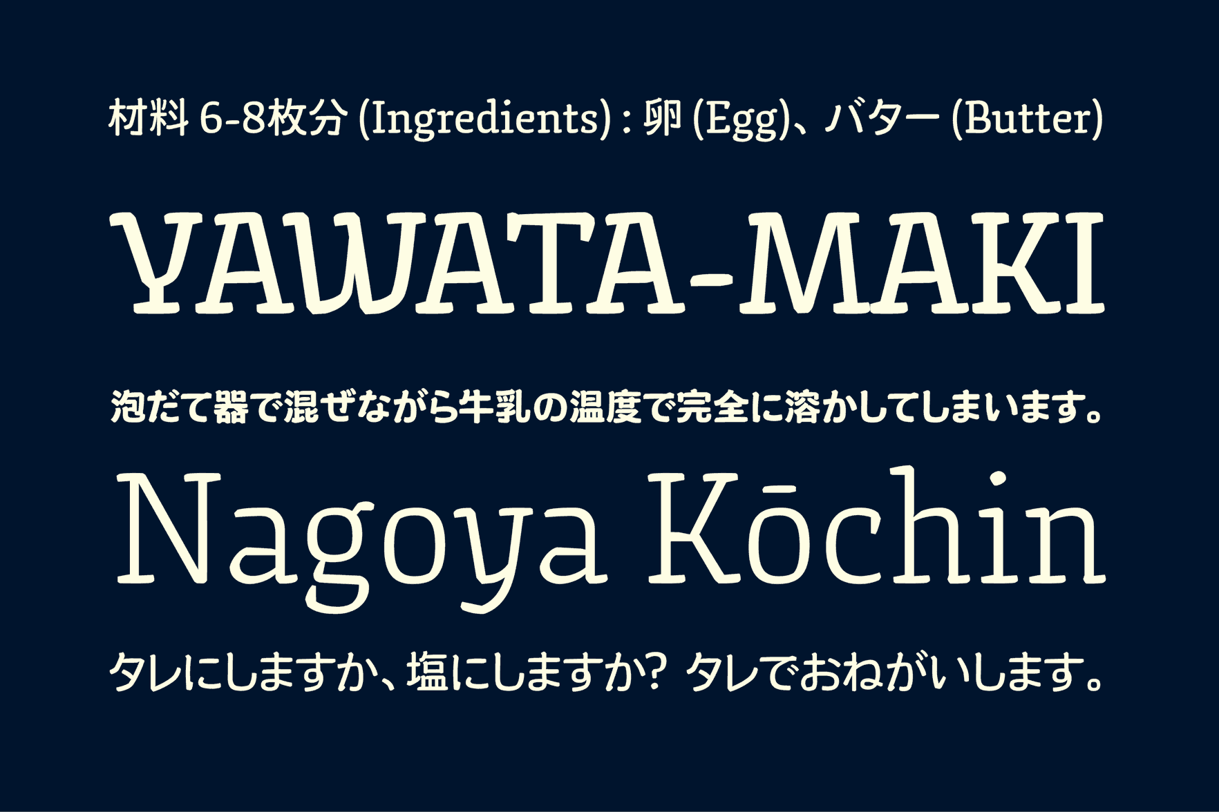
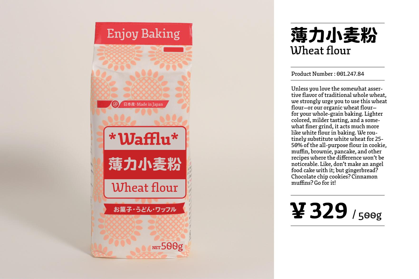
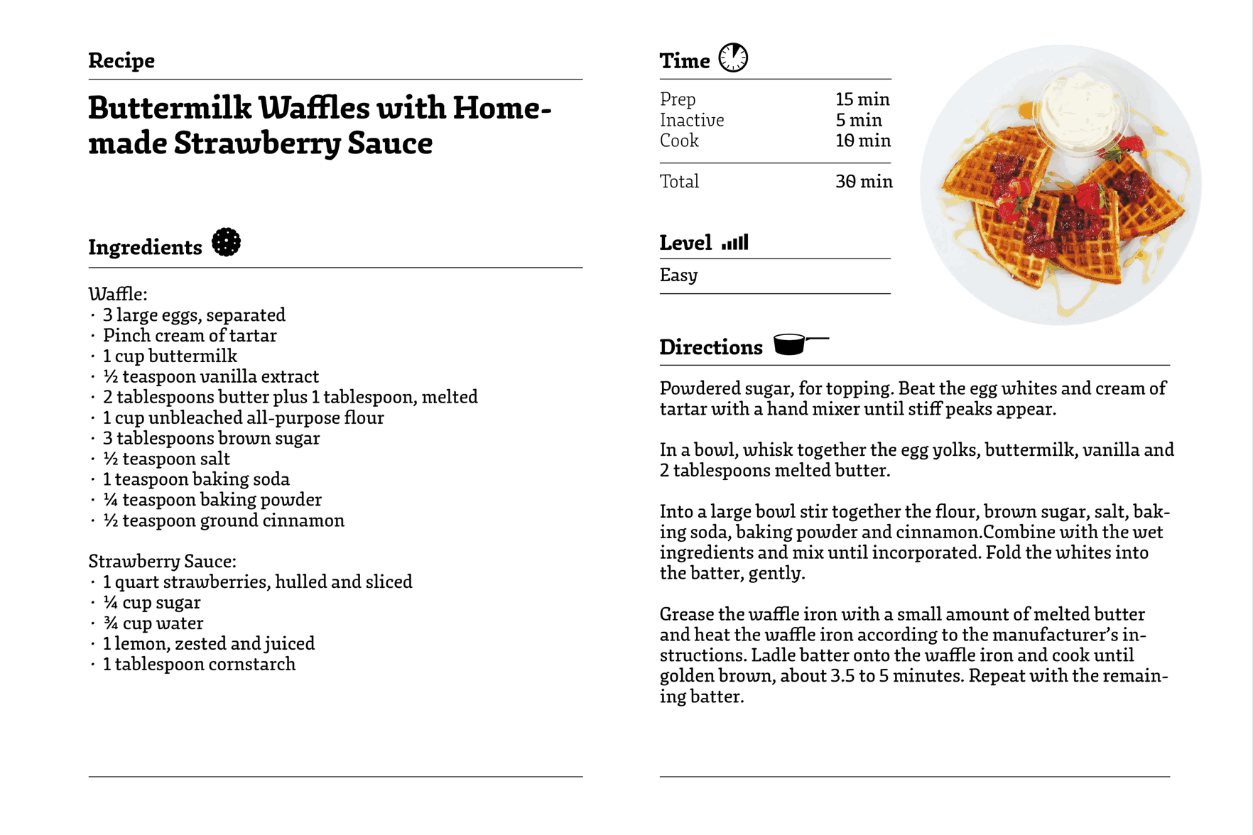
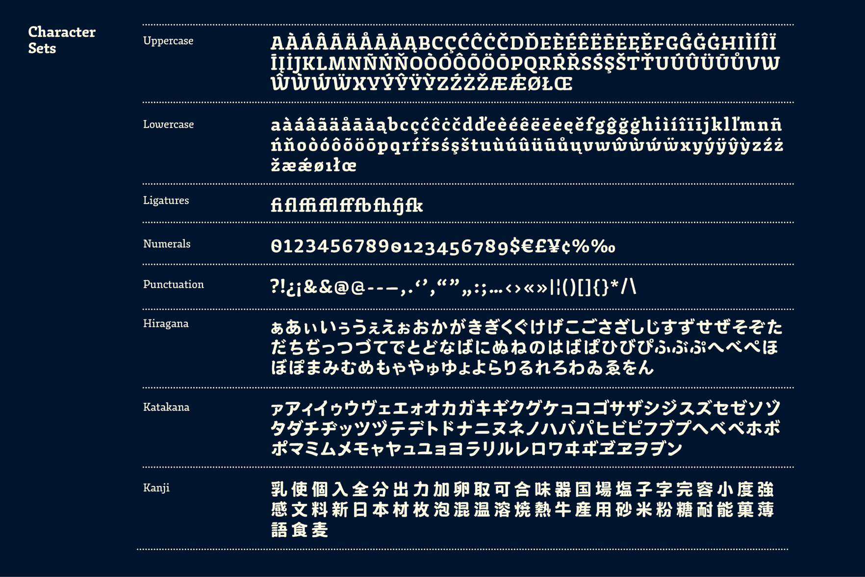
Wafflu
Wafflu is a Japanese typeface which contains the scripts Hiragana, Katakana, Kanji and Latin. The idea of giving the typeface a crisp, crunchy character was inspired by waffles, a popular sweet in The Netherlands. It is an experiment into finding a method to keep the same flavor throughout all four scripts consistent and balanced. Intended applications are display sizes, packaging design and bilingual usage.
Joe (Hsuan-Hao) Chang
Taiwan
Joe (Hsuan-Hao) Chang is a graphic designer from Taipei, Taiwan. Before Type and Media, he worked as a type designer for Dynacomware for two years and also as a freelancer at tenten creative.
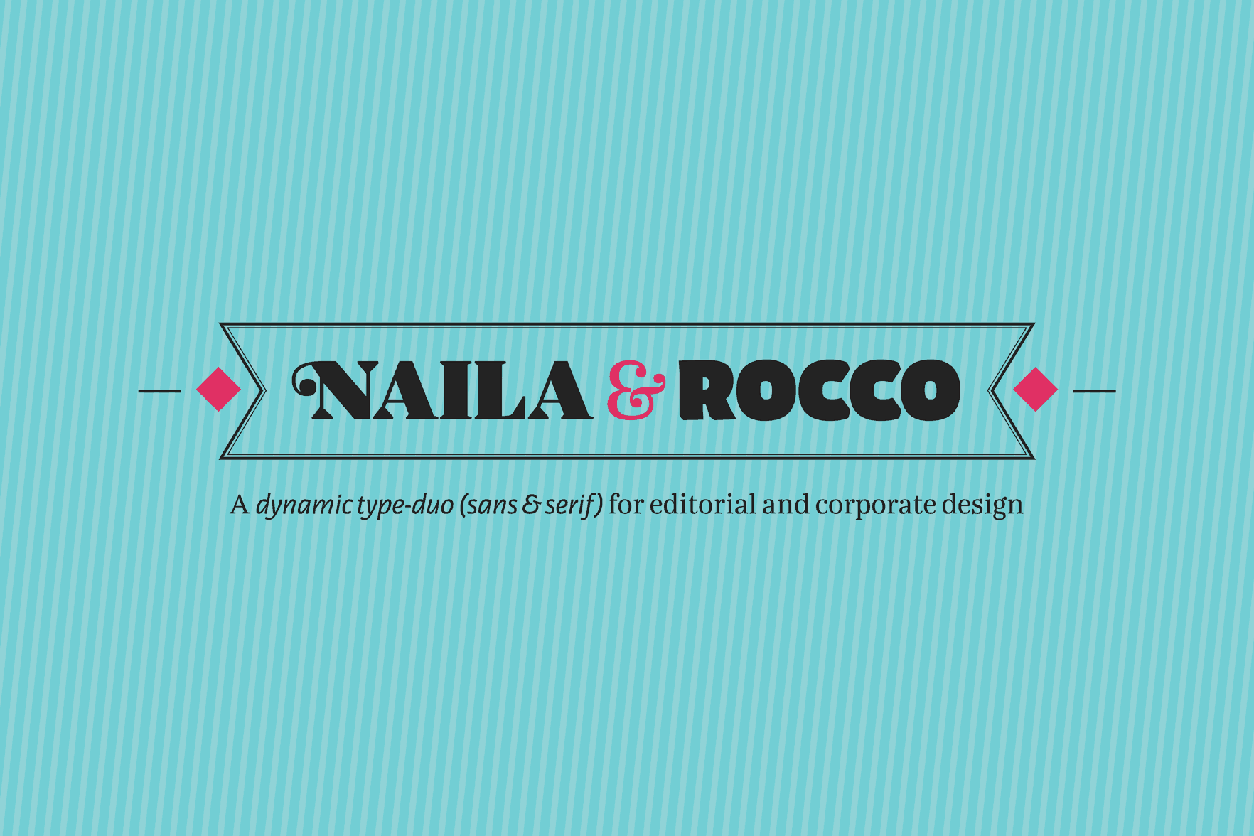
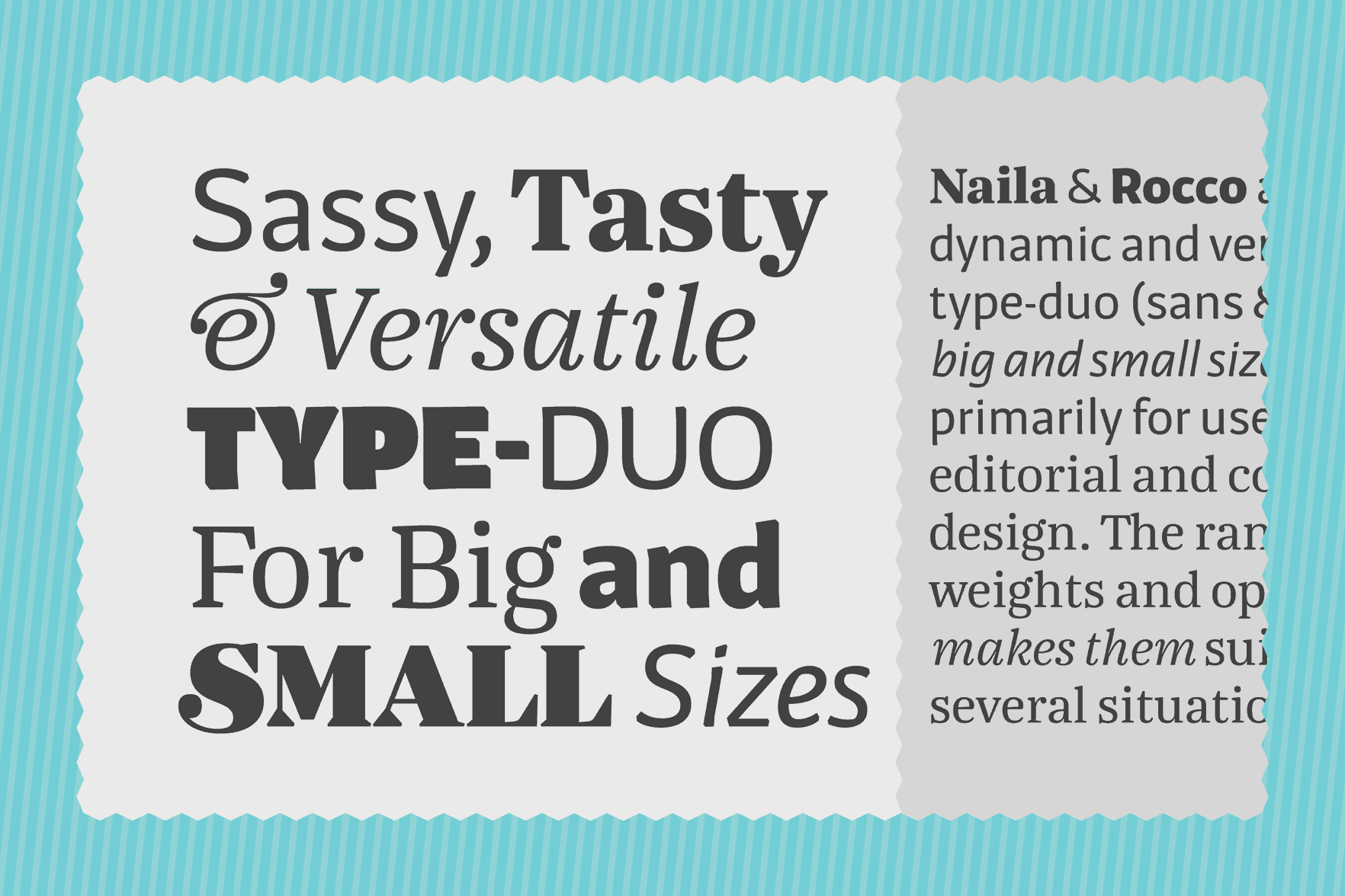
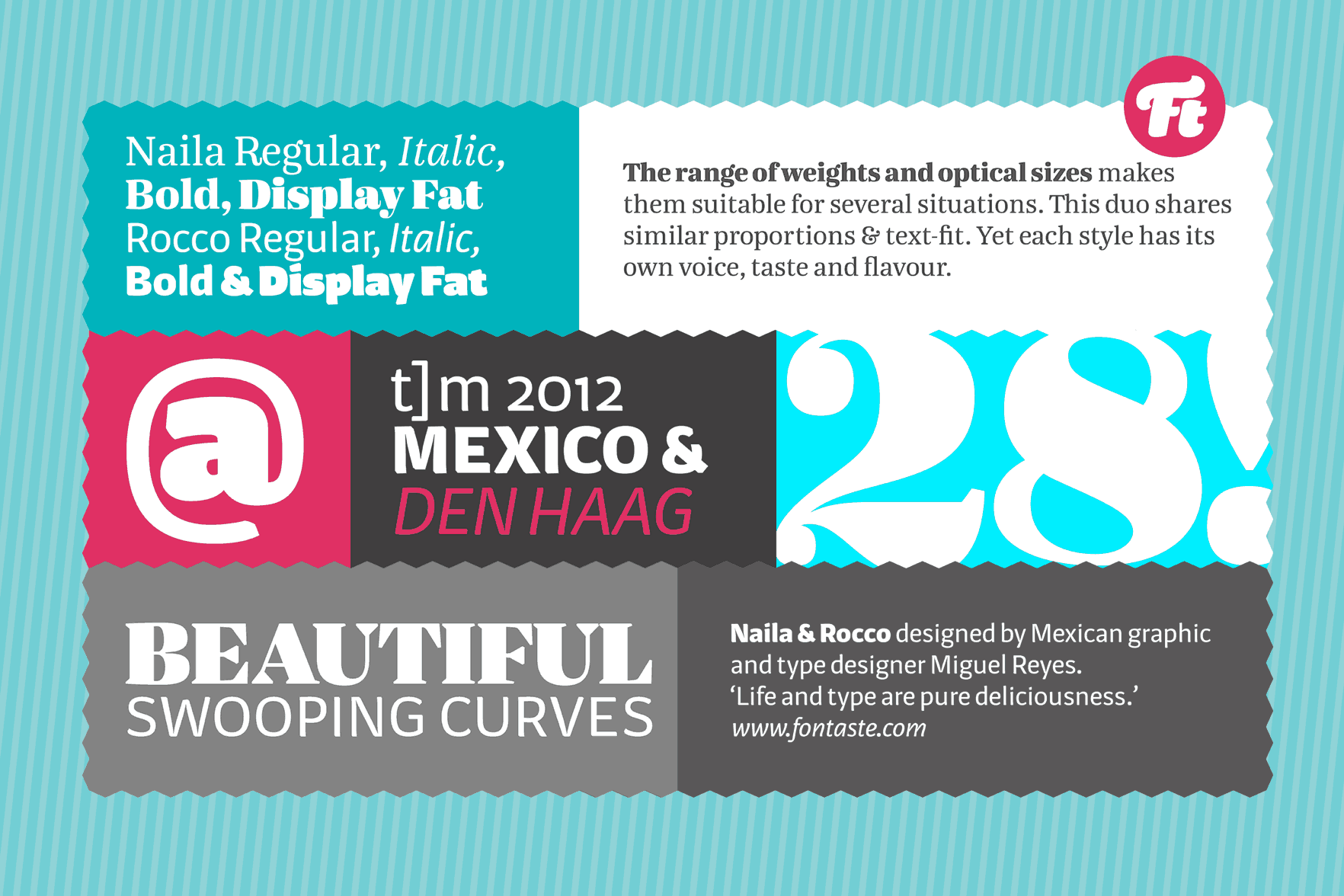
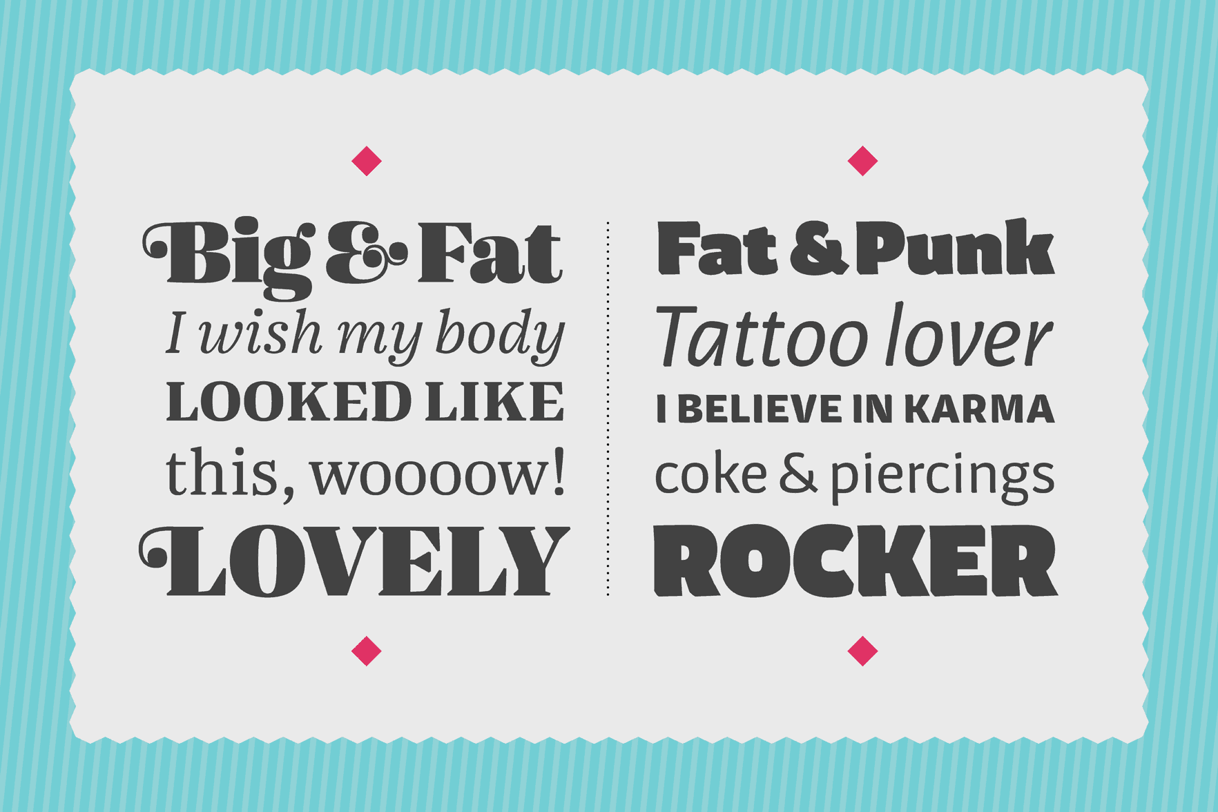
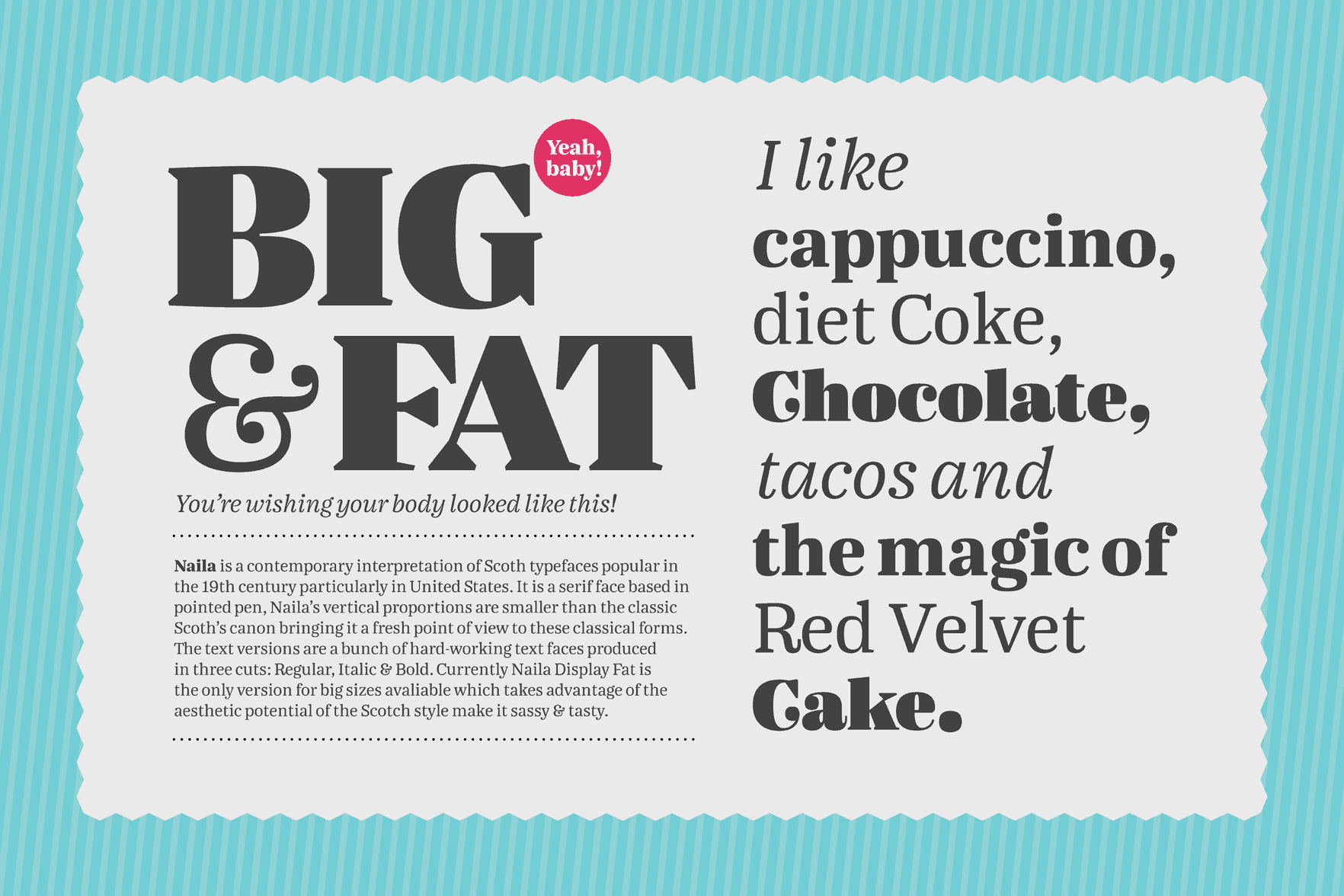
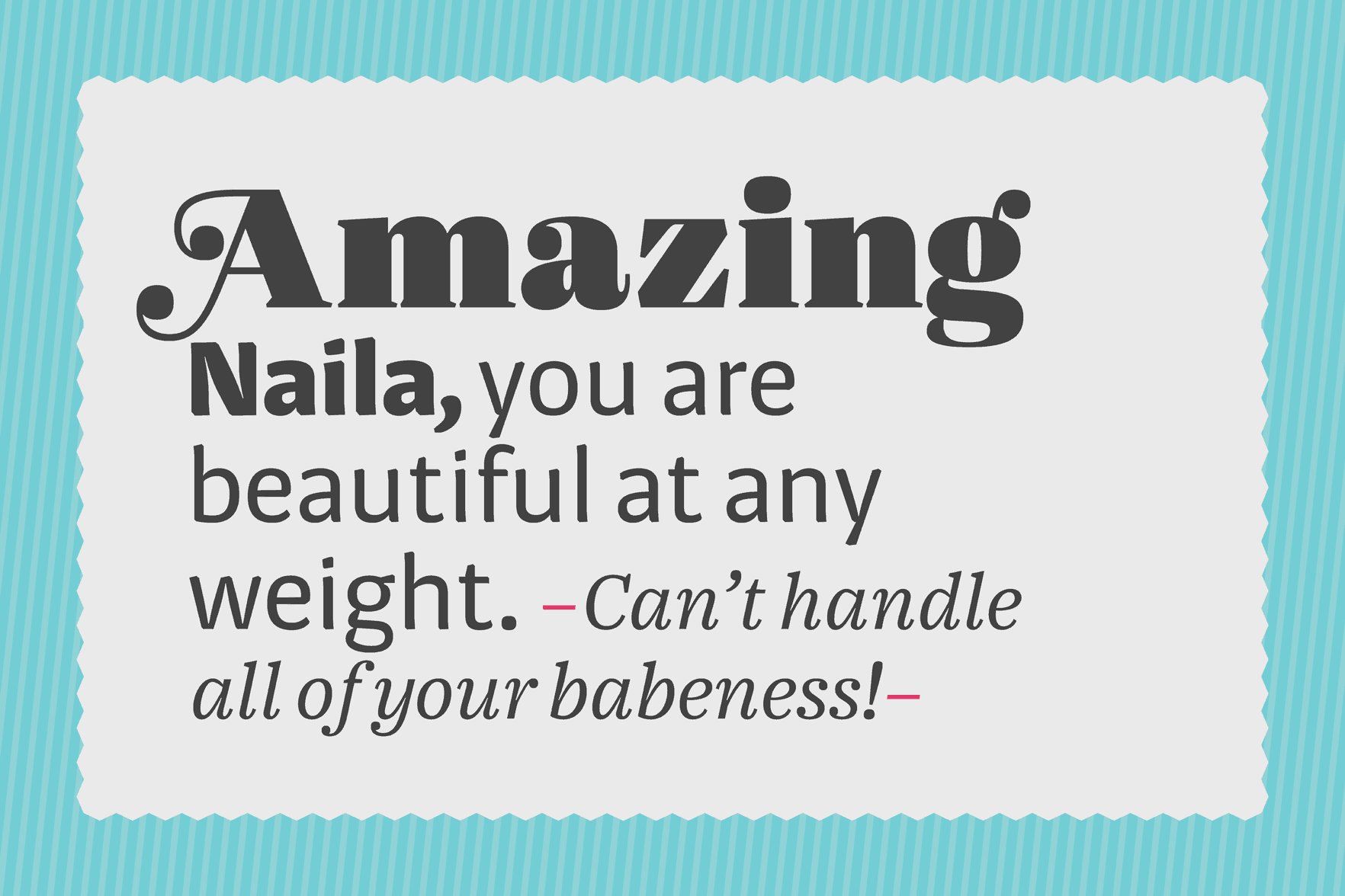
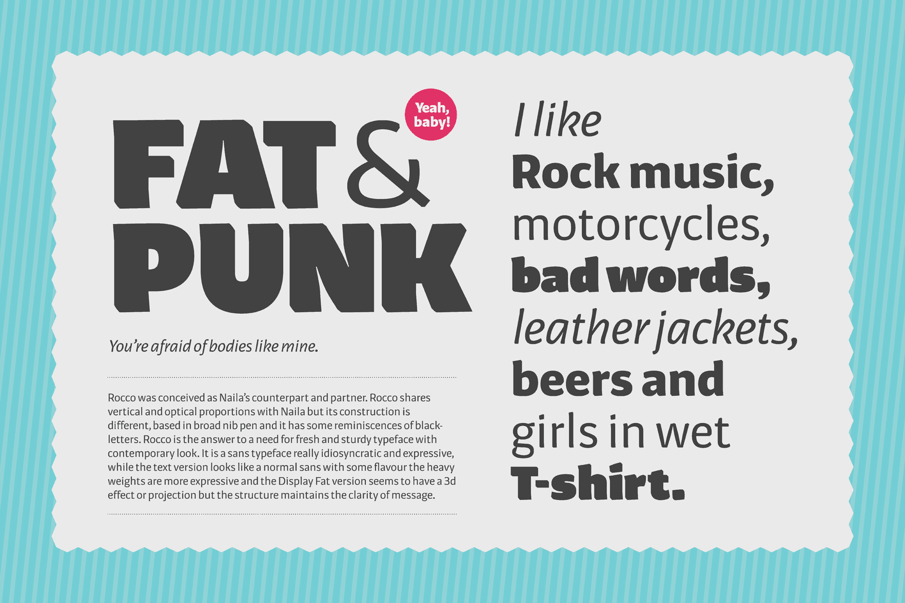
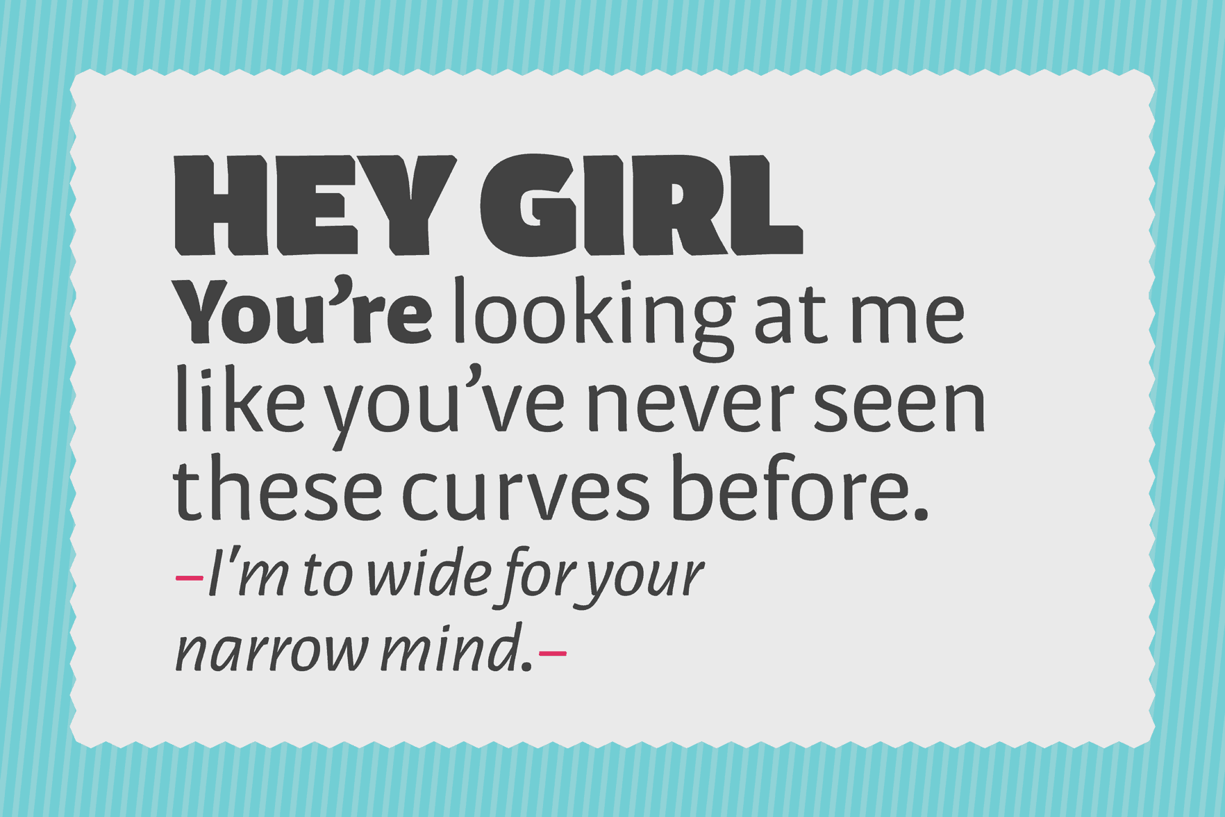
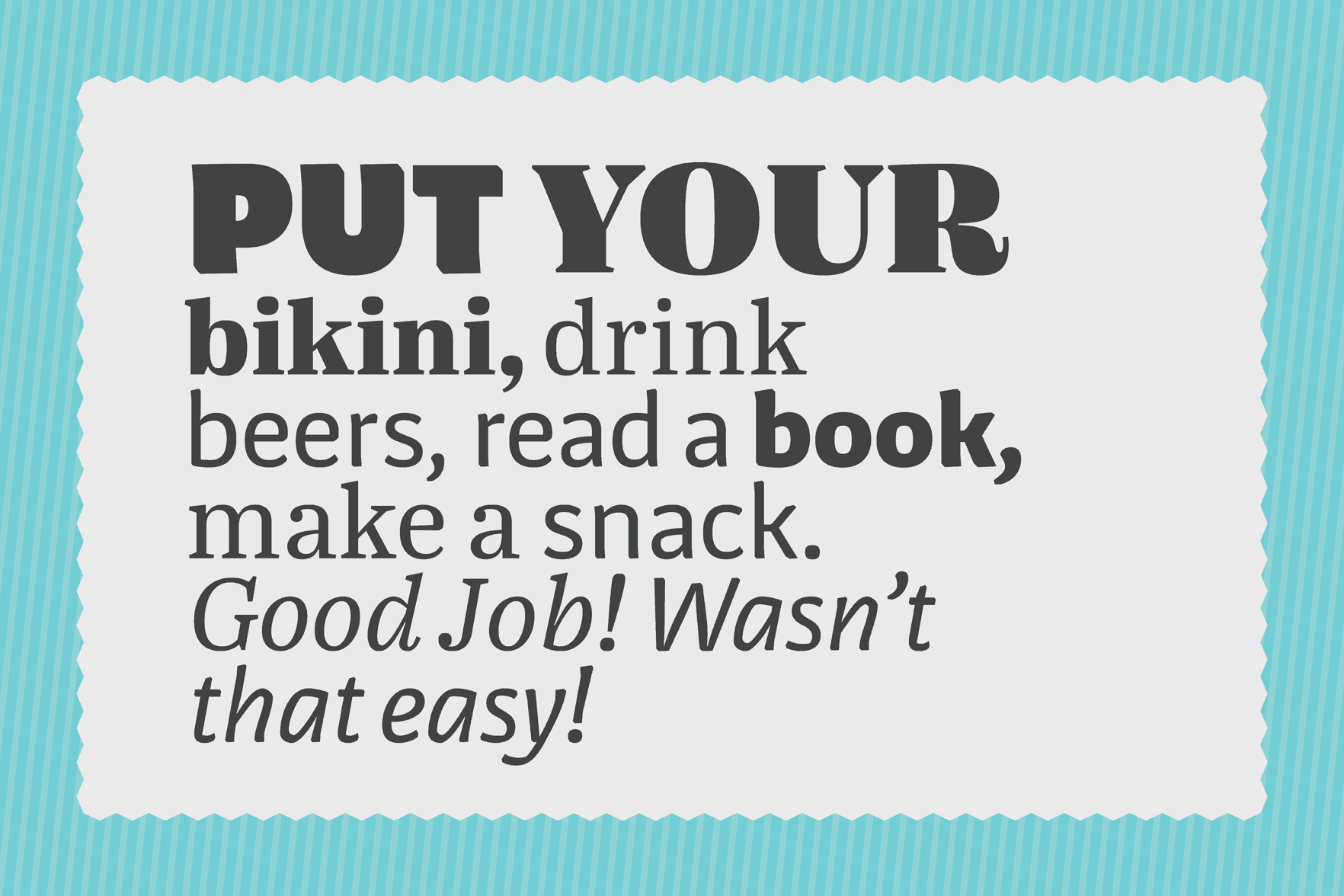
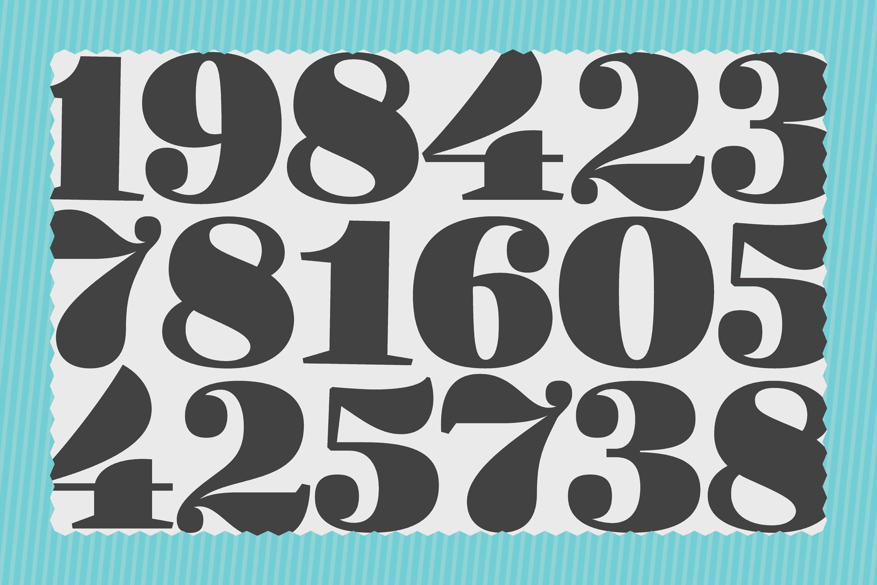
Naila & Rocco
Naila & Rocco are a sassy, tasty, dynamic and versatile type-duo (sans and serif) for big and small sizes primarily for use in editorial and corporate design. The range of weights and optical sizes makes them suitable for many situations. This duo shares similar proportions and text-fit, yet each style has its own voice and flavour.
Miguel Reyes
Mexico
Miguel Reyes is a graphic designer and type designer from Puebla, Mexico. He graduated with a BA as a graphic designer from Benemérita Universidad Autónoma de Puebla and he holds a MA in Type Design from CEGestalt, School of Design. Before Type and Media some of his typefaces where selected in the Biennial of Tipos Latinos in Latin America. He has worked in different studios in México and Barcelona.
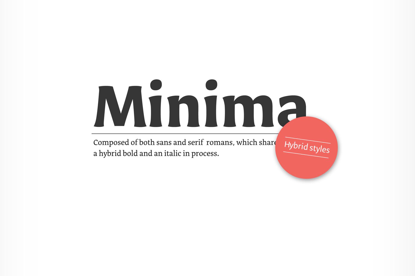
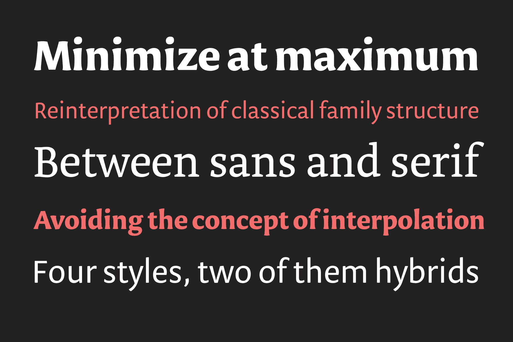
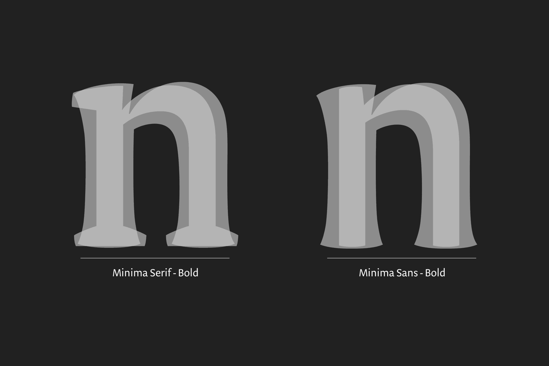
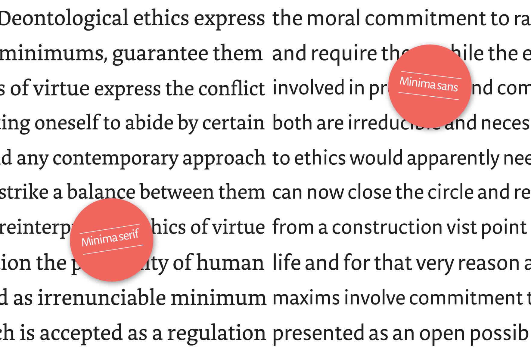
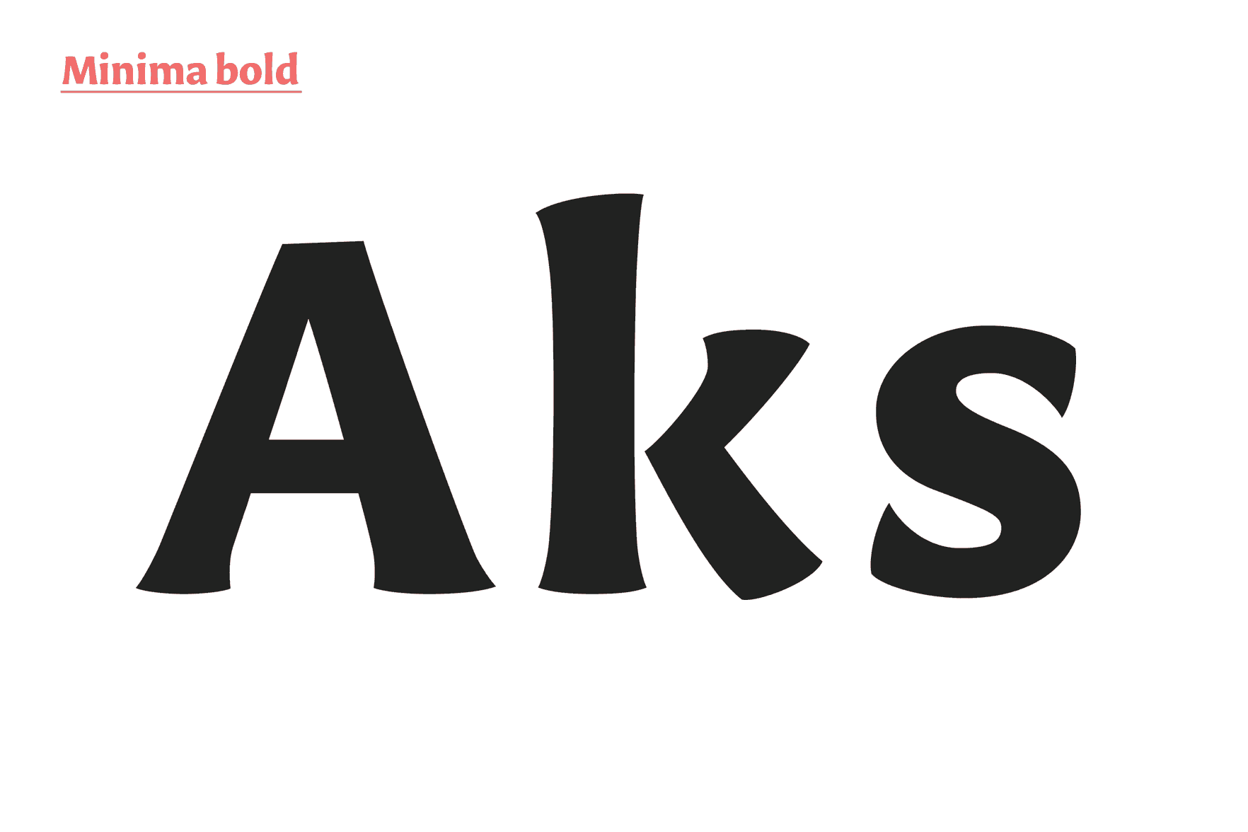
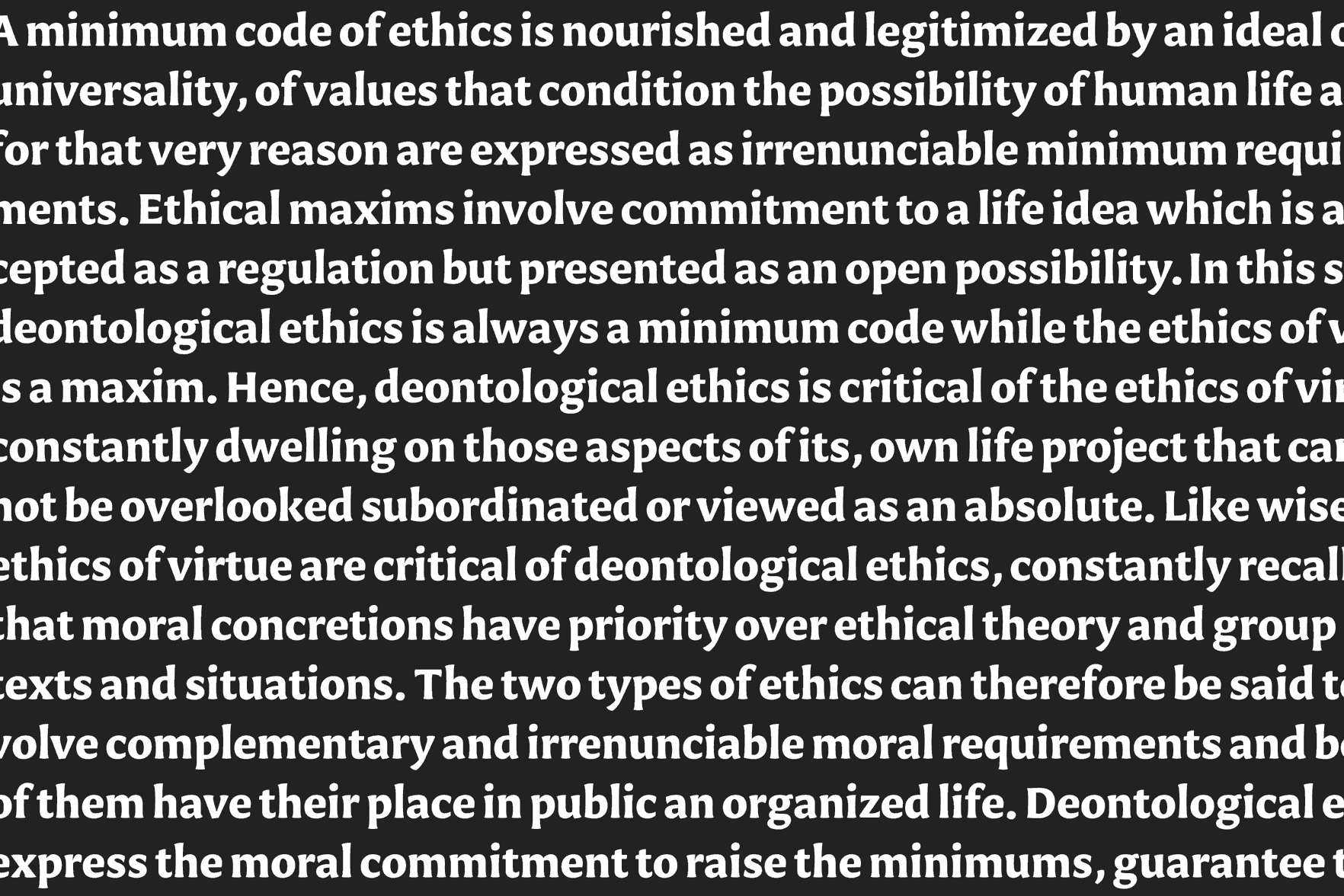
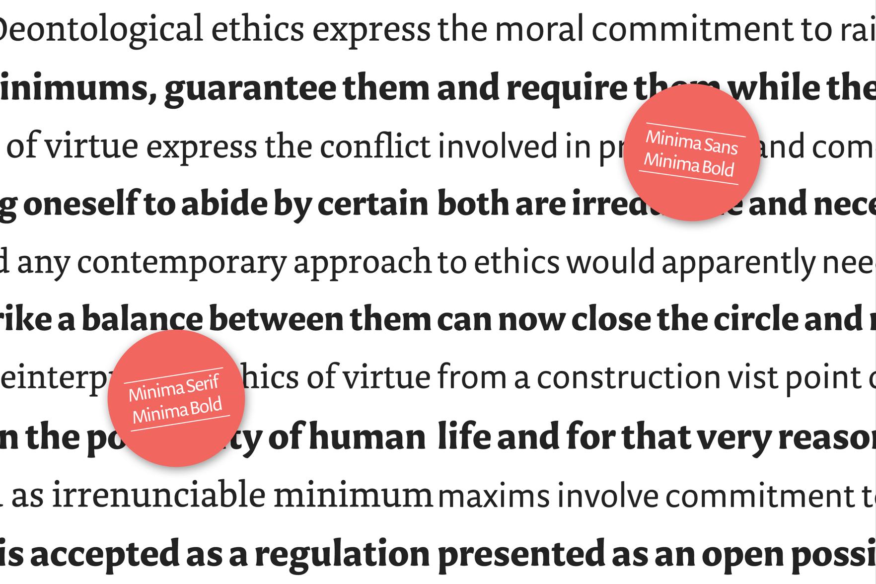
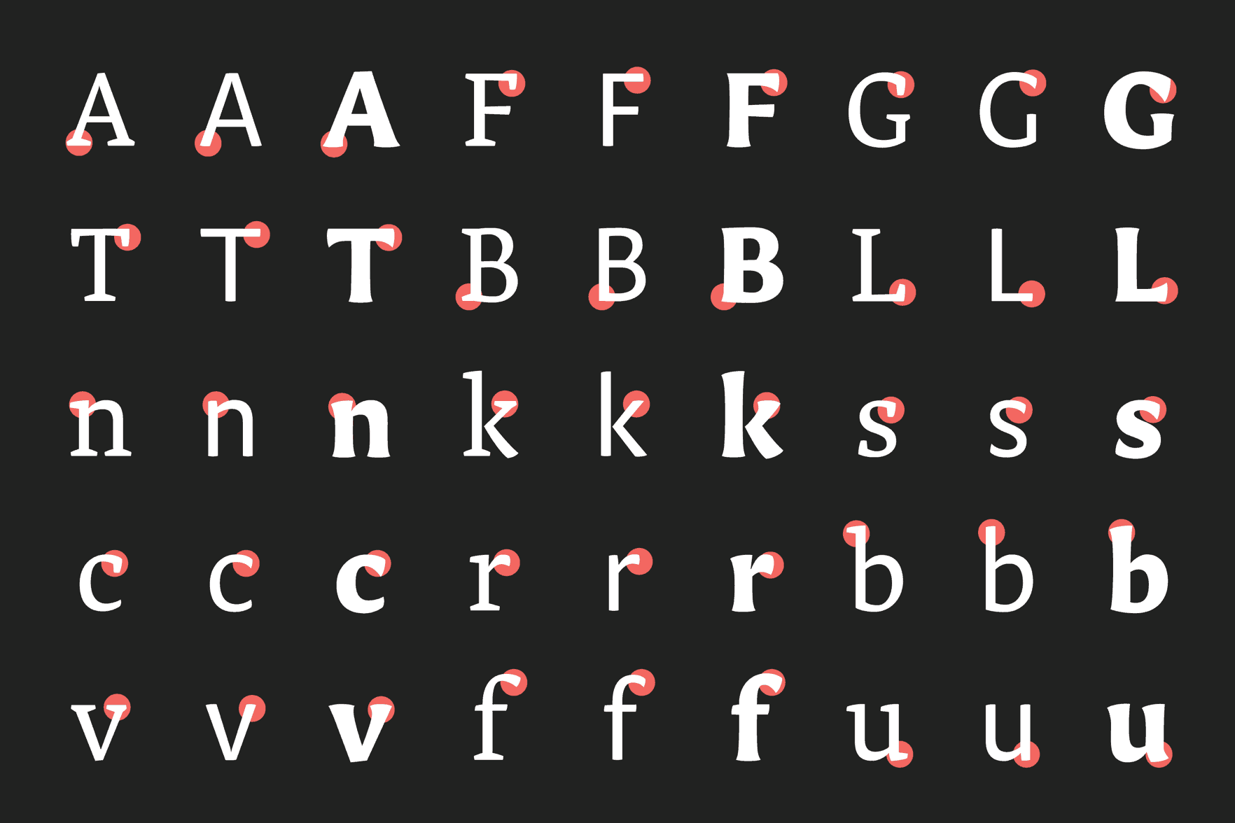
Minima
Minima is a text typeface which reinterprets the classical family structure. Avoiding the concept of interpolation, the main goal was to reduce the amount of styles in the family. It finds new shapes by exploring a hybrid construction between sans and serif. Minima comes in both sans and serif romans, which share a hybrid bold and an italic in process.
Noe Blanco
Spain
Originally from Barcelona, Noe is a graphic designer and type designer currently living in Amsterdam. She holds a BA in Graphic Design from BAU, School of Design and a MA in Advanced Typography at Eina, Escola de Disseny i Art, where her interest in type design began and where she created her first typeface. Since 2008, she has been working as a graphic designer for different studios in Barcelona.
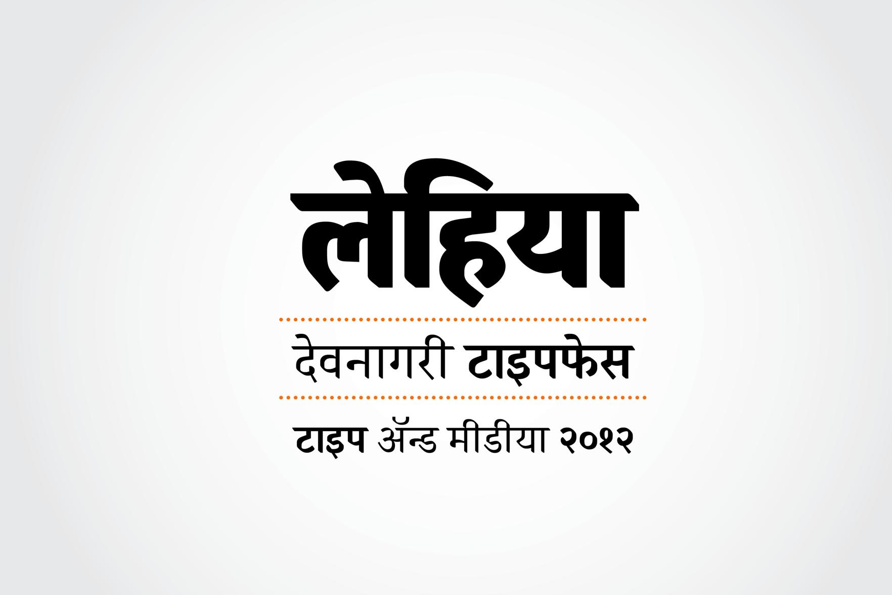
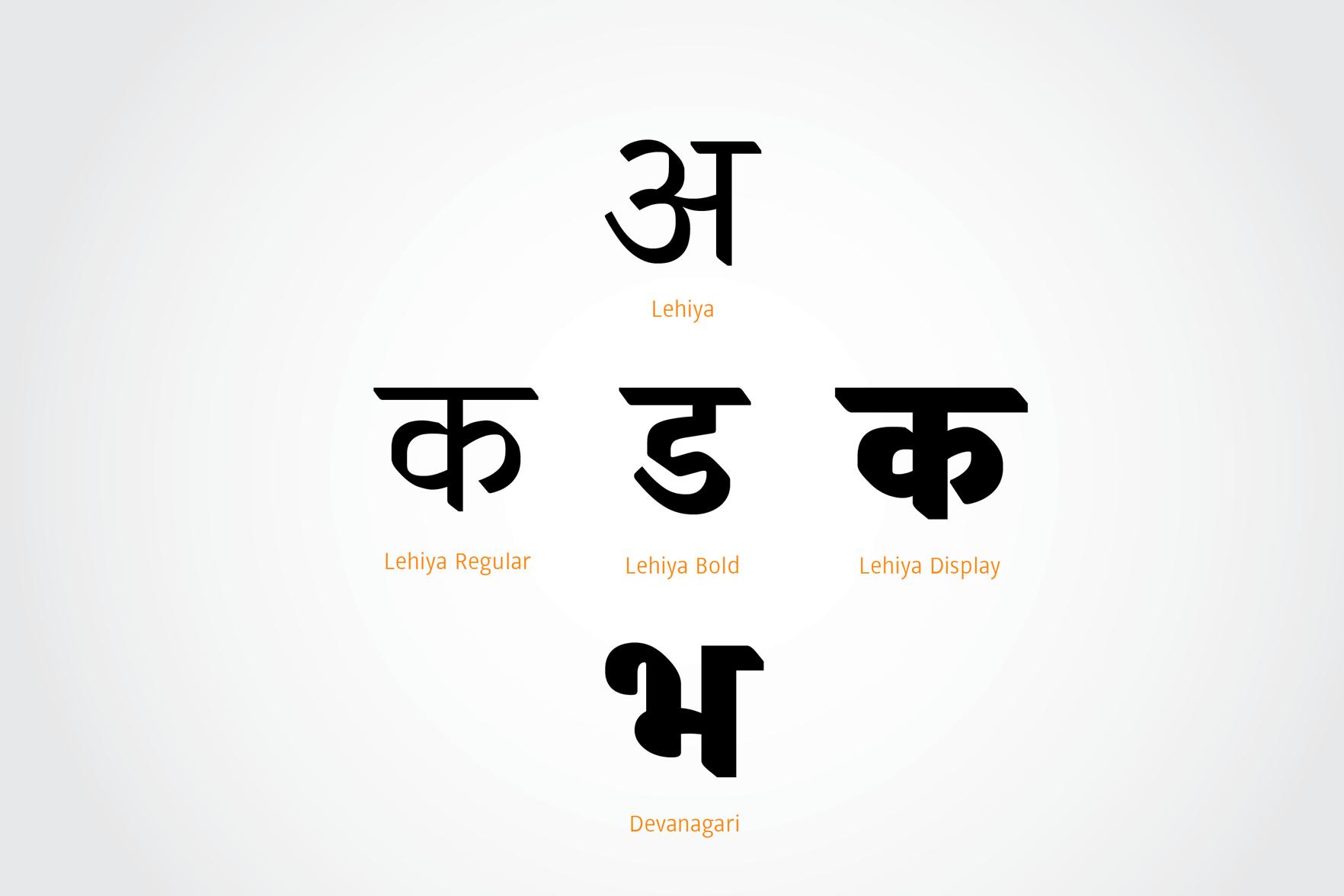
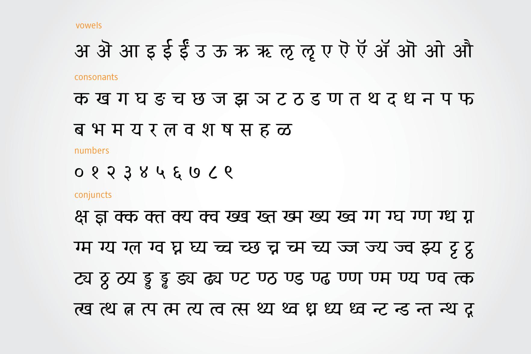
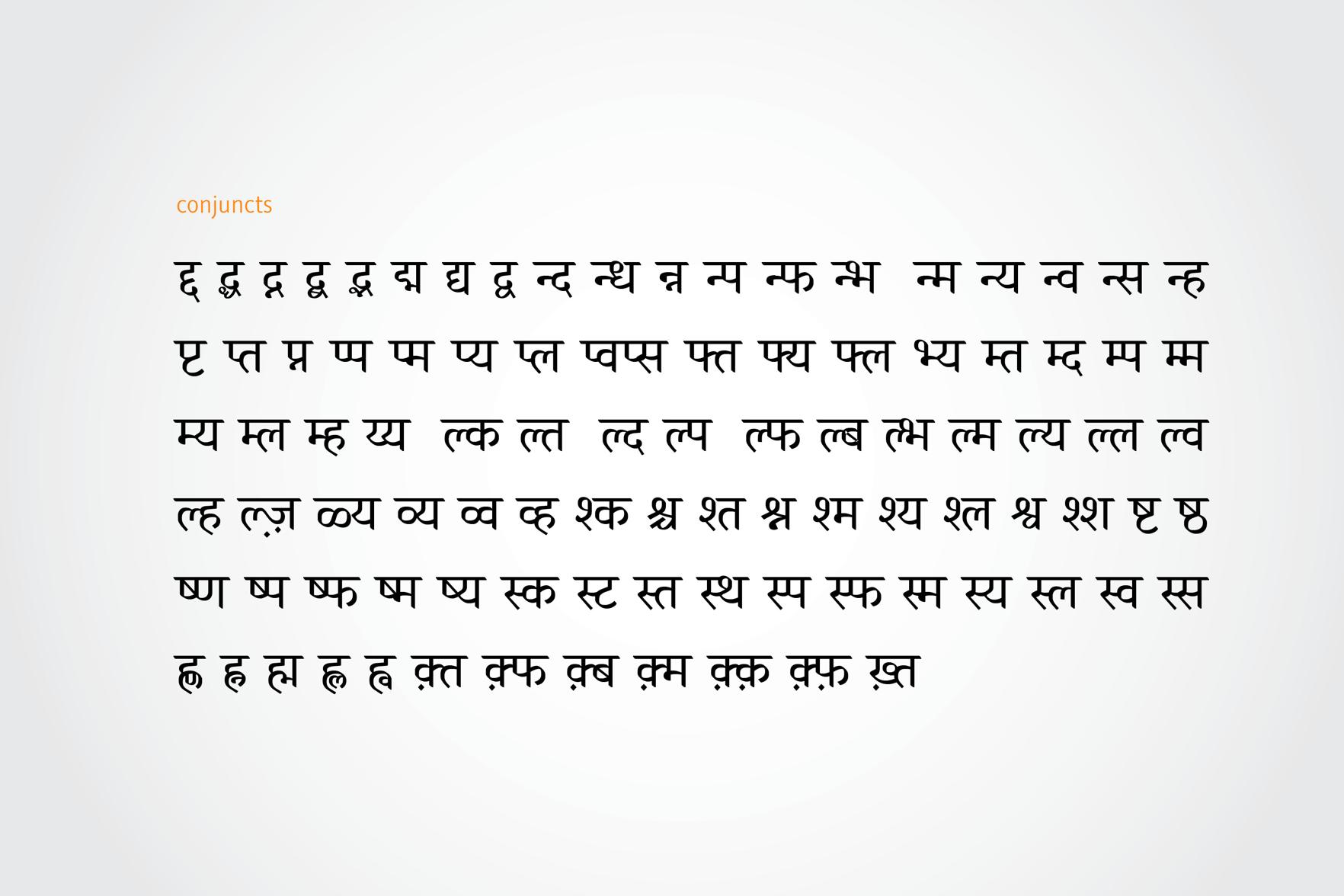
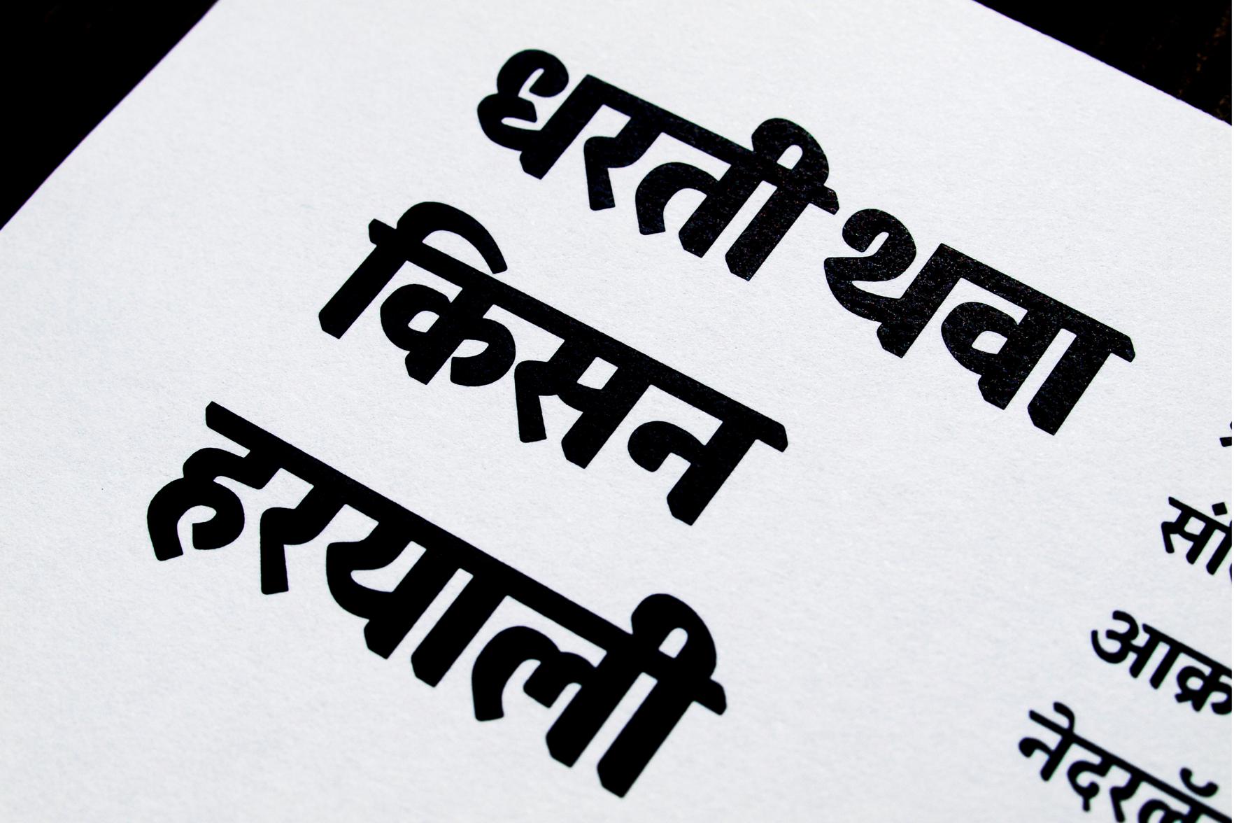
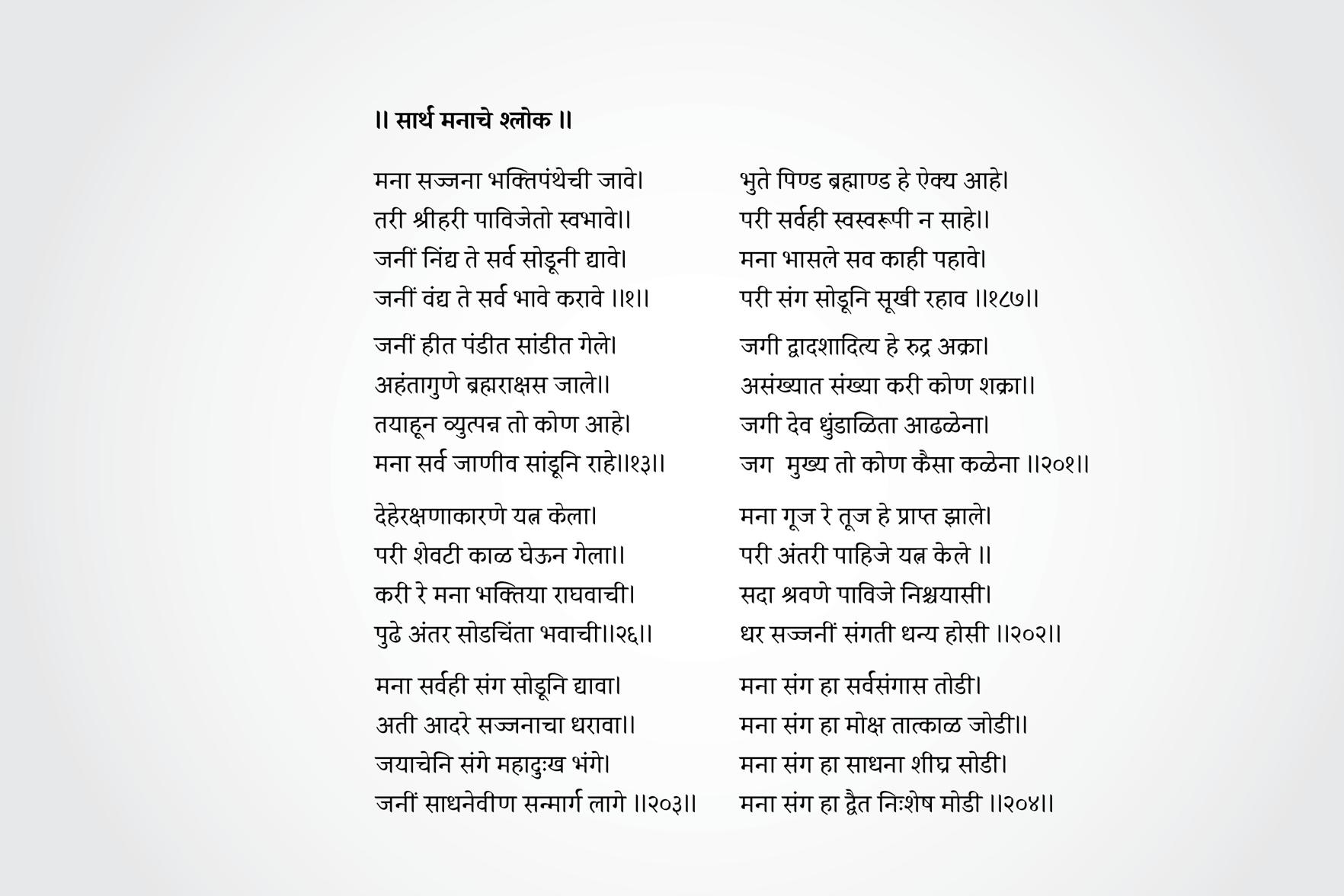
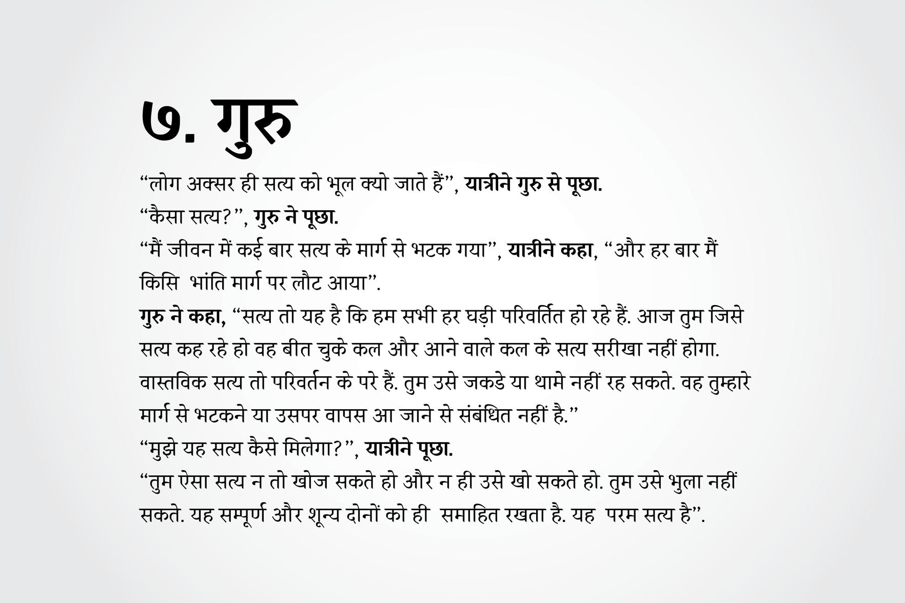
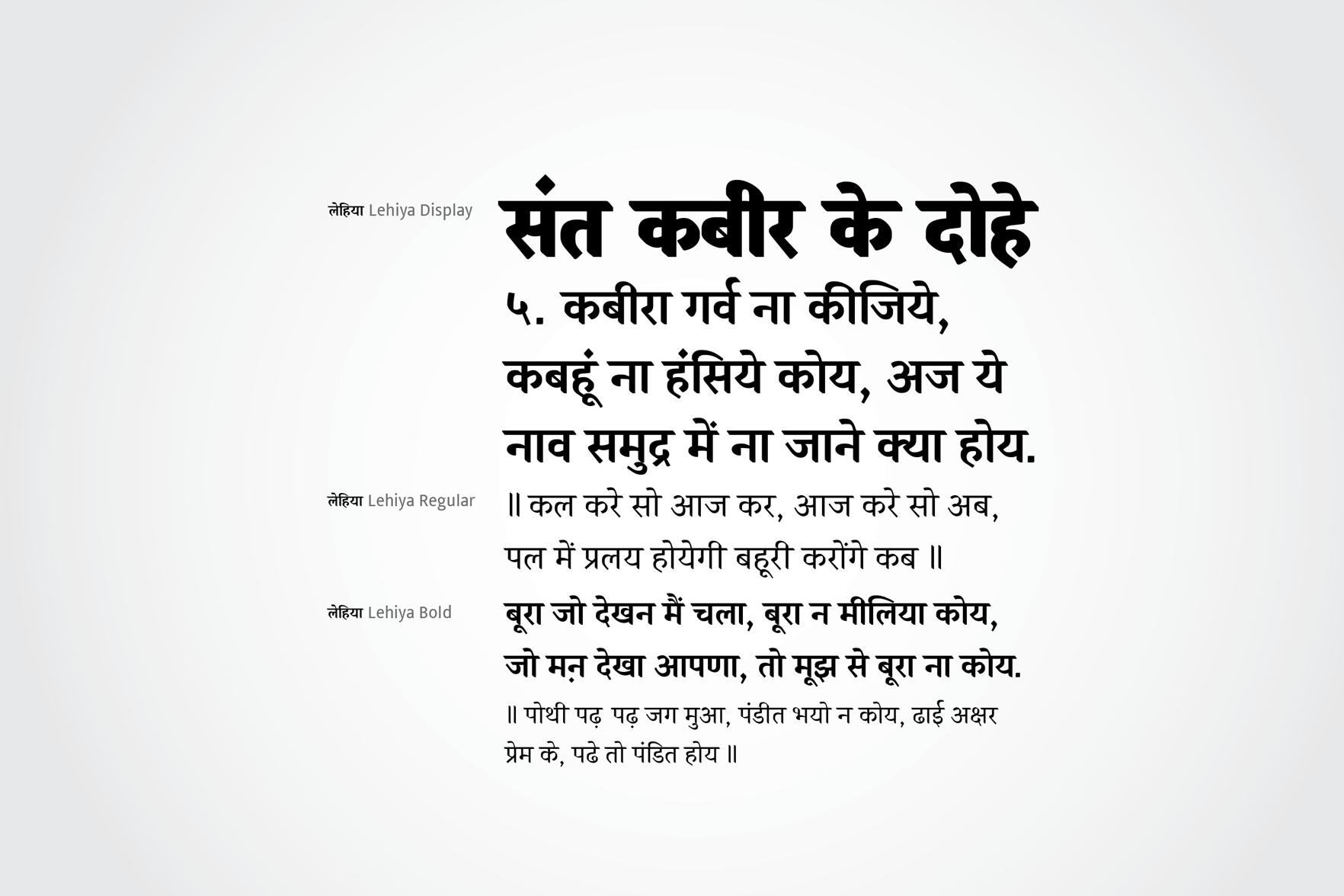
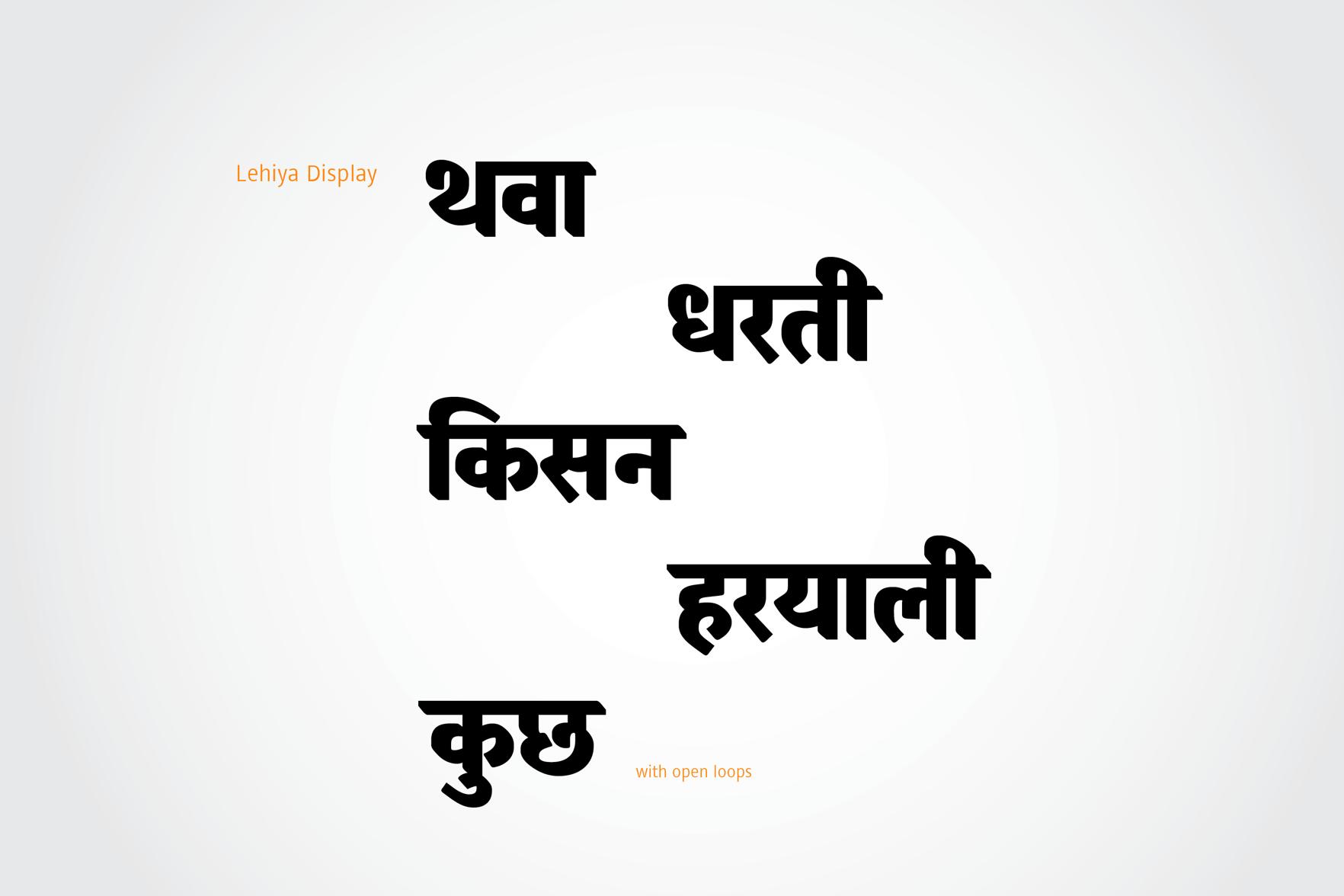
Lehiya
Lehiya is a Devanagari text typeface which is designed for extended reading in Hindi and Marathi. With a compact, squarish look, it is inspired primarily by the calligraphic style of old Jain manuscripts. It gives Lehiya a mature yet outspoken voice for a fresh perspective on Devanagari book text. The typeface family currently consists of three weights — regular and bold for text and a display for titles.
Pradnya Naik
India
Pradnya Naik is a designer from Mumbai, India. After graduating from Sir J. J. Institute of Applied Art, Mumbai in 2009 she started working with WhiteCrow Designs. While developing fonts for two Indian languages like Urdu and Gujarati she discovered her interest in type design. Her work is mostly influenced by various Indic scripts. She has been involved with Aksharaya as a contributor and archivist, as well as with the research and development of multi-script typography for various Indic scripts.
www.pradnyanaik.tumblr.com pradnyanaik17@gmail.com @pradnyanaik17
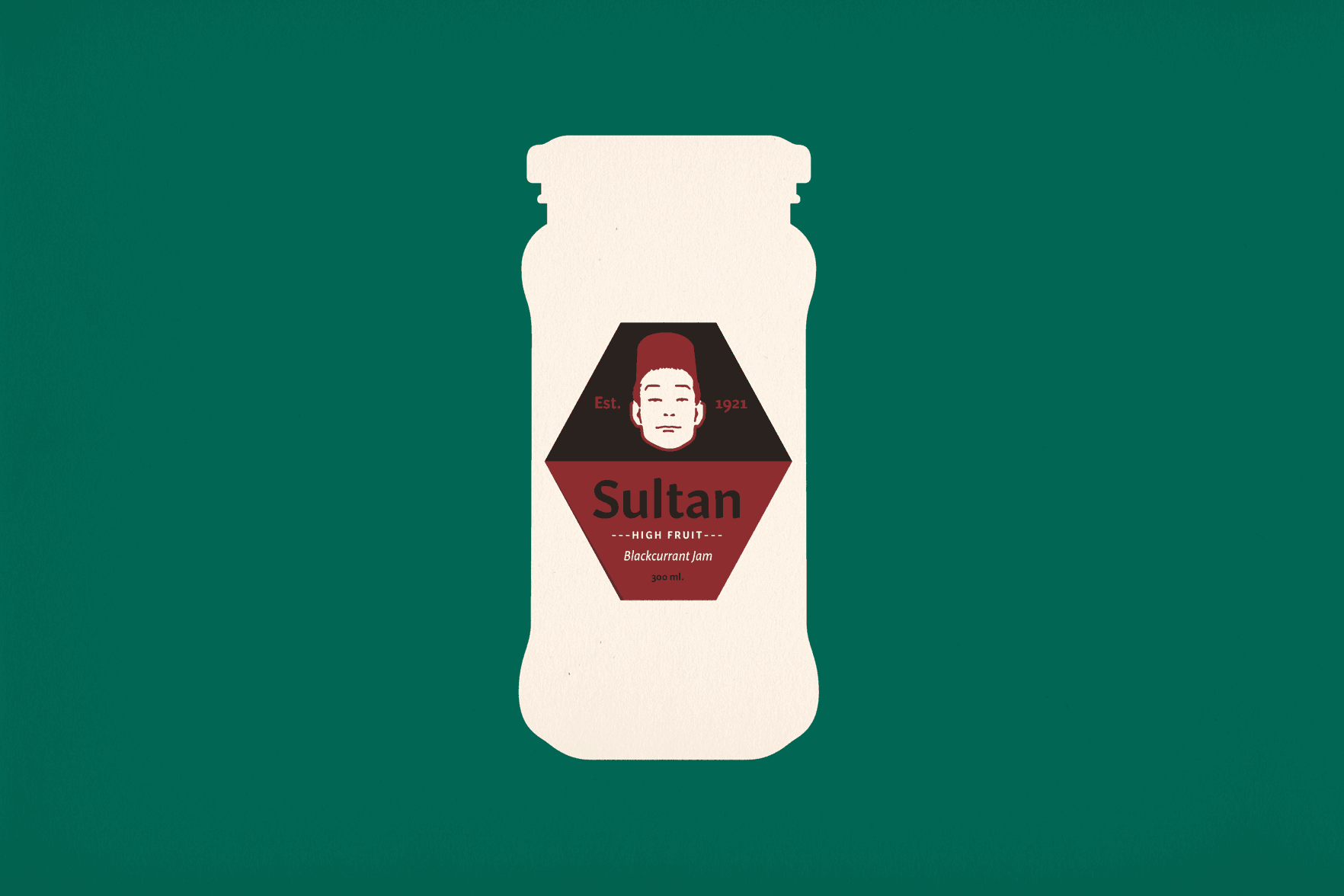

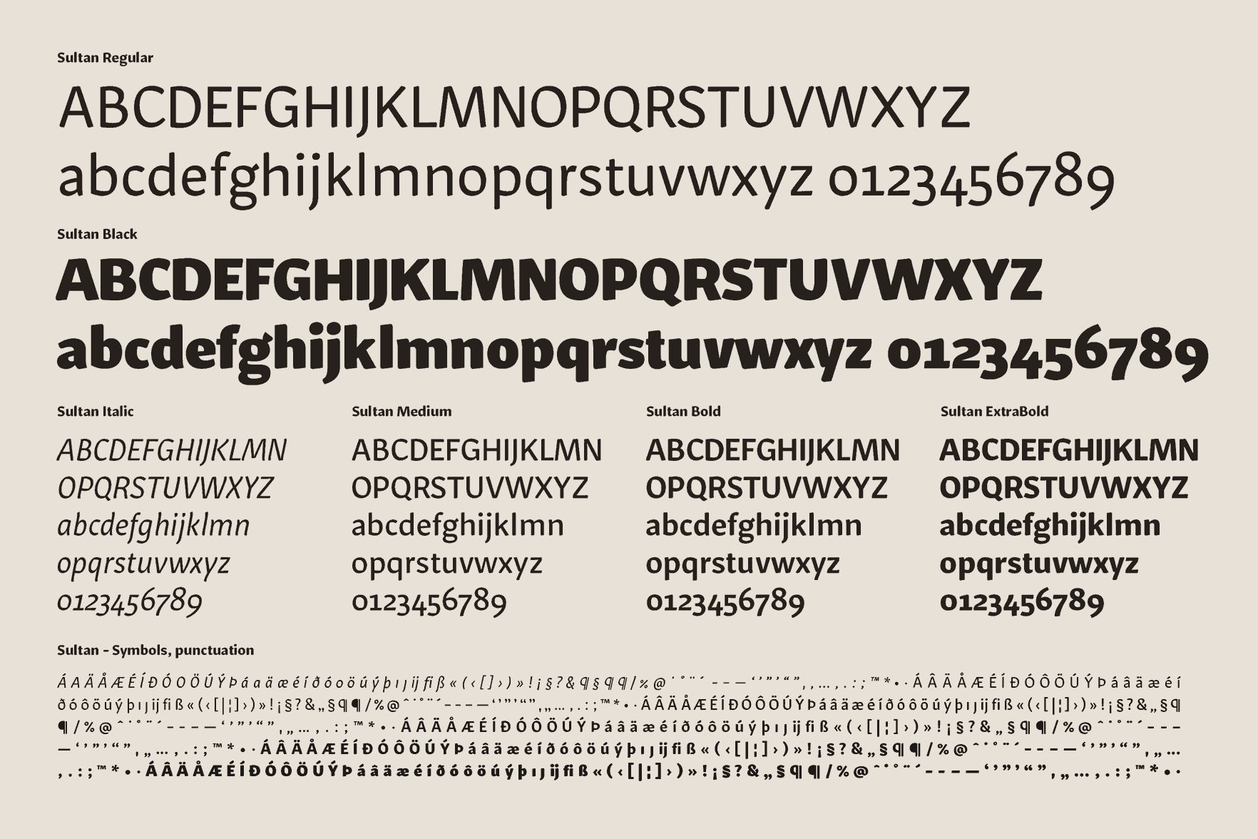
Sultan
Sultan is a sans serif family of typefaces loosely based on broad nib contrast. By juxtaposing fairly modern looking widths and finishings with a contrast model that communicates age and a hand-made feel, it conveys a sense of familiarity and warmth yet has a serious undertone. It is suitable for display and short-to-medium-length text use.
Sveinbjörn Pálsson
Iceland
Sveinbjörn studied graphic design at the Iceland Academy of The Arts in Reykjavík. He has had a varied career in design, with work in magazine design, interaction design, art direction, tomb-stone lettering, custom type design and other fields. After graduation he plans to make some typefaces.